As the web evolves, so does the way people interact with the web. Firefox’s user experience and research teams have been eager to learn about our users’ browsing habits so that we can better design for our users. Lately, Mozillians like Lilian Weng and Jono X have been running some fascinating studies using Test Pilot to determine how, when, and why Firefox users open new tabs. I wanted to note a few key takeaways from their recent study that give us a glimpse into how our users browse (full studies are linked at the bottom of this post).
A caveat is that these results – as with all Test Pilot studies – are gathered using anonymized data submitted by users who have signed up to participate in Test Pilot. Thus, the Test Pilot users data tends to skew slightly towards the technical and early-adopter crowd.
How are people currently using new tabs?
Each day, the average Firefox user creates 11 new tabs, loads 7 pages from a new tab, and visits 2 unique domains from a new tab.[1] The average new tab loads two pages before the user closes or leaves it.[2]
Once users have a new tab page open, about half of the time (53%) they navigate to a new page using their mouse, and about half of the time (47%) they use the keyboard.[1]
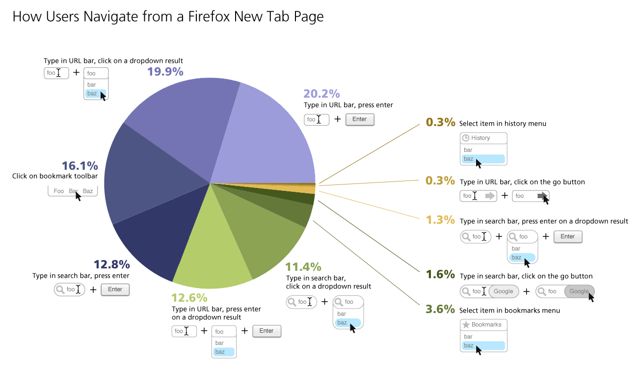
Here’s a breakdown of what actions users take once they’ve opened a new tab:
As you can see above, the URL bar was the most-used item on a new tab page, with 53% of use actions originating there. The search bar only accounted for 27% of user actions. Even though by default it’s not even enabled in Firefox, 16% of new tab page actions were clicking on a URL in the bookmark bar. History and bookmarks menus were both used less than 5% of the time.
In this study, 17.4% of the domains recorded accounted for 80% of the page views for all participants. You might think that the more active a user is, the number of unique domains they’d visit would follow the same ratio. However, this study found that the more sites a user visited online, they more often they would visit the same 20% of domains. Turns out, the most active internet users are even more loyal to a few choice domains than their less active counterparts.[2]
[1]Quick report on new tab study, by Lilian Weng
[2]Test Pilot New Tab Study Results, by Mozilla Research Team


I thought it was common knowledge (especially in usability circles) that pie charts are less desirable than bar graphs.
Actually, for proportional data like this, pie charts are the way to go
It would’ve been more useful if the “click on the bookmark toolbar” had a different color.
Excellent results! What conclusions are you taking for the future Home Tab? Do you think this favors the chrome-like/omnibar design?