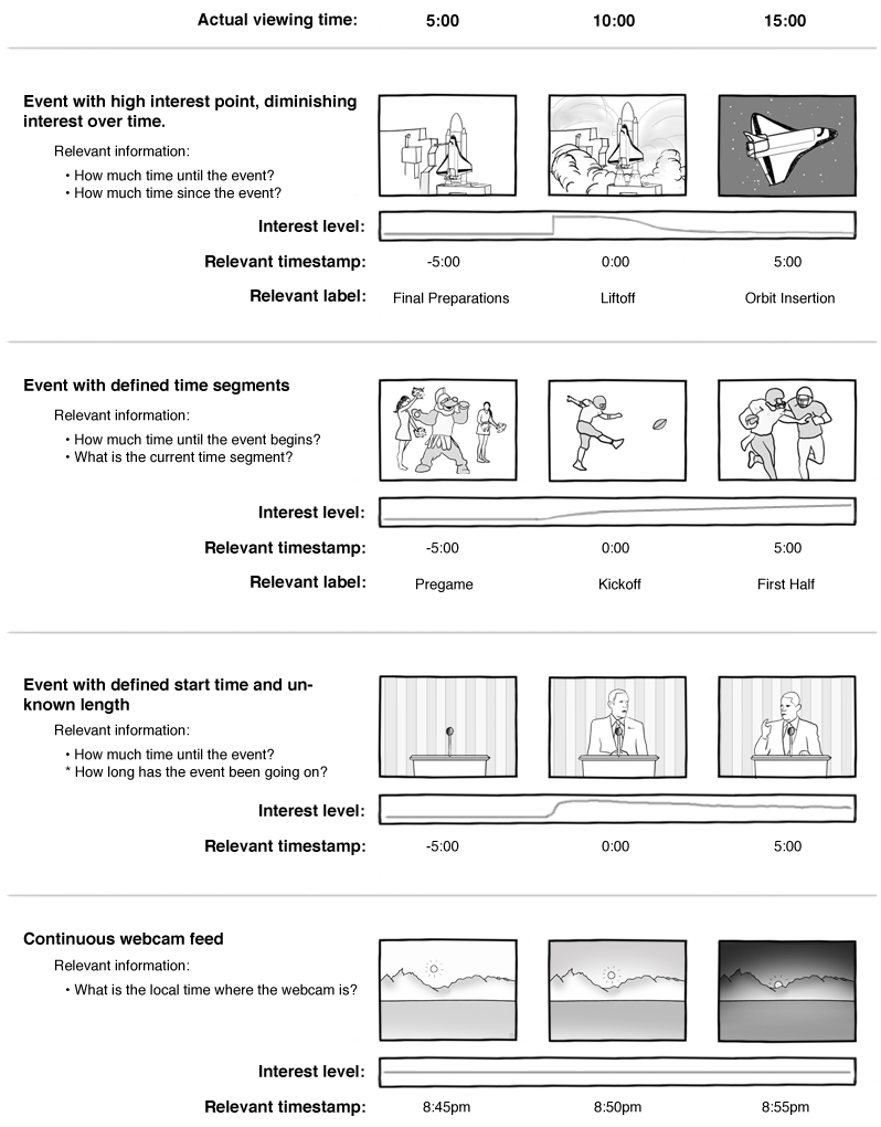
Watching live video online is generally a great experience. It’s a way to watch important world events without a TV, a way to view with friends without syncing, and still the best way to see a shuttle launch naked.
But online live video could be improved. For instance, there’s usually no way to rewind video to see a clip again, nor a way to pause and watch video from where you left off. In fact, current implementations of live video have very few features – usually they are adaptations of regular video controls, but with non-interactive elements such as stationary or removed timelines.

We think users would benefit from the ability to pause and go back in live video by keeping some amount of the video buffered. However, this presents a few design challenges:
- How to visually represent when the user is “live” vs. viewing buffered video
- How to visually represent the amount of video in the buffer
- How to make it easy for the user to jump between live and buffered video
Limi and myself did some brainstorming to develop ways to present this functionality. Below is an idea we had that we’d love feedback on. It’s based on the idea of a “live mode,” which users can enter and exit via the video controls. By default, the user begins in live mode (the box on the right of the timeline). As the user watches the live video, the timeline to the left encompasses how much video has been buffered. So, after one minute the timeline represents one minute in length, and after two minutes it represents two minutes. To give an indication of how much time the bar represents, ticks marking minutes will scroll left as the video plays. Clicking the live mode button or moving the slider back to the live point puts the user back in live mode.

However, eventually the video will reach the maximum that can be buffered. For the purposes of these mockups, we’ll say that 10 minutes is the limit. After the video plays for 10 minutes, the beginning of the video is dropped and no longer accessible. The user sees this as the 0:00 mark disappearing from the timeline, and higher time markers continuing to scroll left.

If the user pauses the video, he exits live mode and the slider moves off of the live mode box. A visual indication will show that the video is no longer live – perhaps by fading the live mode and/or changing the shape and color of the slider. As the video is paused, new live video will be buffered and old video will continue to be dropped, moving the paused slider and the timeline left.

Once the slider has moved back 10 minutes, the new video is no longer buffered: only the ten minutes immediately after the pause is stored. This is so that when the user returns, the video will play from the point they left off and not the somewhat arbitrary 10 minutes before the live video. At this point, the buffered 10 minutes and the live point are no longer connected – a visual indication such as a break of the timeline will indicate this.

So, what do you think? Was this difficult to understand? It’s a bit of a shift from commonly understood video control interaction, but I think it may be intuitive once users play with it. I’ll be eager to find out.
You can read more about our progress in the wiki.
P.S. This is the first blog post I’ve made in awhile, but unfortunately for you I’m going to be posting a lot more frequently, starting now. Please don’t cry, they won’t all be this long.


Recent Comments