All posts in Uncategorized

Add-ons Manager Redesign Status Update

Meta-bug for redesign: bug 550048, wikiQA
Meta-bug for look and feel: bug 586066, wiki

The basic redesigned add-ons manager functionality is running in Minefield nightly builds.  Many smaller parts of the functionality, and especially edge cases, have open bugs and are being actively designed and fixed.  API changes are being made majoritively by David Townsend, and final CSS visual polish is being done majoritively by Blair McBride.  Majoritively is actually not a word.  Individual bugs are not being filed for most of the small steps required to visually style the manager to match the current mockups.

The add-ons manager consists of a separate panel for each category of add-ons, called List View (☑ bug 585950). Individual add-ons’ details can be viewed in Detail View (☑ bug 562902).  The other main parts of the add-ons manager are search, a client-side “Get Add-ons” pane (bug 558158, spec), and the Update Pane (bug 598738).

Unfinished Functionality

  • Extension manager API rewrite (bug 461973, wiki, documentation). Dave Townsend is making API improvements clean up a number of issues, including to allow the main UI to operate without having to speak RDF.  This bug currently has 52 dependencies, including some user experience issues:
    • Having extension compatibility controlled on a per-addons basis (bug 527861)
    • Controlling order of add-ons in manager (bug 595847) and adding a search plugin provider (bug 552747)
    • Installing and upgrading add-ons in the add-ons manager:
      • Allowing the user to pause installations (bug 553024)
      • Using Firefox’s download manager to manage add-on downloads (bug 555753)
      • Handling failed installations to bad directories (bug 557897)
    • Viewing add-ons in the add-ons manager:
      • Allowing thumbnails and full-size screenshots to display in Detail View (bug 553563)
      • Assuring multiple copies of add-ons don’t appear in manager (bug 562922)
  • UX-centric functionality bugs for viewing add-on information:
    • Implement lightbox-style viewer for add-on screenshots (bug 553462)
    • Create numbered badges for active items on category titles (bug 553486)
    • Hovering over backgrounds should give a live preview (bug 562832)
  • UX-centric functionality bugs for installing and updating add-ons:
    • Allow user to undo a cancelled restart (bug 562300)
    • Checking for updates needs more visual feedback (bug 562925)
    • Showing newly installed add-ons prominently in the UI (bug 565522)
  • UX-centric functionality bugs for using add-ons:
  • In-content UI work needed
    • The add-ons manager currently does not visually  incorporate the navigation bar.  Incorporating the navigation and (if applicable) bookmarks bar, as in the mockups, distinguishes in-content pages as a part of the browser, not a part of the web.  It presents a steamlined, simple interface for dealing with what is essentially a panel of Firefox itself.  It also makes such pages distinct and unspoofable.  Bug 571970 is tracking progress on this change.  An added challenge of this change is making in-content UI work when the user has set tabs to display on bottom (see comment 23).  While a decent design solution could be found, this may not be worth the work and time before Firefox 4, and fixing the multiple back forward buttons present with tabs on bottom (bug 597178) is likely a better temporary solution
  • Unresolved issues
    • Giving a better experience for third-party installed extensions. Namely, to outright disable them on upgrade or not? (bug 596343)

Unfinished Graphics

  • Gradients and texture files needed for background of all in-content pages.  This could get slightly tricky with window resizing, anchored images
  • Concept and icon for what we’ve been calling the “gear” menu.  Gear works fine for OSX, not so much for Windows and Linux.  Even current placeholder gear is too close to native OSX window “tasks” menu
  • Final images and colors on sorter bar and search header
  • Final mockup for Update panel and in-line updates

Redesigning Firefox’s Addons Manager

When I ask Firefox users why they love Firefox, the answer often isn’t because of Firefox. Rather, it’s a particular Firefox add-on that provides functionality that has become invaluable to users. From developer add-ons like Firebug to social add-ons like StumbleUpon, a single add-on can fundamentally change how users interact with the web.

Firefox users get starry-eyed when describing their favorite add-ons

The reason add-ons are so important is because they are a fundamental way that users take control of their online life. Firefox touts its customizability as one of its main selling points, but users’ ability to customize their browsing experience is dependent on the talent and creativity of the add-on developer community. I’ve written in the past about the importance of Firefox providing a user experience ideal for as many people as possible right out of the box, without add-ons installed. But each user is truly unique and uses the web in increasingly different ways. That’s why it’s so important that add-ons be trivial to find, install, and begin using.

The Current Add-ons Manager

Add-ons are currently installed, maintained, and configured via the add-ons manager in Firefox. This window, found under the Tools menu, provides an inventory of installed add-ons and allows users to update, install, remove, enable, and disable them.

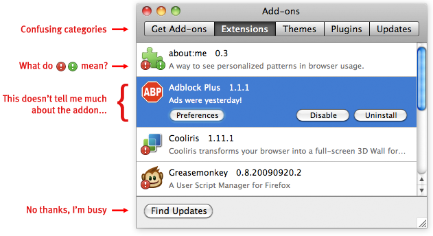
The current add-ons manager works, but could use some love

The add-ons manager has been largely unchanged since 2007, and it badly needs a redesign. One reason is that it has several usability problems that would provide significant benefit to users if fixed. For instance, the process of updating add-ons is currently characterized by interrupting important tasks such as startup. Locating a particular installed add-on currently involves navigating through categories such as extensions and plugins. Even experienced users I talked to find the distinction between these categories hazy. A redesign to address current issues should insure that installing and updating add-ons is trivial, notifications are non-disruptive, and the interface provides clear information about the state of a user’s add-ons.

However, a successful redesign of the add-ons manager must not only fix problems, but add functionality. This is because the scope and functionality of add-ons has increased dramatically and will continue to expand in future versions of Firefox. The current add-ons manager gives only the name of an add-on, an icon, a version number, and a one-sentence description. Users could benefit from more information, such as a description or a screenshot showing what UI the add-on will change. Added functionality is also needed because of new ways to modify Firefox, such as Jetpacks and Personas. These are similar to current add-ons in that users can choose items to download for added functionality, but they are installed, managed, and used differently. A redesigned add-ons manager must be able to incorporate emerging projects like these.

Redesign Priorities

From fixing current usability problems to adding needed functionality, there’s a lot that needs to be tackled in the add-ons manager redesign. To help focus the effort, the main areas to address can be described as five priorities:

1. Maintaining and Configuring

  • Allowing users to quickly locate a particular add-on by name or by type
  • Providing simple, usable controls for basic add-on operations
  • Allowing new forms of add-ons, such as Jetpacks and Personas, to be maintained and configured easily alongside traditional add-ons

2. Updating

  • Updating add-ons automatically by default. I’m increasingly convinced that most users, once they’ve decided an add-on is trusted, do not want to manually update it. They especially do not want to be reminded to update when they are starting the browser
  • Allowing users the option to update add-ons manually, update only a particular add-on manually, and possibly to undo an update

3. Installing

  • Streamlining the install process to as few steps as possible
  • Providing the user with clear indications of what action is needed, especially when some add-ons require a restart and some do not

4. Discovering

  • Providing a compelling first-run experience to new add-ons users, including clearly showing what functionality add-ons provide and what they will change
  • Providing a usable, findable way on the add-ons manager to search all existing add-ons, only requiring a visit to AMO when greater community involvement or information is sought

5. Troubleshooting

  • Providing ways to determine if a particular add-on may be causing performance problems, such as ranking by size, CPU, etc
  • Giving clear communication and instructions if there is a security problem with an add-on

This is still very much a working list open to feedback and changes (especially via comments here or on the wiki).  Basically, what I’d like to focus on is making add-on usage less disruptive and more accessible. Experienced and especially technical users tend to be very aware of add-ons and the functionality they provide. These users may see add-ons mentioned in the tech press, may talk to their friends about their favorite add-ons, and might even get involved in the add-on developer community. These are the users who say “I can’t imagine a world without add-on X.” But the benefit of add-ons is felt almost soley by this group. There are thousands of add-ons available that can improve the online experience of just about any user.  Both users and developers deserve an add-ons manager that helps make customizing the browsing experience simple.

How could Microsoft’s Proposed Browser Ballot be More Effective?

(Note: This is my personal opinion and doesn’t reflect Mozilla’s official position nor any formal statement from Mozilla)

In my post on October 15, I wrote about the European Commission (EC)’s investigation of Microsoft due to its bundling of Internet Explorer (IE) with Windows, which the EC viewed as potentially harming consumer choice and innovation on the web. Microsoft, to appease the EC, proposed that Windows users be presented with a ballot in which they could choose which browser to install. I said at the time, and in a subsequent post, that creating a ballot would not successfully address the EC’s concerns nor provide a good experience to users. However, since the EC seems to be giving Microsoft the go-ahead to design a ballot, it seems that the best we can do is consider how to design a ballot that causes the least amount of harm to users.

Here are two broad principles that are important in ballot design.

Principle 1: A ballot should be clear and simple

A ballot should present the voter with the information they need to make an informed choice, but no more. The verbal and graphic language on the ballot should be organized so that readers follow a consistent path through the ballot’s information.  Many viewing the browser ballot will not be familiar with the browser as a separable element from the operating system, so clear and precise language is vital.

In interaction design, the complexity of a new task can be lessened by leveraging against what the user already knows and expects. For instance, it’s usually best to display the instructions in the top left for western readers, and before the the possible ballot choices (Kimball and Kropf 2002). It is also recommended that the instructions be as close to the first task as possible, because it provides the highest chance that voters will read them (Dillman and Christian 2002 (pdf)).

Other recommendations to make a ballot simple and clear include:

  • Instructions written short and simply, and in an active, affirmative style (Sanders and McCormick 1993)
  • No unnecessary information or clutter around the choices (Niemi and Herrnson 2003)
  • No text smaller than 12pt (Roth 1994), left justification preferred (Dillman 1978), shading and highlighting used to direct the voter’s focus (Kimball and Kropf 2002)
  • Ballot items listed in a single row or column (Darcy and Schneider, 1989). Failure to do this is part of what caused the ballot problems in Florida during the 2004 US Presidential election
  • Enough spacing between lines to highlight groupings of visual elements (Dillman 2000)
  • No ambiguity over which button corresponds to which choice (Kimball and Kropf 2002)

Principle 2: A ballot should be impartial

I wrote in my previous post about how ballot order can influence voters. Another important factor is how much physical space on the ballot each item is designated.

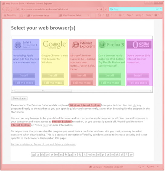
The current design runs into some problems with designated space per item, swayed in favor of IE. For instance, in the current design:

  • The user must double-click on an Internet Explorer icon, labeled “Internet Explorer”, to launch the ballot
  • The ballot appears within Internet Explorer browser chrome
  • Internet Explorer is mentioned repeatedly within the ballot, Bing is shown as the default search engine, and the IE logo appears as a favicon multiple times

The current space allocation for IE is roughly 3.35 times as much as the other browsers.

ie_ballotshaded

Current ballot: 3.35 times more space given to IE than the other browsers

piechart_browserballot

Allocation of visual space for each ballot choice

This space that IE occupies in the top left of the ballot is particularly important because it’s where users begin an eye scan of a new page.  As an anonymous source pointed out to me, Microsoft mentions this in their layout guidelines:

“All things being equal, users first look in the upper left corner of a window, scan across the page, and end their scan in the lower right corner.  They tend to ignore the lower left corner.

But in interactive UI, not all things are equal so different UI elements receive different levels of attention. Users tend to look at interactive controls—especially controls in the upper left and center of the window—and prominent text first”

Improving the ballot based on these principles

In summary, the ballot would be improved by being simpler, clearer, and be presented with equal weight to each browser.

Here’s a version similar to the current proposal but with these principles in mind:

top_buttons

Hello!

I’m Jennifer Boriss, but I go by just Boriss. Two weeks ago I started work at Mozilla as a user experience designer. I’ll be working alongside established superheros Mike Beltzner, Alex Faaborg, Madhava Enros, and Aza Raskin to make the Firefox the best online experience possible.

I’m joining Mozilla at an interesting and exciting time. The much anticipated Firefox 3 will arrive soon, and its first release candidate was released on May 17. The response to RC1 so far has been overwhelmingly positive, and deservedly so. Firefox 3 is a solid, excellent product, and everyone here and in the community is very thrilled to see it out the door. The Firefox 3 release is the latest in a long series of exciting events to happen at Mozilla. Ever since Firefox 1.0’s release in 2004, it’s been steadily gaining users in almost every country. Today, Firefox enjoys over 16%[1] market share online (28%[2] in Europe), and this is only growing. Fairly impressive, considering IE held 95%[3] of the market at Firefox 1.0’s release.

Like many, I found the success little open-source browser that could very exciting. Beyond the fast, clean web experience, the collaborative and open nature of Firefox’s development is exciting as a model for achieving projects online across many countries. And also like many, I found the previous lack of choice in browsing and the poor user experience of Internet Explorer disturbing. If the internet is the new medium of information, business, and communication, the experience of its users is too important to be entirely written by Microsoft. This is why I joined Mozilla and am pumped about what’s to come.

This is a formative time for Mozilla, but also the internet as a whole. The nature of the browser and online experience will go through a series of important changes – evidenced in part by the hype of web 2.0 and more recent development of rich internet applications. How we access and create content is still shifting and being rewritten. While no one knows the precise direction the internet will take, we can set broad goals and work through advancing technology to achieve them. My focus is on user experience, so some possible goals could be:

  • Accessibility and freedom of information
  • Protection of the user’s privacy and data
  • Ease of content access and creation
  • Ability to customize one’s personal online experience
  • A positive online experience for any task from work to leisure
  • These are fairly broad goals, and I surely don’t know all the specifics of how we should achieve them. And, given the number of very passionate Firefox users, the task of improving the user experience is a bit daunting. If Firefox were a poor product, this job would be easy. As it is, Firefox already has what I consider an excellent user experience, and I know the risk of fixing something that isn’t broken – I won’t do it lightly. That’s why I’m hoping this blog will be more of a conversation than a monologue. I’ll use it to post ideas and designs for Firefox, and hope that people will comment. I welcome all feedback, especially negative. After all, my job at Mozilla isn’t to implement my own personal visions, but rather to be an advocate for the users. So rant, rave, complain, tell me what makes your grandmother angry, whatever – let’s start the conversation.