(Note: This is my personal opinion and doesn’t reflect Mozilla’s official position nor any formal statement from Mozilla)
In my post on October 15, I wrote about the European Commission (EC)’s investigation of Microsoft due to its bundling of Internet Explorer (IE) with Windows, which the EC viewed as potentially harming consumer choice and innovation on the web. Microsoft, to appease the EC, proposed that Windows users be presented with a ballot in which they could choose which browser to install. I said at the time, and in a subsequent post, that creating a ballot would not successfully address the EC’s concerns nor provide a good experience to users. However, since the EC seems to be giving Microsoft the go-ahead to design a ballot, it seems that the best we can do is consider how to design a ballot that causes the least amount of harm to users.
Here are two broad principles that are important in ballot design.
Principle 1: A ballot should be clear and simple
A ballot should present the voter with the information they need to make an informed choice, but no more. The verbal and graphic language on the ballot should be organized so that readers follow a consistent path through the ballot’s information. Many viewing the browser ballot will not be familiar with the browser as a separable element from the operating system, so clear and precise language is vital.
In interaction design, the complexity of a new task can be lessened by leveraging against what the user already knows and expects. For instance, it’s usually best to display the instructions in the top left for western readers, and before the the possible ballot choices (Kimball and Kropf 2002). It is also recommended that the instructions be as close to the first task as possible, because it provides the highest chance that voters will read them (Dillman and Christian 2002 (pdf)).
Other recommendations to make a ballot simple and clear include:
- Instructions written short and simply, and in an active, affirmative style (Sanders and McCormick 1993)
- No unnecessary information or clutter around the choices (Niemi and Herrnson 2003)
- No text smaller than 12pt (Roth 1994), left justification preferred (Dillman 1978), shading and highlighting used to direct the voter’s focus (Kimball and Kropf 2002)
- Ballot items listed in a single row or column (Darcy and Schneider, 1989). Failure to do this is part of what caused the ballot problems in Florida during the 2004 US Presidential election
- Enough spacing between lines to highlight groupings of visual elements (Dillman 2000)
- No ambiguity over which button corresponds to which choice (Kimball and Kropf 2002)
Principle 2: A ballot should be impartial
I wrote in my previous post about how ballot order can influence voters. Another important factor is how much physical space on the ballot each item is designated.
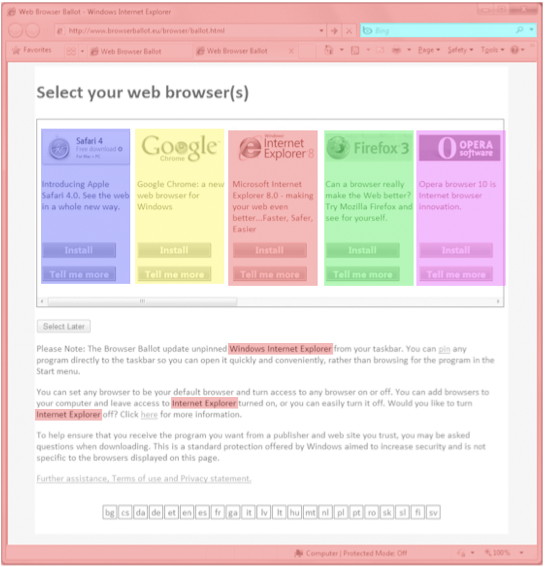
The current design runs into some problems with designated space per item, swayed in favor of IE. For instance, in the current design:
- The user must double-click on an Internet Explorer icon, labeled “Internet Explorer”, to launch the ballot
- The ballot appears within Internet Explorer browser chrome
- Internet Explorer is mentioned repeatedly within the ballot, Bing is shown as the default search engine, and the IE logo appears as a favicon multiple times
The current space allocation for IE is roughly 3.35 times as much as the other browsers.
This space that IE occupies in the top left of the ballot is particularly important because it’s where users begin an eye scan of a new page. As an anonymous source pointed out to me, Microsoft mentions this in their layout guidelines:
“All things being equal, users first look in the upper left corner of a window, scan across the page, and end their scan in the lower right corner. They tend to ignore the lower left corner.
But in interactive UI, not all things are equal so different UI elements receive different levels of attention. Users tend to look at interactive controls—especially controls in the upper left and center of the window—and prominent text first”
Improving the ballot based on these principles
In summary, the ballot would be improved by being simpler, clearer, and be presented with equal weight to each browser.
Here’s a version similar to the current proposal but with these principles in mind:


Recent Comments