All posts in Firefox

Add-ons Manager Redesign Update

Greetings! I want to tell you about some changes to the add-ons manager you’ll be seeing in Firefox’s trunk release very soon.

Add-ons in the Content Area, Oh my!

The biggest change you’ll see is that the add-ons manager will no longer appear in a separate window, but in a tab in Firefox’s content space. This represents a big shift in Firefox’s interaction model. You can read more about the reasons for in-content display here, but the summary is that displaying in content:

  • Allows for similar display across devices
  • Allows for quick updates from external sites, like Mozilla Add-ons (AMO)
  • Gives more screen real estate to tasks, allowing for less constrained interaction
  • Eliminates the need to manage small, easily-hidden windows

Eventually, we’d like to move many of Firefox’s various “extra” windows (Download Manager, Bookmarks Library, etc) into the content area. The add-ons manager, by being the first, will hopefully provide a solid working model that will guide the redesign and improvement of Firefox’s other windows.

So, what will you see when this thing lands in trunk? Something like this:

Ugh, These Icons Aren’t Final, Are they?

No, they’re not. Can you not read giant ridiculous gradient-heavy starbursts?! These are not the final graphics nor colors; they’re placeholders for now. In redesigning the add-ons manager, interaction design and visual design were kept deliberately separate. What you’ll see in trunk is a reflection of the new interactions in the add-ons manager – viewing in a tab, configuring and installing add-ons, etc. The final visual look will come later. This is partially because there’s still kinks to work out before the final graphics are created, and we’d like the community to try out the manager before it’s 100% done.

A Model for Firefox’s “Extra” Windows

There’s another reason the graphics aren’t final. If Firefox’s extra windows are going to move into the content area,  they have to feel very different from the rest of the web. They need to feel fundamentally a part of the browser itself. They also need to feel like a part of Firefox and the operating system. Additionally, they need to feel like each other. One of the goals here is to make Firefox’s look and feel more cohesive. The browser is the one stable part of the browsing experience. The web is a dizzying array of different content, and the browser should provide a dependable framework for exploring it. Right now, Firefox’s style is inconsistent in many places, both in design and interaction.

It looks like different parts of Firefox were made by different people at different times because, well, they were. Compare that to a product with fewer people working on each feature’s interface and a much shorter turnaround cycle.

Incongruous design is often a result of software having an organic development cycle over a long period of time; different parts begin to look and feel very different to each other.

One way to mitigate against organic growth creating dissimilar design is to make and use style guides. Firefox follows them for code and terminology, but we don’t have much for interaction and interface design. So, before we can really bring all these extra windows to content, we need a clear picture of the interactions and style that we’re following. Starting this process has been contingent on the new Firefox theme becoming solidified. Stephen Horlander‘s done incredible work here, and we can feel confident moving forward with a plan for these other windows. This is a separate project that I’m starting up and will be blogging about in the future.

Design Influences

Even though the graphics and style are not yet final, I wanted to point out some of the projects that influenced the interaction of the add-ons manager redesign. Nothing is ground-breakingly new in the manager, and this is deliberate; I was trying to find the simplest interactions that would work for a wide variety of content and users.

One simple interaction being used is the two-panel design itself.  “Zooming in” to information by moving right has become a standard of application design. All major operating systems have a similar interaction here: selecting an item on the left shows its contents and/or details on the right (the opposite is true for right-to-left language readers). This design is already being used in Firefox for the History sidebar, Bookmarks Sidebar, and Library.

The basic layout of the addon manager’s “digest” and “detailed” view are similar to the layout of addons on addons.mozilla.org (AMO). Luckily for us, AMO had a recent redesign and solved many of the problems of displaying add-on information. Giving summary information in a list helps find an add-on of interest, and more information is available on click. Using a similar style to AMO was also important because of how intrinsically the add-ons manager and AMO  are related. Treating add-ons differently within Firefox would mean that add-ons users would have to learn two systems rather than one.

Other bits of the design are inspired by small interactions I’ve seen other applications get right.  For instance, add-ons in the manager can be downloaded from within the manager. But, popping open the Downloads Manager to show a progress bar would clutter the interaction. I looked around for an elegant way to do in-content downloads, and found it in the video player Miro. Miro elegantly turns the download button for a video into a progress bar, meaning the user does not need to look away from the target they clicked on. They also incorporated pause and stop button beautifully into the bar itself. The new add-ons manager handles the progress bar very similarly.

Another element of Miro I thought was a good idea was the very subtle “Show More” button, which gives an expanded view of the selected item.  This works well for add-ons as well as videos, and thus the redesign has a similar link.

The view of multiple add-ons was also inspired by task-management application Things, which also groups right-paneled items into expandable boxes.

Better close out before this gets too much longer.  Tune in next time for: why themes are hard. Hopefully I’ll have a better title by then.

Themes and Personas in the Add-ons Manager

Personas and Themes are a bit of a strange beast in the add-ons kingdom. Themes completely change the look of Firefox, from its color and menus to the shape of buttons. Currently, Firefox needs to restart to switch Themes. Personas, or “Backgrounds” as I’ll refer to them here, are a kind of light-weight skinning which puts an image behind Firefox’s user interface, but makes no other changes. These can be applied without a restart.

This gets slightly complicated when a Theme and a Background are used at the same time. For instance, if someone wants to use a Theme with circular buttons, but also a freakin Twilight Background behind them. So, the UX question: how explicitly should we make the difference between Backgrounds and Themes in the user interface for the add-ons manager?

One solution is to ignore most of the complexity: allow users to use both a Theme and a Background and simply mark what is being used. This makes for the simplest interface, but can lead to the user being confused about results (“Why does using this Theme disable my other Theme, but my Background remains the same?”).

Or, we could be more explicit about it: give the user an indication that they can only have two items, and only one of each type.

Towards a Cleaner Firefox Startup

Notifications when Starting Firefox

What should happen when you start up Firefox?

Nothing. No notifications, no updates; nothing but a clean window ready to browse. This simple startup has been a goal for the Firefox user experience team for awhile (Faaborg has outlined our plan for eliminating startup dialogs here). As add-ons manager updates are among the worst current offenders, moving these notifications away from the startup process has been one of my goals in its redesign.

Why is it so important to make Firefox’s startup clean? The obvious reason is speed. Notifications and updates appearing and then requiring dismissal wastes valuable seconds. But there’s also interaction drawbacks when windows pop up. If a user is launching Firefox, he probably has a goal in mind, and that goal is unlikely to be updating his add-ons. By seeing an update notification, the user is being distracted from the task he wanted to achieve and forced to give some of his attention to a new task: dealing with or closing the notification.

Crashing Without Session Restore

However, what if we took this one step further, and didn’t try to automatically restore a user’s session after a crash? What if instead there was just one window, ready to go, with a link to restore the previous session?

Currently, if Firefox crashes once, the session restores when Firefox is reopened. If Firefox crashes twice in a short space of time, it’s assumed to be because of bad content from the session. That’s when Firefox throws its famous “Well, this is embarrassing” screen, and gives the option to restore the full or partial session.

This is fine in the expected case of the user crashing because of bad content and wanting to restore their session and get back to work. The problem is that forcing Firefox to quit, or deliberately crashing it, are increasingly becoming alternatives to quitting. Since websites often throw warnings before they close and stalling sites can mean waiting until a command can go through, it can be much faster to crash than quit normally. Here’s a couple ways this can go wrong:

Scenario 1:

Sally has 15 windows open, each with lots of tabs. A few websites she opened are starting to stall. Sally could wait until those pages resolve their issues, but her session is getting bloated and she really just wants to start over with a fresh session. Rather than wait for the stalling pages, Sally forces Firefox to quit. However, when she reopens Firefox, it tries to restore the session she doesn’t want. Sally quickly forces Firefox to quit a second time. Now she has the new session she wanted, because Firefox assumed her two crashes were due to bad content bringing down the browser.

Scenario 2:

Oliver’s first date with Annah is going great, and she’s come back to his apartment. Oliver knows the way to win her over is to show her that hilarious video with a cat falling down stairs. Annah sits down with Oliver at the computer, and Oliver goes to open Firefox. But, he hesitates. The last time he used Firefox, did he quit the browser normally, or did he force a quit, or did he crash, or did he turn his computer off? If it’s any of the last three, his last browser session will automatically display in front of his innocent date. Oliver isn’t sure he wants that. He opens Chrome instead.

If we give a link to restore a session rather than restore it automatically, Sally can use crashing the browser as a way to get a new session and Oliver can ignore his last session and watch his video.  When someone actually crashes they only need to click once, and they’re back where they started.

Add-ons Manager Update

Big day, right? iPad, Prop 8 Trial’s Witness Testimony concludes, Obama’s first State of the Union, Ted Haggard was cured of being gay (again). But you found the time to stop by my blog anyway.  That warms my heart.  So have a seat, and let’s talk about the add-ons manager.

Oxygen or Bling?

First, humor me a second, because I want to back out a little. Lately I’ve noticed that we talk about add-ons in very different ways.  Add-ons developers and community sometimes talk about add-ons as something “everyone” should install. I’ve heard some say that there’s an add-on for everyone, or that everyone should install a few that help their browsing experience. This is the “add-ons are oxygen” view. And heck, it’s been said plenty that add-ons are one of the main things that make Firefox great, and they are certainly what differentiates Firefox from other browsers.

But hold on. Isn’t Firefox sexy and beautiful right out of the box? Don’t about half of Firefox users have no add-ons installed? And when users have problems with Firefox, aren’t “weird add-ons” the first thing we blame and disable? This is the “add-ons are bling” view.

So, should we encourage users who don’t use add-ons to install them? Are they oxygen or bling? Like about everything, they’re probably in between.

A Browser with a Bike Rack

The purpose of a car is to drive places. That’s why you’d buy one, and you’d expect it to do that perfectly as soon you buy it. There are some car nuts (I know quite a few) who care deeply about a car’s engine, performance, style, etc. They will make incredibly deliberate decisions about the car they buy, and even make modifications to get it to behave differently. Some of these modifications will be purely functional (e.g. tires with better traction), others are stylistic (e.g. racing stripes), and some help them perform other activities (e.g. a bike rack).

But the majority of car drivers won’t look for modifications and will be content as long as their car looks good, drives well, and get them from A to B safely. If they’re driving a good car, it’s probably because one of their car-head friends told them it was a good model (explains my Civic). Should these users be encouraged to modify their car? If so, how?

While the casual car drivers may not understand much about the workings of their car and may be bored at what car-heads find interesting, many could have a better car experience if some modifications were easy to understand and easy to install. If I could change the color of my car every day with a click, I would. Ditto if I could add a laser gun to the front. If putting a red stop-sign sticker on my windshield protected it from bird droppings, I’d stick it on.

So if you were a car manufacturer of free cars and free car modifications, and your goal was happy users, what would you do? First, for those car-heads, you’d want modifications to be easy to develop and share. For those casual drivers, you’d want the free modifications to be simple to find, install, remove, and understand. You’d want it to be clear how a modification would change the driving experience. And if one of those casual users wanted to become more of a car-head, you’d pave the path for them. These are roughly the goals of the add-ons manager redesign.

Add-ons as Preferences

There’s something else to keep in mind with the add-ons manager. Add-ons are essentially choices the user has made about how to tailor their browsing experience in a way that reflects their preferences. Uhoh, preferences? You bet – installing and configuring add-ons is a small part of a user’s browser preferences, and as such should probably not be separate from the Preferences menu. I constantly see users go to the Add-ons Manager when they want their Preferences, and vice versa. So in a future Firefox, it makes sense to combine these. But, because there are many separate challenges involved, for now we are focusing only on the add-on manager’s redesign, with the eventual goal of integrating it with Preferences. I’ve described in a previous post that it makes sense for the Add-ons Manager to display in the content area of Firefox: I think the same can be said for the Preferences menu.

The Preferences project is still in its infancy, but keeping in mind that the add-ons manager will probably exist within the context of the user’s Preferences is important both in design and implementation.

Design Direction

The design currently being considered for the add-ons manager is a two-panel basic hierarchy view within the content area of the browser. Add-on categories would display in the left panel, with an expanded on the right.  This gives the user an overall view of that the add-ons manager entails, as well as enough room to individually configure items.

One of the benefits of having this two-panel design is that it allows scanning the contents of a category.  The current add-on manager currently employs a sort of “digest-style” summary for each add-on, and with category view this sort of functionality can be improved with better information.

If a user selected a particular add-on from their manager, the right panel would show a detailed view of that add-on.  This is something the current add-ons manager lacks: enough space to find out more about an add-on and configure it.  Below an add-on’s information, the developer could add preferences for that add-on.  The current manager pops preferences out in a separate window, launched from a button.  This is essentially a pop-up window within a pop-up window.  A two-panel in-content layout allows all of this functionality to be integrated.

This post is getting long pretty fast, so I’ll close here for now. Next up – how some of the interactions for maintaining, configuring, and installing add-ons could work within such a design.

As usual, these designs are not final and feedback (especially from add-on developers) is absolutely welcomed..

Mechanical Turk Studies Show IE Users’ Discontent, a Growing Interest in Chrome

You’re probably familiar with the whole European Commission/Microsoft browser case. Long story, but basically the EC accused Microsoft of harming consumer choice by bundling Internet Explorer with Windows, Microsoft offered to present users with a browser ballot, I wrote about how a ballot wasn’t a great solution but should be designed well, yadda yadda.  Last month, Microsoft agreed to show the browser ballot choices in random order, rather than fixed. Definitely an improvement!

I still wondered what effect, if any, item order and other variables would have on what browser people would choose. Would certain design changes on the ballot have a big impact on users? And how could Firefox optimize its space on the ballot to be most effective?

Mechanical Turk: The Odds are Good, the Goods are Odd

My colleague Alex Faaborg suggested that I try using Amazon’s Mechanical Turk to get some answers to these questions. Mechanical Turk lets users create tasks that they need humans (called workers) rather than computers to perform. Workers select tasks that look interesting to them and are paid a small amount for each task completed. I was pretty skeptical about using any pay-for-answers service at first. My fear was that workers would be a strange grabbag of too-technically-competent-to-be-representative people who would go through tasks at lightening speed, barely reading them, to get the most profit out of their time. But I was curious about how well the system worked and tried it out with a series of tests.  Some of these presented workers with ballots, and others asked workers to compare different aspects of Mozilla’s branding within the ballot.

I was actually amazed at how well the Turk performed, and especially at the ludicrous speed at which workers responded. Within four hours I had the time of about four hundred workers, each spending an average of three minutes on a short seven-question survey that I thought would take 20 seconds. To my surprise, the vast majority of free-form answers were filled in with thoughtful detail. Numbers of people this large, for that kind of time, for so little money (each worker was paid ten cents USD) was pretty sweet. It’s frightening how the hive mind’s torrential force is so easily bribed.

The bad news is that as suspected, the Turk workers are a strange sample. They skewed heavily towards living in North America and being more technical than an average users. Of my workers, 49.35% were already using Firefox (compared with 31.34% worldwide), and only 18.44% were using Internet Explorer (compared with 55.53% worldwide).  However, those free-form answers were pretty effective at separating geeks from n00bs, and it’s n00bs I was interested in.

So what are the results already?

Ok, ok. For the majority of tests, I presented users with a browser ballot with some small variables changed – maybe a different Firefox logo, a different description, etc – and had users select a browser as though they were being given the ballot when starting Windows. Unsurprisingly, no change to Firefox’s logo nor description on the ballot made a statistically significant difference to what browser workers selected.  But people were in the mood for change: 29.09% of people wanted to switch browsers when presented with the ballot. Internet Explorer users were most likely to want a new browser – 38.03% of them changed teams. Opera users were most loyal, with 92% staying on Opera. 70.53% of Firefox’s users wanted to stay with Firefox.

Of those Firefox users who wanted to switch, 51.79% wanted to try Chrome. Of Chrome users who wanted to switch, 50% wanted to try Firefox. It’s not too surprising that there’s crossover – both Chrome and Firefox attracted the more tech-saavy users who followed browser innovation to some degree. What’s interesting is that the main reasons people gave for switching to Firefox and Chrome from any browser were related to brand recognition. Nearly everyone who wanted to switch to Firefox said they’d “heard good things” about it, or that an acquaintance had recommended it. Most switching to Chrome mentioned using and liking Google’s search engine and being curious to see what else Google could do. In Firefox’s case, recognition was based on recommendation. In Chrome’s case, recognition was all about the familiar logo associated with successful searching.

Of Internet Explorer users – the only ones who will actually see the ballot – 22.53% wanted to switch to Chrome, 8.45% to Firefox, and 7.04% to Opera.  I should note that I believe the high Chrome percentage is partially because this sample of people make part of their income through the browser and are thus more familiar with the Google brand than your average European Joe. However, it does show a huge momentum towards Chrome, fueled by that all-important brand recognition.

So what else made people switch browsers? Workers had many associations with browsers – even those they didn’t use. They described both Chrome and Firefox as fast, easy to use, and innovative.  Most users sticking with Internet Explorer described it as being familiar, or that they were content with their current browsing experience.  However, there was one association that workers only made with Firefox: security. Nearly every comment relating to security and privacy was in support of Firefox, and most of those who would consider switching to Firefox mentioned this as a personal priority.

Below is a graph of how the workers responded to the ballot. Unsurprisingly, most people voted for the browser they were using, shown by a strong top-left to bottom-right diagonal.

If these results were extrapolated, it would dramatically change the browserscape of Europe. Internet Explorer would lose 38.03% of its European market share, Chrome would gain 10.11% the European share, and Firefox would gain 3.79%. Again, these results are highly skewed towards Chrome because of the Mechanical Turk sample, but I do think that Chrome will probably emerge as a big winner of the ballot screen. The Google brand is well known and well established, and I believe it will cause users to recognize Google as a brand they already use thus try Chrome.

Herdict and its Tasty, Anonymized, Aggregated Data

Nothing sucks on the web like not being able to go to the site you want. Page not found and 404 errors are an inconvenience that entirely halt your workflow. What’s worse than not being able to access a site is not being given relevant information to fix the problem. When users are presented with an error message, they tend to do whatever will make the error go away to get back to their task. Page not found errors can’t be dismissed, because they’re shown instead of the content wanted.

What creates an added level of frustration is not being given information on what the problem is. When users get a Page not found error, they likely have two questions in mind:

  1. Is this problem on my end, or not?
  2. If the problem is on my end, how can I fix it?

These are questions that have been hard for browsers to answer. Currently, Firefox’s network error pages aren’t incredibly useful. They’re certainly not as useful as Chrome’s, which use Google Link Doctor to find possible matches both for subdirectories and domains. That won’t necessarily tell the user if the problem is on their end or not, but it will help if the problem is a typo.

So how could a browser tell users if the problem is on their end or not, without infringing on their privacy? One project that currently takes a stab at this is Herdict, which Johnathan Zittrain’s been working on at Harvard University’s Berkman Center for Internet and Society. What Herdict does is let computer users tell the “herd” – via a Firefox extension – what sites are accessible. The aggregated data can tell if a site is down (because no one can access it), or blocked by a firewall (because only some people can access it), or likely on the user’s end (because everyone else can access it). Not only does that answer the question of “is this problem on my end,” but it may start to answer questions like “is this problem only experienced by my country, network provider, or device?”

Useful stuff! Does it have a place in the browser, and specifically in Firefox? I think that getting and submitting anonymized data should have an increased role in the browser, and especially where it promotes transparency and information to the user. Mitchell Baker has been writing about data, and how Mozilla could be treating aggregated, anonymized data as a public asset that should be freely available. Especially in situations where sites are being blocked and censored, giving users knowledge of the situation seems to align with Mozilla’s goals of transparency and viewing the web as global public resource that must remain open and accessible.

One way something like Herdict could be incorporated is through those Page not found errors. If there were an option on these to submit anonymized data, we could build a pretty accurate view of accessibility information for a website and share it. Allowing users to submit data when there’s a problem is something many programs do already – especially for crashes. This is good design; it makes users feel better by registering the annoyance they feel as a useful data point to developers. Here’s some sketches of what it could look like to incorporate Herdict’s aggregated accessibility data with these error messages:

1. No available information on a site:

2. Site is blocked due to local firewall:

3. Site is down for a country:

4. Site is down for everyone:

Relocating Firefox’s Add-ons Manager

In my last post, I described some of the ways that we’d like to improve the add-ons manager. First, we’d like to fix some of the add-ons manager’s usability problems, such as confusing installation processes and distracting notifications. There’s also some new functionality that the add-ons manager needs to provide, such as better information about add-ons and incorporation of newer projects such as personas. It was clear from the feedback that developers as well as users would like to see the maintenance and configuration of add-ons become easier.

The Add-ons Manager as a Tab

The current add-ons manager window sometimes gets in the way (with apologies to Gizmodo)

A few commenters on my last post highlighted problems caused by the add-ons manager being a separate window. It can get lost among other windows, be as distracting as a pop-up ad when giving a notification, and means part of the browser UI being modified is obscured. A potential solution that I think addresses these well is moving the add-ons manger into the content area of the Firefox, so that it runs in a tab. Here’s a few benefits this design provides:

  1. Gives more screen real estate to the add-ons manager. This would allow enough room for useful add-on information, scanning an entire add-ons inventory, and functionality like add-on preferences.
  2. Presents a less fragmented browser experience. Firefox’s chrome is basically a frame in which users go about their online life. But to modify that frame, users have to jump outside of it and onto a floating window. Modifying add-ons in the content space means the user never has to leave their tabbed browsing. Also, they can see all changes their add-ons make rather than having those changes obscured by a window.
  3. Allows for a similar add-ons experience across different devices. Running the add-ons manager in a tab means that an internet-capable device does not need a separate window or menu to modify add-ons – any device which can open a window can use add-ons in the same way as a desktop computer. Add-on management on mobile devices, tablet computers, and fullscreen mode would all provide the same experience. This is a huge win as the web becomes less about the device it runs on and more about the user, who may access the web on multiple devices.

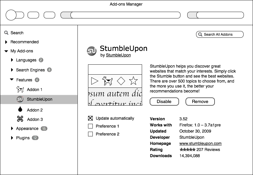
Designing such an add-ons manager is a challenge we’re actively engaged in. The final design must feel like it’s a part of Firefox rather than a website, even if it’s displayed within a tab. It must also be unspoofable. Below is a rough wireframe of the design direction that we are considering.

Redesigning Firefox’s Addons Manager

When I ask Firefox users why they love Firefox, the answer often isn’t because of Firefox. Rather, it’s a particular Firefox add-on that provides functionality that has become invaluable to users. From developer add-ons like Firebug to social add-ons like StumbleUpon, a single add-on can fundamentally change how users interact with the web.

Firefox users get starry-eyed when describing their favorite add-ons

The reason add-ons are so important is because they are a fundamental way that users take control of their online life. Firefox touts its customizability as one of its main selling points, but users’ ability to customize their browsing experience is dependent on the talent and creativity of the add-on developer community. I’ve written in the past about the importance of Firefox providing a user experience ideal for as many people as possible right out of the box, without add-ons installed. But each user is truly unique and uses the web in increasingly different ways. That’s why it’s so important that add-ons be trivial to find, install, and begin using.

The Current Add-ons Manager

Add-ons are currently installed, maintained, and configured via the add-ons manager in Firefox. This window, found under the Tools menu, provides an inventory of installed add-ons and allows users to update, install, remove, enable, and disable them.

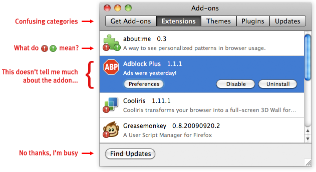
The current add-ons manager works, but could use some love

The add-ons manager has been largely unchanged since 2007, and it badly needs a redesign. One reason is that it has several usability problems that would provide significant benefit to users if fixed. For instance, the process of updating add-ons is currently characterized by interrupting important tasks such as startup. Locating a particular installed add-on currently involves navigating through categories such as extensions and plugins. Even experienced users I talked to find the distinction between these categories hazy. A redesign to address current issues should insure that installing and updating add-ons is trivial, notifications are non-disruptive, and the interface provides clear information about the state of a user’s add-ons.

However, a successful redesign of the add-ons manager must not only fix problems, but add functionality. This is because the scope and functionality of add-ons has increased dramatically and will continue to expand in future versions of Firefox. The current add-ons manager gives only the name of an add-on, an icon, a version number, and a one-sentence description. Users could benefit from more information, such as a description or a screenshot showing what UI the add-on will change. Added functionality is also needed because of new ways to modify Firefox, such as Jetpacks and Personas. These are similar to current add-ons in that users can choose items to download for added functionality, but they are installed, managed, and used differently. A redesigned add-ons manager must be able to incorporate emerging projects like these.

Redesign Priorities

From fixing current usability problems to adding needed functionality, there’s a lot that needs to be tackled in the add-ons manager redesign. To help focus the effort, the main areas to address can be described as five priorities:

1. Maintaining and Configuring

  • Allowing users to quickly locate a particular add-on by name or by type
  • Providing simple, usable controls for basic add-on operations
  • Allowing new forms of add-ons, such as Jetpacks and Personas, to be maintained and configured easily alongside traditional add-ons

2. Updating

  • Updating add-ons automatically by default. I’m increasingly convinced that most users, once they’ve decided an add-on is trusted, do not want to manually update it. They especially do not want to be reminded to update when they are starting the browser
  • Allowing users the option to update add-ons manually, update only a particular add-on manually, and possibly to undo an update

3. Installing

  • Streamlining the install process to as few steps as possible
  • Providing the user with clear indications of what action is needed, especially when some add-ons require a restart and some do not

4. Discovering

  • Providing a compelling first-run experience to new add-ons users, including clearly showing what functionality add-ons provide and what they will change
  • Providing a usable, findable way on the add-ons manager to search all existing add-ons, only requiring a visit to AMO when greater community involvement or information is sought

5. Troubleshooting

  • Providing ways to determine if a particular add-on may be causing performance problems, such as ranking by size, CPU, etc
  • Giving clear communication and instructions if there is a security problem with an add-on

This is still very much a working list open to feedback and changes (especially via comments here or on the wiki).  Basically, what I’d like to focus on is making add-on usage less disruptive and more accessible. Experienced and especially technical users tend to be very aware of add-ons and the functionality they provide. These users may see add-ons mentioned in the tech press, may talk to their friends about their favorite add-ons, and might even get involved in the add-on developer community. These are the users who say “I can’t imagine a world without add-on X.” But the benefit of add-ons is felt almost soley by this group. There are thousands of add-ons available that can improve the online experience of just about any user.  Both users and developers deserve an add-ons manager that helps make customizing the browsing experience simple.

How could Microsoft’s Proposed Browser Ballot be More Effective?

(Note: This is my personal opinion and doesn’t reflect Mozilla’s official position nor any formal statement from Mozilla)

In my post on October 15, I wrote about the European Commission (EC)’s investigation of Microsoft due to its bundling of Internet Explorer (IE) with Windows, which the EC viewed as potentially harming consumer choice and innovation on the web. Microsoft, to appease the EC, proposed that Windows users be presented with a ballot in which they could choose which browser to install. I said at the time, and in a subsequent post, that creating a ballot would not successfully address the EC’s concerns nor provide a good experience to users. However, since the EC seems to be giving Microsoft the go-ahead to design a ballot, it seems that the best we can do is consider how to design a ballot that causes the least amount of harm to users.

Here are two broad principles that are important in ballot design.

Principle 1: A ballot should be clear and simple

A ballot should present the voter with the information they need to make an informed choice, but no more. The verbal and graphic language on the ballot should be organized so that readers follow a consistent path through the ballot’s information.  Many viewing the browser ballot will not be familiar with the browser as a separable element from the operating system, so clear and precise language is vital.

In interaction design, the complexity of a new task can be lessened by leveraging against what the user already knows and expects. For instance, it’s usually best to display the instructions in the top left for western readers, and before the the possible ballot choices (Kimball and Kropf 2002). It is also recommended that the instructions be as close to the first task as possible, because it provides the highest chance that voters will read them (Dillman and Christian 2002 (pdf)).

Other recommendations to make a ballot simple and clear include:

  • Instructions written short and simply, and in an active, affirmative style (Sanders and McCormick 1993)
  • No unnecessary information or clutter around the choices (Niemi and Herrnson 2003)
  • No text smaller than 12pt (Roth 1994), left justification preferred (Dillman 1978), shading and highlighting used to direct the voter’s focus (Kimball and Kropf 2002)
  • Ballot items listed in a single row or column (Darcy and Schneider, 1989). Failure to do this is part of what caused the ballot problems in Florida during the 2004 US Presidential election
  • Enough spacing between lines to highlight groupings of visual elements (Dillman 2000)
  • No ambiguity over which button corresponds to which choice (Kimball and Kropf 2002)

Principle 2: A ballot should be impartial

I wrote in my previous post about how ballot order can influence voters. Another important factor is how much physical space on the ballot each item is designated.

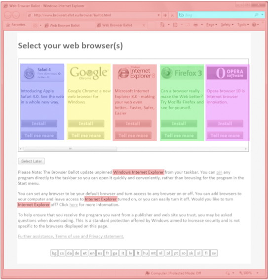
The current design runs into some problems with designated space per item, swayed in favor of IE. For instance, in the current design:

  • The user must double-click on an Internet Explorer icon, labeled “Internet Explorer”, to launch the ballot
  • The ballot appears within Internet Explorer browser chrome
  • Internet Explorer is mentioned repeatedly within the ballot, Bing is shown as the default search engine, and the IE logo appears as a favicon multiple times

The current space allocation for IE is roughly 3.35 times as much as the other browsers.

ie_ballotshaded

Current ballot: 3.35 times more space given to IE than the other browsers

piechart_browserballot

Allocation of visual space for each ballot choice

This space that IE occupies in the top left of the ballot is particularly important because it’s where users begin an eye scan of a new page.  As an anonymous source pointed out to me, Microsoft mentions this in their layout guidelines:

“All things being equal, users first look in the upper left corner of a window, scan across the page, and end their scan in the lower right corner.  They tend to ignore the lower left corner.

But in interactive UI, not all things are equal so different UI elements receive different levels of attention. Users tend to look at interactive controls—especially controls in the upper left and center of the window—and prominent text first”

Improving the ballot based on these principles

In summary, the ballot would be improved by being simpler, clearer, and be presented with equal weight to each browser.

Here’s a version similar to the current proposal but with these principles in mind:

top_buttons

Follow-up to “Microsoft Proposes a Browser Ballot” Post

It seems that my previous post has set up a lot of debate on the topic of Microsoft’s proposal and the browser space overall. I’ve been reading through the feedback and have been impressed by the constructive and insightful comments (as well as some less constructive). It’s clear that this is a subject people care about and have many excellent ideas on, and I’m thrilled to see this debate playing out. The nature of innovation and user choice on the web and how it pertains to the operating system and corporate interests is one of huge importance.

Many people agreed that changing the order of browsers on the ballot would mainly effect users uninterested in deciding what browser they use. This being presumably a majority of current internet users, what I want to avoid is systematic bias – particularly one that causes the majority of users to receive an outcome that is not optimal for them. That’s essentially the problem with having a ballot: it forces users to make a decision they likely don’t care about, and thus end up with an experience that may not be right for them. As a user experience designer, my rule of thumb is that if the user is ever asked to make a decision he doesn’t care about, the design has problems.

Naturally, I’m very happy to admit that I do believe Firefox is the best browsing experience available. That said, my proposals in which Firefox received ordering preference according to market share were intended to be illustrative of the problems with having a ballot rather than as highly desired solutions. Any ballot is likely to contain preset systematic biases that swing certain voters. Normalizing for all of these is unlikely to be possible, so how to best minimize them is a good discussion to have.

The wider issue of how to best help users make appropriate choices without needlessly overburdening them with the complexity of the choice is itself exciting: we face it daily in politics, economics, medicine, etc. It’s a space that I hope we can continue explore on this blog and in the wider internet community.