All posts in Firefox

Looking Ahead: Challenges for the Open Web

Mozilla at the 2008 Summit in Whistler.  Mozilla Community at 2008 Summit. Taken by Gen Kanai

At the end of this week, I’m moving on after six amazing years at Mozilla. On August 25, I’ll be joining Reddit – another global open source project – as their first user experience designer. I’m ecstatic to help shape and design the future of another incredible community.

In looking back at all that’s changed in technology and the web since I joined Mozilla, I find myself humbled at the trials we’ve met and overcome. When I joined in 2008, we were smaller and scrappier. Fellow designer Alex Faaborg and myself stood before whiteboards, explaining how tabs on top of the URL bar were more efficient. The bug backlogs of Firefox 3 kept us up at night, but when we launched in July 2008 we made the Guinness Book of World Records for most software downloads in 24 hours ((Mozilla sets new Guinness World Record with Firefox 3 downloads)). Chrome didn’t even exist yet!

Of the challenges in Mozilla’s future, many are nearly universal for open source communities and largely unsolved. Here are three I find myself often returning to:

1. How do we protect users’ data when users consistently choose utility over privacy?

You can package it any way you like, but if your privacy-centric product even slightly hinders user enjoyment of the web, it won’t see wide adoption.

When prompted, users overwhelming cite online privacy (referring to data being shared with companies and governments) as a concern. A recent poll ((Right To Be Forgotten: Do Users Even Care?)) showed 26% of people were “extremely concerned” about privacy when using a search engine, with nearly 90% expressing some level of concern. And yet, 92% of those use Google and only 3% use DuckDuckGo, an explicitly non-tracking search engine. In the developing world and younger markets, users are even less concerned. Mozilla’s research team is currently investigating attitudes towards privacy in Malaysia and the Philippines, and most people they’ve spoken with don’t even have a concept “online privacy” aside from not wanting their friends and relatives to see all they’ve posted to social media.

Those of us who care about online privacy are increasingly at a values impasse with our users. The solution is not to simply inform, coax, or frighten users into taking security measures.

Most importantly, a world without the practical technological possibility of privacy is much scarier than one where users can choose, either actively or passively, to share their information.

2. How can global communities accommodate incompatible values?

Philipp asks if this is good for the company

Championing inclusiveness and diversity is an easy decision for most organizations. But when push comes to shove, members of any large community will still disagree fundamentally on many important values. The need to bridge fundamental divides is an inevitability.

As an example, open source contributors disagree vehemently when it comes to DRM. Is it better to follow the content industry and implement extensions so content owners can control how users share content? Or, is DRM’s current instantiation so harmful to an open web that it’s worth limiting user’s access to content to avoid supporting it? Both these views and many others exist amongst Mozilla contributors, yet ultimately decisions about what ships in Firefox must be made. When this happens, the community cannot simply shrink by the number of people opposed to the decision.

To successfully cooperate, global communities have to form a sustainable plurality. The key is allowing members to operate in a context of known responsibilities to each other, yet also generalized freedom to hold, express, and act on their views. Freedom of expression should exist by default, but the community will collapse if members don’t understand that they also have responsibilities that are defined and understood.

Furthermore, the balance of power between the community at large and its leadership is best when it is understood and predictable. Major organizational decisions are often be made by a few executives or benevolent dictators for life. Where and how these decisions are made as well as what was decided needs to be widely available for a community to cohere. The community must also know the difference between the organizational values which guide decisions and the personal values of leaders which do not. Realistically, the two are never wholly separate.

The question over “public vs. private” values in leadership has been addressed frequently at Mozilla. Perhaps the lines that separate public and private views cannot be entirely explicit, but acknowledging and engaging openly about differences bring strength to a community. Again, this is best where the role and position of leaders in making decisions is clear.

3. How can design culture embrace open source?

Affinity Diagramming with Firefox in Toronto

Within design communities, open source is still met with disinterest at best and derision at worst. This is hurting both open source and design.

The main barrier towards design culture embracing open source is a chicken-and-egg: few open source projects appear to value usability and design. Scratch-your-own-itch hacker culture assumes the creators of technology are its users, which deemphasizes the need for usability and accessibility. Additionally, feedback in open-source is heard mainly from a few power-users, and the temptation to appease them can thwart designs that would appeal to a wider audience.

Another reason design culture hasn’t embraced open source stems from designers’ wariness over being taken advantage of. I remember Mark Mentzer, one of my Carnegie Mellon design professors, warning his students to “never work for free!” This attitude runs deep in design circles, and for good reason: we’ve become used to requests for work where the only payment will be “another piece in your portfolio.” Honoring those requests devalues design work as a whole.

But, open source is different from free labor. Just as developers do, designers love their work and often consider it a hobby as well as an occupation. The transformative potential of open source projects excites designers as much as developers. By insisting on excellent user experience, open source projects can show designers that they are communities that value design.

Another reason design culture hasn’t embraced open source is because code contributions fit more easily into open projects than design contributions. Any developer can jump into an open source project by taking and fixing a bug. Little context is needed beyond what’s provided in the ticket: current behavior, expected behavior, acceptance criteria. Patch written, reviewed, done, boom.

In design, more context and background is needed to “fix a problem,” which hinders potential community contributions. A design “bug” is harder to identify than most engineering bugs. Simply diagnosing them requires user research, collaboration, and context. Providing well-scoped design problems with dedicated mentors can help bring on contributors.


Mozilla Heart

To Mozilla, thank you for six amazing years. You’re my allies, my friends, and the most incredible people I know.

Firefox’s Redesigned Preferences Feel More like the Web

Another great Firefox improvement is releasing soon!

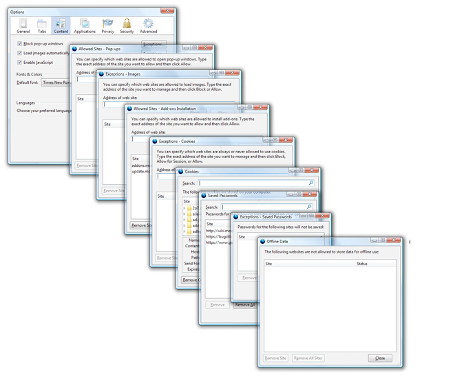
Firefox’s Preferences, until now, have required navigation through a cumbersome floating window where it’s nearly impossible to find what you’re looking for. This window is a classic example of a common software problem: settings are slowly added onto the interface as new functionality is introduced, and eventually it sags under the weight.

The mess that is current Firefox Preferences

The mess that is current Firefox Preferences

Until now, that is!

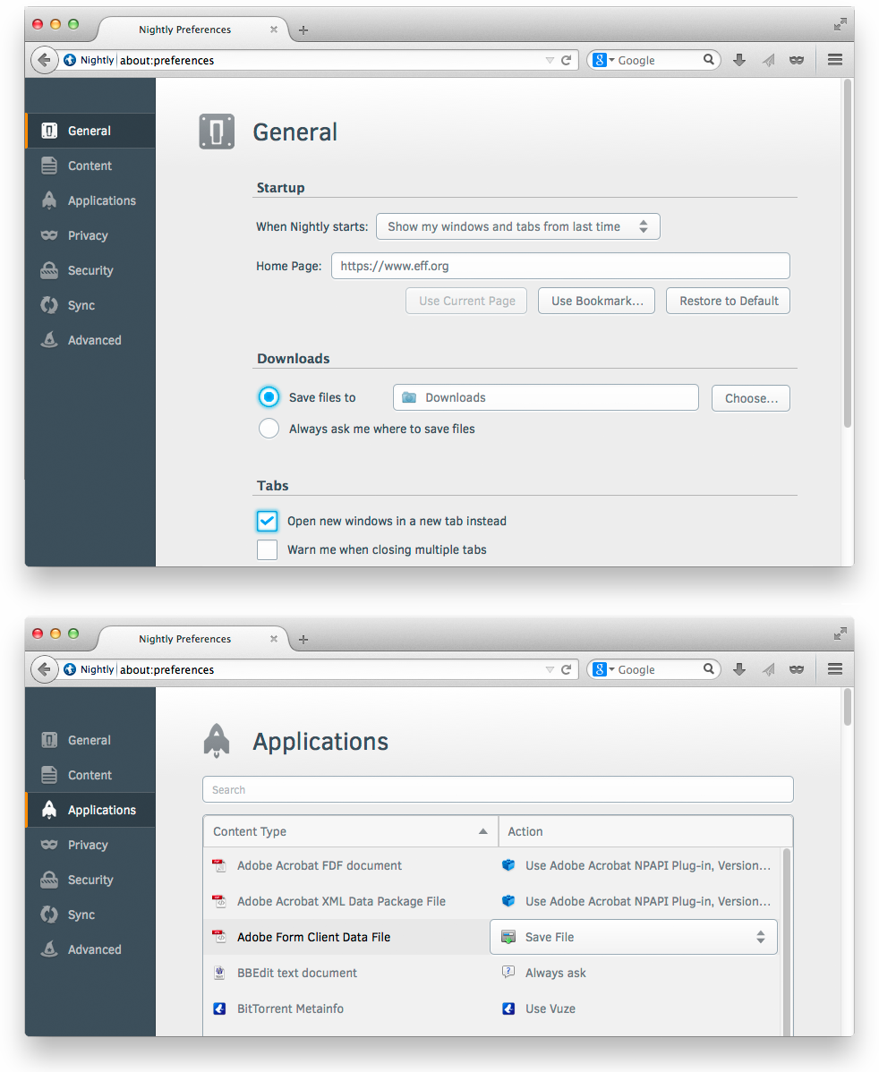
The Firefox UX team is excited to announce that brand new, beautiful Preferences are now the default in Firefox nightlies and will soon be in release Firefox. In this redesign, the interface is visually consistent, the information architecture is improved, and the whole thing is rendered in content space rather than as a separate window.

Firefox’s new in-content preferences

Why is it important that Preferences are in the content space rather than a separate window?

  1. Consistency across devices. By using the content space, we no longer have to rely on the ability of a device to draw separate windows and dialogs. This is particularly important on tablets and phones, where window management is more difficult. Now, users of mobile Firefox will see a familiar interface when move to desktop Firefox, and vice versa.
  2. Consistency across operating systems. Windows, OSX, and Linux all create windows and dialogs differently, which means the user’s experience with Preferences was different depending on the OS. Now, as we draw this interface within Firefox, we can make it look and feel identical across systems.
  3. Consistency with the web. Ultimately, the browser is a doorway to the rest of the web. For the browser to behave like a dialog-heavy desktop application rather than the web itself was jarringly anachronistic. Beneficially, rendering like a website also means users won’t need to find and manage a separate window in addition to their open tabs.
  4. Space to grow. Not being bounded by a small, floating window means we can create richer customization experiences. The Add-ons manager has already  moved to content space, and we’ve been able to explore richer use cases as a result. Similarly, expect to see innovative customization experiments as well as the usual Firefox settings.

And before you ask, yes, the next step is absolutely a search field in Preferences to summon the exact setting you’re looking for. This is needed particularly so users won’t have to “learn” our interface, but can instead focus on their task.

A special thank you goes to Senior Visual Designer Michael Maslaney, who’s been spearheading Project Chameleon, the style guide behind this redesign. Another thank you goes to MSU students Owen Carpenter, Joe Chan, Jon Rietveld, and Devan Sayles for creating the award-winning first version of Firefox’s in-content Preferences in May 2012.

Firefox and Flux: A New, Beautiful Browser is Coming

Tomorrow, on April 29, something amazing is coming to Firefox.

It’s not an interface adjustment or tweak.  It’s not a bug fix.  It’s a complete re-envisioning of Firefox’s user experience, and it’s been brewing for the past five years.

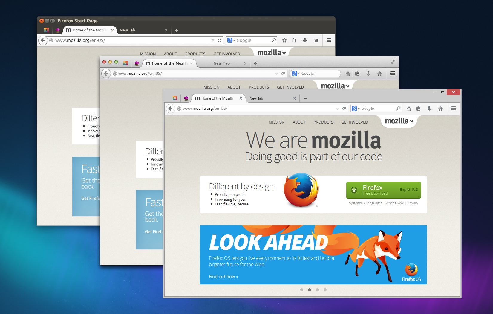
Firefox on Linux, OSX, and Windows

Firefox on Linux, OSX, and Windows

Good to Great

This new Firefox, Firefox 29, was borne out of a series of incredible, detail-obsessed designers and engineers understanding that taking products from good to great requires more than a series of incremental improvements.

Good can be achieved through incrementalism.  Great requires, at times, overhaul.

Firefox 29 contains extensive improvements that were planned back when Alex Faaborg, Madhava Enros, and myself were the only designers at Mozilla.  Back then, Firefox was beginning to buckle under the weight of its inconsistent code and interface.

Realizing the Need for Overhaul

It’s common enough for large codebases maintained across years to develop inconsistencies.  But, Firefox’s nature as an open-source community project contributed to idiosyncratic user experiences.   Menus and dialogs used different tenses and tones.  Add-ons behaved unpredictably.  Customization was handled differently throughout the browser.  Over the past few years, we’ve been working to improve many instances of inconsistent behavior, such as replacing modal dialogs for tab-modal ones, standardizing notifications, and using a uniform tone-of-voice.

Making improvements here and there is often what user experience designers at an organization are expected to do: fix what’s broken, slightly improve what isn’t, and generally don’t get in the way of engineering effort.  But, this method can only make an existing product slightly better, and the gaps it causes reveal themselves in time.

A sinking ship can’t be patched endlessly when it needs a new hull.  This is when user experience design is most effective: when it envisions the system as a whole.  When it steps away from the trees and sees the forest holistically.

Firefox needed a new hull, and the bulk of that hull is arriving on Tuesday.

Others have been blogging about Firefox 29’s beautiful redesign, so I’ll just mention the highlights.

Consistent Customization

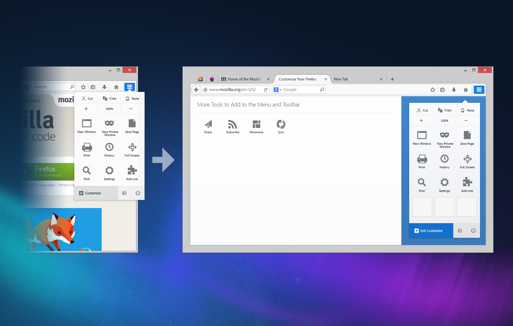
Customizing Firefox is now entirely predictable and much more fun.  Rather than digging into Preferences windows and dialogs, you can make Firefox the way you like via dragging-and-dropping buttons wherever you want them.

A Customize panel – itself customizable – displays the tools you want available in a single click but don’t want cluttering your interface.

Firefox Customize Menu

Firefox Customize Menu

Simple and Streamlined

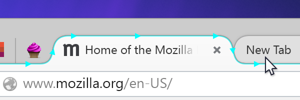
Gone are the bulky angles and edges of tabs and menus.  In Firefox 29, you’ll see streamlined, almost aerodynamic, curves giving emphasis to your current tab and subtly understating the rest.

Streamlined Tab Shape

Streamlined Tab Shape

Themes and Personalization

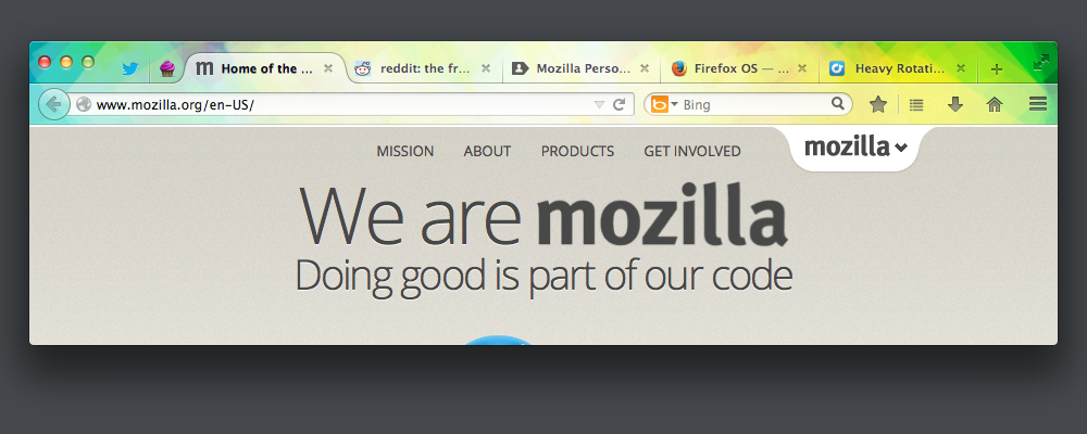
Making Firefox visually your own is not only easy, but gorgeous.  Lightweight themes look fantastic in 29 with a light interface overlay on whatever image inspires you while you browse.

Lightweight Theme Applied to Firefox

Lightweight Theme Applied to Firefox

Obsession with Details

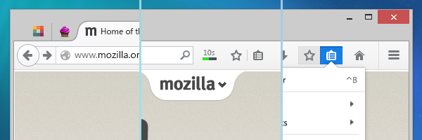
It’d be hard to describe all the changes coming to Firefox in a single post, but I hope you’ll find that we left no stone unturned.  Firefox 29 is all about details: the glows, the colors, the animations all reflect our desire to make the entire experience seamless.  A special hat tip to our visual designer, Stephen Horlander, for his painstaking eye for detail.

It's All About the Details

It’s All About the Details

Tomorrow’s launch day will, perhaps, be our biggest yet.  It’s certainly an emotional day for myself and the others who have worked on this release for years.  I can’t wait.  I hope you love it.

Update on Firefox 13’s Home and New Tab Redesign

(Note: the following has been cross-posted to Mozilla UX)

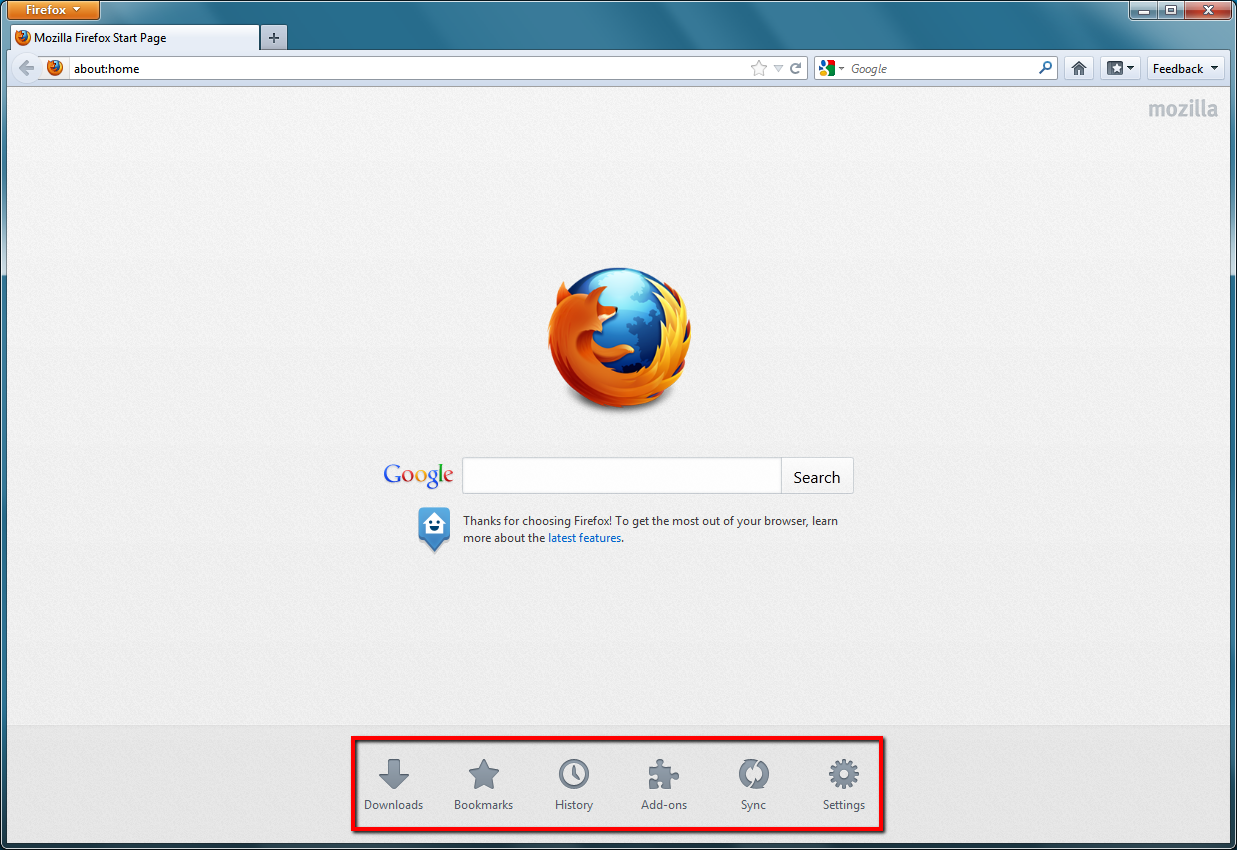
Two Firefox features getting a redesign in Firefox 13 (currently in beta) are the Home Tab and New Tab. Home Tab can be viewed by clicking house icon in Firefox or by typing “about:home” into your URL bar. New Tab appears when you click the “+” at the end of your tab strip.

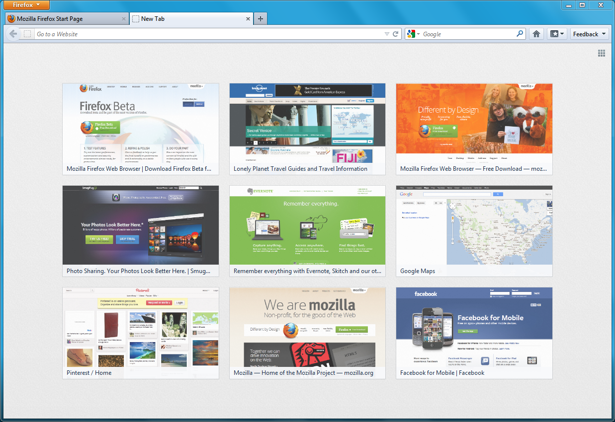
Firefox 13 New Tab Page

Firefox 13 Home Tab Page (launch targets emphasized)

Firefox’s Home Tab and New Tab have, until now, had fairly basic pages. In Firefox 12, Home Tab had a large search bar, a “snippet” which Mozilla uses to display messages to users, and little else. The main reason the search bar is on Home Tab is because many users click the Home button to initiate a search, either unaware of the toolbar search box or preferring not to use it. The snippet allows Mozilla to give a message to users, such as last October when it asked users in the United States to contact their representatives when the anti-internet-freedom bill SOPA was being heard in the House of Representatives. Such messages can be important while not being urgent enough to disrupt users with a notification.

New Tab, for most of Firefox’s history, has been completely blank. This was done deliberately to offer users a clean, fresh “sheet” to begin a new browsing task. However, a blank tab may not be distracting, but it’s also not useful.

Surely, we thought, we can present a more helpful design than a blank page! Using Mozilla Test Pilot, we began to research how Firefox users use New Tabs. What we learned is that each day, the average Firefox user creates 11 New Tabs, loads 7 pages from a New Tab, and visits two unique domains from a New Tab. The average New Tab loads two pages before the user closes or leaves it.

What this tells us is that users create many New Tabs, but they’re very likely from those to return to a limited number of their most-visited websites. So, we began to experiment with giving users quick access on New Tab to the websites they visit most frequently.

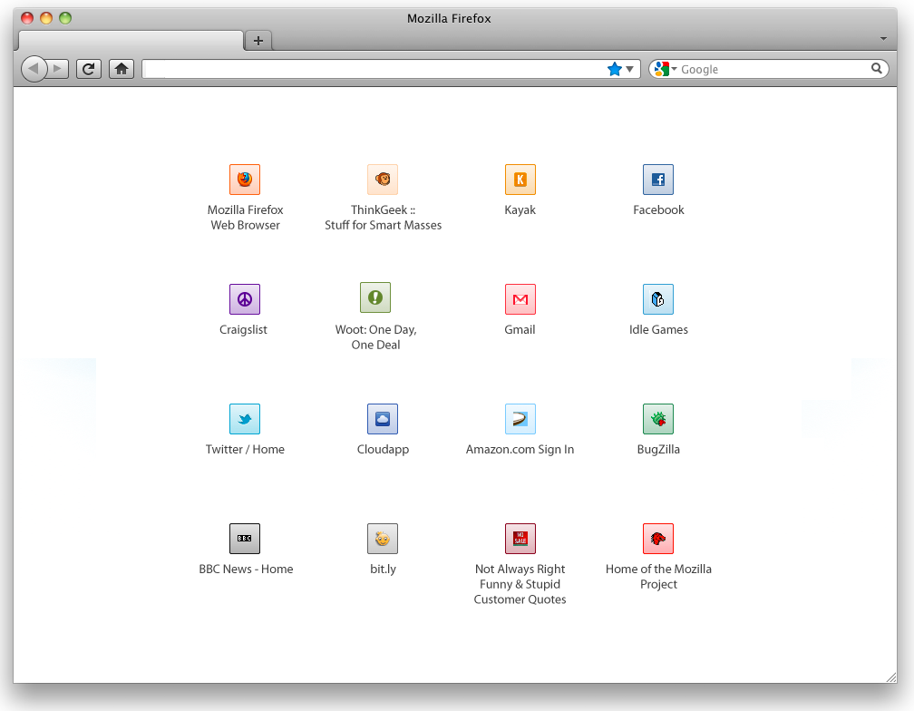
What you’ll see on the New Tab page of Firefox 13 are your most-visited sites displayed with large thumbnails, reducing the time it takes to type or navigate to these pages. This data comes directly from your browsing history: it’s the same information that helps Firefox’s Awesome Bar give suggestions when you type. Or, if you want to go somewhere new, the URL bar is still targeted when you type on a New Tab page. If you want to hide your top sites – permanently or temporarily – a grid icon in the top right wipes the new tab screen to blank.

Mozilla Home is getting a redesign, too! While still keeping the prominent search bar and snippet, the graphic style is softer, the text is more readable, and launch targets at the bottom allow you to quickly access areas such as Bookmarks, Applications, and previous Firefox sessions.

Both Home and New Tab are being improved as part of our longterm vision of making Firefox more powerful, engaging, and beautiful. Over the next few releases, more design improvements will be made towards this goal. For now, please try out Firefox’s new Home and New Tab pages in Firefox 13 Beta and tell us that you think!

Enabling Real-Time Communication on the Web Platform

Mozilla’s manifesto describes the internet as an integral part of modern life and a key component in communication. However, communication on the web has far to go before it’s as rich as face-to-face communication. Real-time video communication on the web should be easy, rich, and readily available to developers in a way that proprietary formats can’t be.

That’s why a new project is spinning up at Mozilla called WebRTC (Real-Time Communication). WebRTC will allow developers to use the web platform to include video and audio conferencing as part of their websites and applications, both mobile and on the desktop. In its first phase, WebRTC will make webcam feeds a primary object in the browser, allowing sites to create rich interactions such as video calling and conferencing. In later phases, WebRTC will allow interactions like co-browsing, in which users can share their screen with a friend.

Privacy and Security

Privacy and security are major concern in enabling open video communication on the web. A face and voice are two of the most identifiable kinds of shareable data, and keeping users in absolute control of who has access to them is vital. As the IETF states in its WebRTC draft document, the ability for users to control access to their webcam, be able to cancel communication at any time, and not be eavesdropped upon are essential.

Some of the challenges we’ll face are in giving users the most accurate information possible about the site and caller who are requesting access to their webcam. Most requests for webcam access will simply be from a trusted site itself, but a malicious site could potentially try to gain access by embedding its call request within a trusted site. In this paper, Eric Rescorla outlines how potential “ad-hoc” calling attacks could come from ads in iFrames embedded within trusted sites.  Many other potential attacks need to be dealt with.  For instance, because WebRTC would be controlled by a web server rather than conventional real-time systems, web browsers might expose JavaScript APIs which allow a server to place a call. If access to such an API were unrestricted, sites could “bug” a user’s computer and capture video camera activity (Rescorla).

Even a trusted site could be compromised, both during a call or after. And, since the sites themselves would control and display the UI of the call itself, Firefox needs to give the user both constant indication that they are in a call and the ability to disconnect at any time.

User Interface

However, guarding against threats only goes so far towards keeping users in control of their webcam communication. Clear messaging, useful tools, and sensible defaults need to be in place for video conferencing to safely take root in the browser.

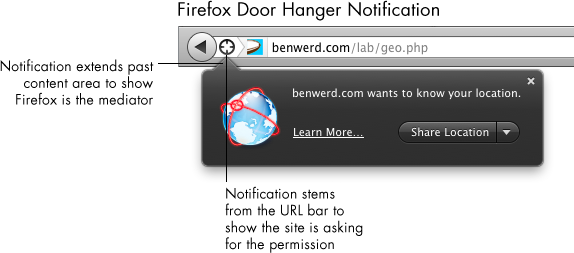
The first phase of enabling WebRTC will allow the most basic use case: giving a site access to a user’s webcam and microphone. The browser already serves as a mediator for other user data, such as location and access to cookies. Firefox usually asks for permissions using a door hanger notification. Door hangers stem from the URL bar to show the site is asking for a permission, and it extends past the content area to show that Firefox is the mediator of the permission request. Using a door hanger notification for WebRTC is both consistent within Firefox and correctly conveys visually that the site has requested access, and Firefox is asking the user for that permission.

Usually, these door hangers simply ask the user for a permission, and in a click the user can give it. However, webcam access requires a secondary stage: showing a preview of the webcam feed. This approach has three benefits:

  1. It gives users the ability to make sure their webcam and microphone work correctly
  2. If users had casually or accidentally accepted the webcam permission, nothing makes people more aware of what they’re about to transmit like showing them their own grubby mug
  3. It gives users the ability to fix their hair/put on a shirt/remove incriminating items from background before beginning call

In some ways, it’s unfortunate to ask users to pass through two dialogs to give webcam feed rather than one. After all, in most cases the site itself will be providing all necessary UI, and perhaps even a video preview before a call is initiated. So, this could all be redundant in many cases.  However, we cannot predict what purpose a site may be requesting webcam feed for, nor what UI will be in place for the user on that page. Even with all our efforts against security threats, any request for webcam access must be treated as potentially malicious.

Once a user has given a site access to their webcam and is likely engaging in face-to-face communication, that interaction should be given a heightened level of priority within the browser. For a user to lose that tab or forget they are broadcasting could range from mildly embarrassing to, well, use your imagination. If a user is actively sharing their webcam feed, they should be able to jump to the tab where data’s being shared or simply cut their webcam feed from anywhere within Firefox. This will require at the very least a toolbar-level Firefox control that appears once a user’s actively sharing.

Designing and implementing a new API is always a complex process.  If you’re interested in reading more or contributing to this project, here are some resources:

How People Use New Tabs

As the web evolves, so does the way people interact with the web. Firefox’s user experience and research teams have been eager to learn about our users’ browsing habits so that we can better design for our users.  Lately, Mozillians like Lilian Weng and Jono X have been running some fascinating studies using Test Pilot to determine how, when, and why Firefox users open new tabs.  I wanted to note a few key takeaways from their recent study that give us a glimpse into how our users browse (full studies are linked at the bottom of this post).

A caveat is that these results – as with all Test Pilot studies – are gathered using anonymized data submitted by users who have signed up to participate in Test Pilot. Thus, the Test Pilot users data tends to skew slightly towards the technical and early-adopter crowd.

How are people currently using new tabs?

Each day, the average Firefox user creates 11 new tabs, loads 7 pages from a new tab, and visits 2 unique domains from a new tab.[1] The average new tab loads two pages before the user closes or leaves it.[2]

Once users have a new tab page open, about half of the time (53%) they navigate to a new page using their mouse, and about half of the time (47%) they use the keyboard.[1]

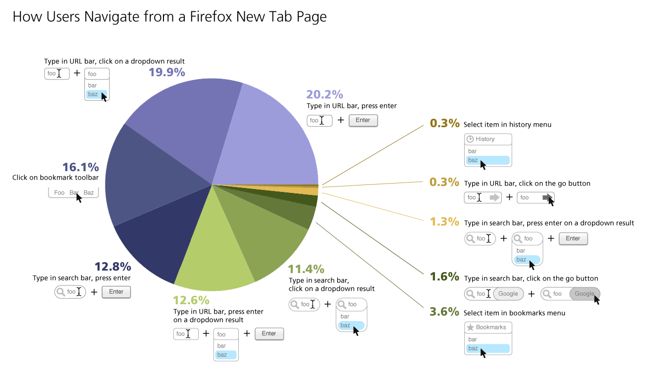
Here’s a breakdown of what actions users take once they’ve opened a new tab:

How People Use New Tabs

As you can see above, the URL bar was the most-used item on a new tab page, with 53% of use actions originating there. The search bar only accounted for 27% of user actions. Even though by default it’s not even enabled in Firefox, 16% of new tab page actions were clicking on a URL in the bookmark bar. History and bookmarks menus were both used less than 5% of the time.

In this study, 17.4% of the domains recorded accounted for 80% of the page views for all participants. You might think that the more active a user is, the number of unique domains they’d visit would follow the same ratio. However, this study found that the more sites a user visited online, they more often they would visit the same 20% of domains. Turns out, the most active internet users are even more loyal to a few choice domains than their less active counterparts.[2]

[1]Quick report on new tab study, by Lilian Weng

[2]Test Pilot New Tab Study Results, by Mozilla Research Team

Firefox Would Love to Read Your Mind

I’d like to highlight the awesome research project that intern Lilian Weng is leading around Firefox’s new tab page.

While our goal is to make users more efficient at their browsing tasks, what makes them more efficient is a question we keep returning to. Most other browsers display links on new tab pages based on frecency. Frecency is a portmanteau which combines frequency and recency. At Mozilla, we use it to refer to sites that users have been to often, recently, or both. It’s how we calculate what should be the first, second, third, etc site that appears when you type a letter into Firefox’s URL bar.

Using frecency to list links on a new tab page seems an obvious design direction, but we want to truly investigate whether another solution would be best for users. So, Lilian is spinning up a brave new study. Once her test is ready, users of Test Pilot, our platform for collecting structured feedback on Firefox, will be asked if they’d like to participate in a new study. If they say yes, they will be randomly assigned one of six new designs on their new, blank Firefox tabs. One of these six designs will be our control group: a blank white tab, just as Firefox users see currently. The other five will look almost identical to each other. They will display a simple 8×8 grid of favicons set on a button which is colored to highlight them based on a color-matching algorithm designed by Margaret Leibovic:

Minimal 8x8 Grid Layout of Site Links

The only variable that will be changing among the five designs is which sites are displayed in this grid. Here’s the five variations we’re testing:

  1. Frecency. A combination of a user’s most frequently and most recently visited sites.
  2. Most recently bookmarked sites. By displaying prominently what a user has recently starred, we effectively turn the new tab page into a read it later list.
  3. Most recently closed sites. This could lead users to treat new tab page as an undo feature, or close tabs in order to temporarily store them in the new tab page as a short-term read it later list.
  4. Sites based on content similarity. Intern Abhinav Sharma is trying out his project, called Predictive Newtabs, which displays sites based on where the user has opened a new tab from. For instance, if the user has been browsing a news site, a new tab would offer other news sites the user has been to.
  5. Sites based on groups of sites frequently visited together. In another part of Abhinav’s Predictive Newtabs experiments, he has designed an algorithm to predict sites to show based on sites users visit in groups. For instance, if every time you get to work you first check the weather and then check stock prices, this new tab would offer you a stock page on a new tab after you checked the weather. If you want to try this experiment out yourself, you can download the Jetpack here.

The above study is still in preparation, and once it goes live I predict that we’ll learn tons of valuable information about how new tab suggestions can positively impact users. Lilian will be collecting data on many aspects of users’ responses to these designs, such as how they effect the breadth of sites users visit, how likely they are to click on each item in the grid, and how long they spend deciding where to navigate. I can’t wait to start pouring over the data that comes back: it’s very new research in an area that has a profound impact on how we use the web.

Research Spinning Up on New Tab Page

Whenever you open a new tab in Firefox, your goal is to navigate somewhere.  To aid your navigation, on this new tab Firefox currently offers you… nothing.  Just a blank page.  100% white, and 100% not useful.

Firefox has been displaying this blank page when users open a new tab for as long as there’s been a new tab.  And, partially, it’s deliberate.  After all, a blank page is guaranteed not to distract you from your current task.  It’s just clean and white, like a canvas, offering no suggestions for the next move and no distractions from it.  Alex Faaborg explains very well in his recent blog post the concerns we have with distracting users and the ways that data overload on a new tab page can be harmful.

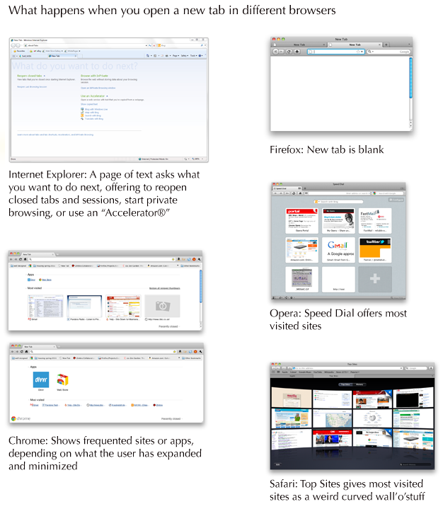
This isn’t the case when you open a new tab in other browsers.  Opera was the first to offer a “Speed Dial” with giant thumbnails linking users to their most frequented sites.  Safari’s giant wall-o-televisions offers much the same.  Chrome has played around with different designs, first trying a speed dial like Opera’s and later integrating other content, such as apps.  Internet Explorer, the most unusual of the designs, offers you some options: reopen closed tabs and sessions, start private browsing, or use an “Accelerator,” which usually means do “something with Bing.”

What happens when you open a new tab in different browsers

So, which approach is best for our users?  Would presenting large thumbnail targets to direct people to sites they frequently visit save them time?  Could we present information to make it easier for users to navigate to their next destination?  Can we do so without being distracting and leading users away from the task they had in mind?

We realized that we couldn’t answer these questions without finding out more about our users.  So, a few people at Mozilla are heading up studies to find out how people use tabs and how different designs of new tab page effect how they browse and user the web.

Here’s what’s going down:

1. Quantitative study through Test Pilot on what users do after opening a new tab

Intern Lilian Weng is currently working on a quantitative study within Test Pilot to capture data on what users do after they open a new tab.  This should answer questions surrounding user intention when opening a new tab, and possibly how long users take to perform actions after opening a new tab.

2. A/B test of a new tab page vs. blank new tab

Interns Diyang Tang and Lilian Weng are preparing to do an A/B test using Test Pilot to determine how user behavior differs when presented with a new tab page vs. none.  They are attempting to answer questions such as:

– Does a new tab page slow users down (e.g., by distracting them), or speed them up (e.g., help them find the target site faster)?
– Does a new tab page discourage breadth in visited sites?
– How do users navigate to a website after they open a new tab in each scenario? (location bar, search bar, top sites, bookmarks, history, etc.)
– Are there users who are more mouse-based and some who are more keyboard-based? How does a new tab page affect them?

3. Cafe testing for current Firefox

Diane Loviglio and myself are preparing more qualitative “cafe” tests to gain insight into how people use tabs currently.  We’d like to know why and when users open new tabs in a more contextual perspective than Test Pilot data provides.  Our goal is to find a wide enough range of users that the most common new tab behaviors can be grouped and discussed in a more tractable framework.

4. Testing multiple new tab page designs

Once the research from tests 1-3 is available, variations on new tab pages will be implemented and tried out with real users.  There are multiple testing methods that could be useful here, such as a multivariate testing or even journaling to gain insight into how new tab pages effect behavior of a user over time.

5. Creating a contextual speel dial implementation

Not quite a research project, but intern Abhinav Sharma is designing and implementing an experimental new tab page which uses contextual information about a user’s current browsing session to offer suggestions.  His page makes intelligent recommendations about where you’re likely to go next based on where you’ve been.  The project’s still in alpha, but you can see the code he’s done already for a basic speed dial implementation on his github.

You’ll notice that a lot of this work is being done by our awesome new Summer 2011 interns!  It’s only early June and they’re already rocking hard.

I’ll post what we learn from these studies as results come in.  I predict we’ll gain some insight into user behavior that will inform not only Firefox’s new tab design, but many other features besides!

Making Add-on Updating not Suck

Updating software sucks.  For most of your software, you’d probably prefer to never think about updating.  Ideally, your applications  would stay current and fast on their own without ever requiring your input.

That’s why one of the important changes in Firefox 4’s add-ons manager is keeping add-ons up-to-date automatically.  This happens in the background without you even noticing.

Automatically updating add-ons does exactly what users have been telling us they’d like for a long time.  However, some users will want to manually update their add-ons, as they did before Firefox 4.  Other users will want to automatically update some add-ons but not others.

Hard as it is to cater to many use cases, we felt it was important to allow users to manually update add-ons if they prefer.  Add-on updates are essentially new software, and users should always have the ability to opt out of them.

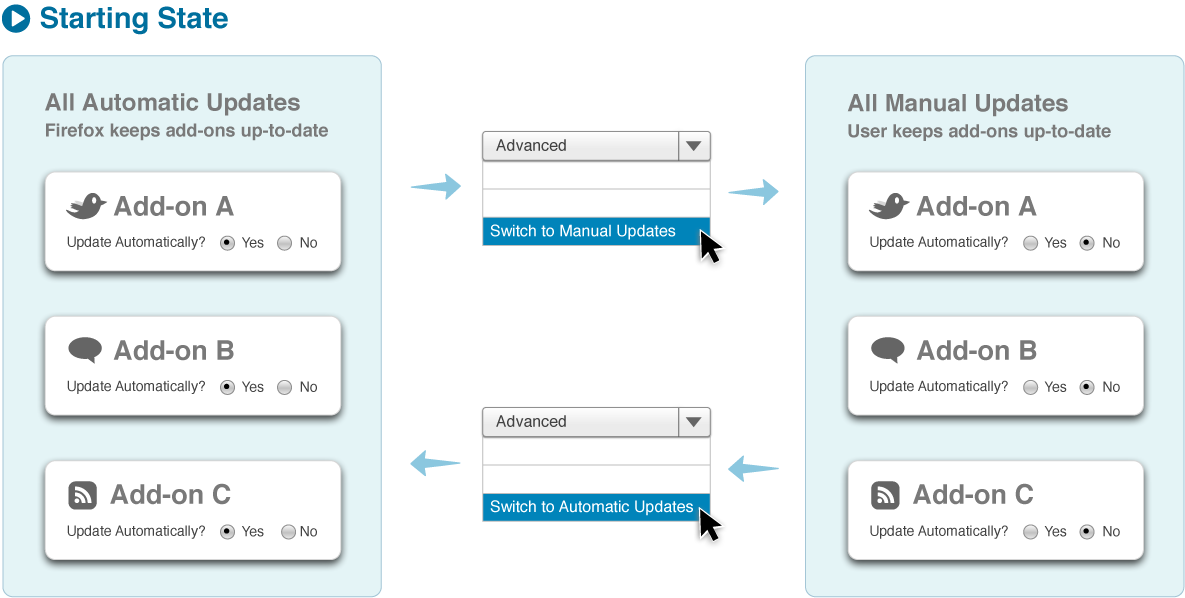
Below is the basic use case of managing add-on updates I’m proposing for Firefox 5 (which is only a few weeks after the release of Firefox 4 thanks to our new shorter release cycles).  The user begins with completely automatic updates on by default.  By switching to manual updates in the advanced menu, the user can go back to installing updates themselves.  Each add-on shows, in its detailed pane, whether it receives updates automatically or manually.

However, there’s another kind of usage that needs to be supported.  What if a user wants all but a few add-ons updated automatically?  Or, all but a few add-ons updated manually?  Allowing users to switch any particular add-on between manual and automatic updating allows users to make one-off exceptions.

If a user goes to the detailed pane of add-on, they can see how an add-on is currently updating and switch it to the other method.  To change <i>all</i> add-ons to the other method, the user needs to select that option in the advanced panel.  This way, we allow users to make both blanket rules and exceptions as they go.  Here’s a more complete diagram showing updating preferences, with one-off exceptions included:

Simplifying and Polishing the Add-ons Manager’s List View

As we approach the release of Firefox 4, the last few polish and stylistic changes are happening in the add-ons manager.  Some are simply graphic cleanup, while others are the result of beta testing the new manager for the past several months.

I wanted to highlight one change in particular that you’ll be seeing in the Firefox nightlies soon.  The date an add-on was last updated, rather than being displayed in list view, will now only appear in the detailed view of an add-on.  This also means that installed add-ons can no longer be sorted by last updated date.

Old vs New Add-ons Manager: Removal of Sorting Bar and Last Updated Date

For some users, this change is substantive and will feel disruptive.  So, I wanted to give the rationale behind this design decision.

1. Providing a simplified overview

The intended purpose of the add-on manager’s list view is to give a brief overview of the users’ add-ons and to provide only the minimal, most used information and functionality.  This minimal information is the name of an add-on, its icon, and a short description.  The minimal functionality is the ability to disable and remove an add-on.  Even the author name we’ve removed to provide the simplest, most visually scannable design.  By removing the last updated date, we not only visually clean an add-on’s list entry, but also eliminate the need for a sorting bar at the top of list view.  This gives back both whitespace and a cleaner appearance at the top of the list.

2. Updated date does not provide important functionality for most users

For most users, the last updated date does not give information meaningful enough to justify its placement in list view.  It allows users to see which add-ons have been updated automatically most recently, but does not give any details about the updates nor provide tools to interpret the information.

Some advanced users use the last updated date as a diagnostic tool to identify which add-on updates may be causing a recent problem in Firefox.  However, the date makes a very poor diagnostic tool. One reason is that the date does not give any information about the size nor scope of the update, and thus can only be used for diagnosis by disabling one add-on at a time to isolate a problem.  In many cases, a problem in Firefox caused by an add-on are instantly identifiable as being caused by a particular add-on.  Even in the rare case where a problem suddenly appears in Firefox, the chances of it being from an add-on update are not large.  A problem could be caused by any number of online events, which is why Firefox provides tools such as the Error Console and about:crashes to help diagnose them.  And, even if we were to give fuller information about updates in the add-ons manager and make it into a better diagnostic tool, why should this tool be so far removed from other diagnostic tools?  How could a new user figure out that, to access diagnostic tools related to add-ons, they should go to the add-ons manager rather than a more comprehensive diagnostic tool?  It would be wildly inefficient to apply this elsewhere in Firefox by placing diagnostic tools only on the interface elements they relate to.

What we should do is add diagnostic tools about add-ons to comprehensive tools such as about:support.  Then, we could  provide expert users the information they want in a better format while keeping one-off diagnosis away from list view in the add-ons manager.

3. The goal of removing updating entirely for most users

The intended purpose of automatic updates is to remove updating from the list of items the user has to care about and remember.  By exposing the updated date in list view, Firefox insinuates both that the updated date is very important that this is a process the user should manage.

Actually, the actual reason sorting and the last updated date were initially proposed in the add-ons manager design was to give users the ability to sort their add-ons by performance, not updated date.  Sorting by performance would allow users to find out how their add-ons effect Firefox on metrics such as startup time and memory.  However, the ability to rank an add-on’s performance is going to be a part of FIrefox after the 4.0 release, making the remaining sorting categories (alphabetic and updated date) much less useful.

By the way, Firefox 4 beta 10 is out, so please try it out and tell us what you think!