(Note: the following has been cross-posted to Mozilla UX)
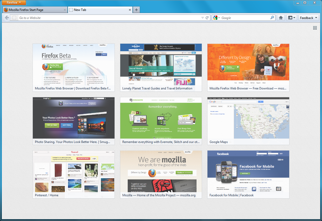
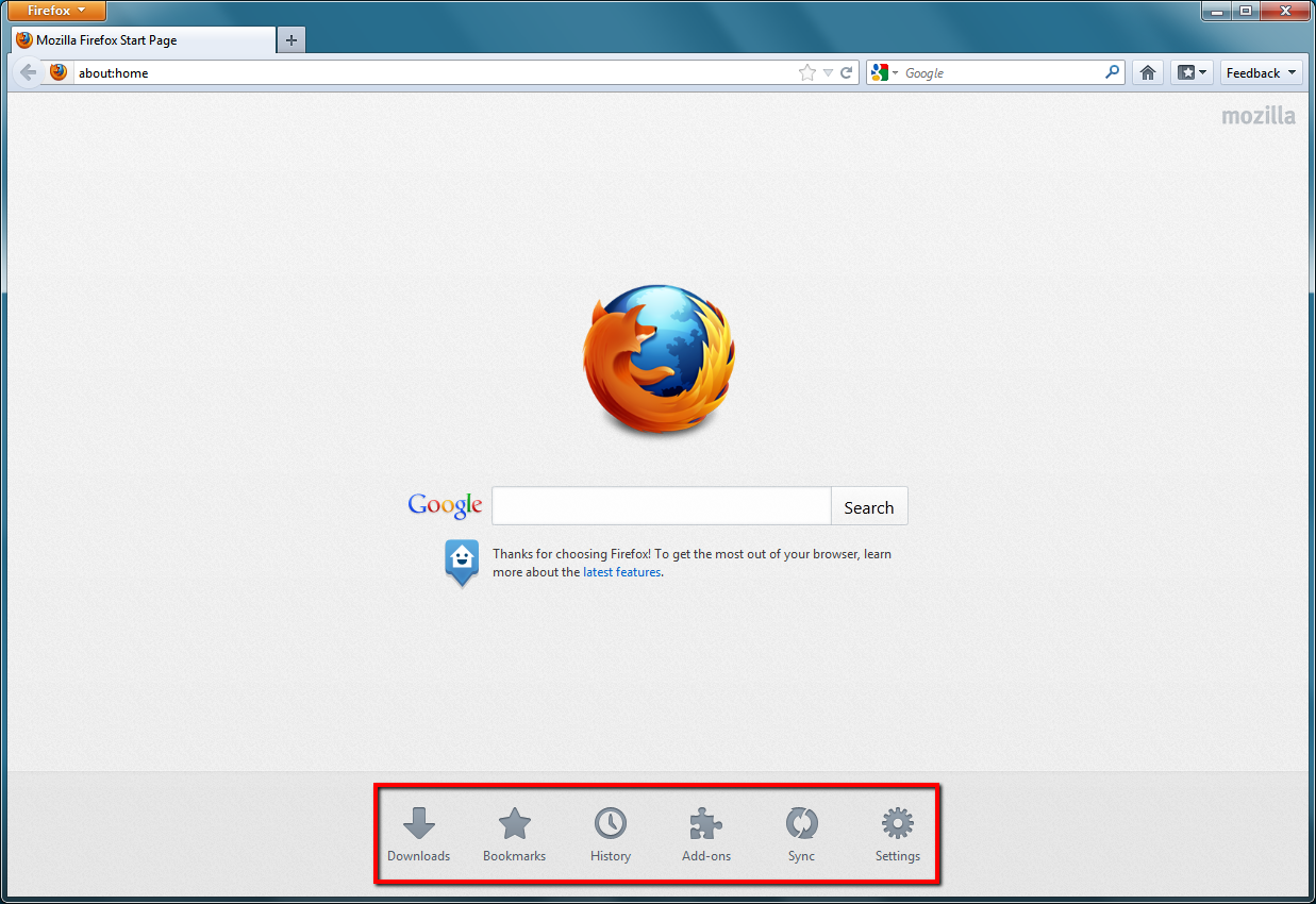
Two Firefox features getting a redesign in Firefox 13 (currently in beta) are the Home Tab and New Tab. Home Tab can be viewed by clicking house icon in Firefox or by typing “about:home” into your URL bar. New Tab appears when you click the “+” at the end of your tab strip.
Firefox’s Home Tab and New Tab have, until now, had fairly basic pages. In Firefox 12, Home Tab had a large search bar, a “snippet” which Mozilla uses to display messages to users, and little else. The main reason the search bar is on Home Tab is because many users click the Home button to initiate a search, either unaware of the toolbar search box or preferring not to use it. The snippet allows Mozilla to give a message to users, such as last October when it asked users in the United States to contact their representatives when the anti-internet-freedom bill SOPA was being heard in the House of Representatives. Such messages can be important while not being urgent enough to disrupt users with a notification.
New Tab, for most of Firefox’s history, has been completely blank. This was done deliberately to offer users a clean, fresh “sheet” to begin a new browsing task. However, a blank tab may not be distracting, but it’s also not useful.
Surely, we thought, we can present a more helpful design than a blank page! Using Mozilla Test Pilot, we began to research how Firefox users use New Tabs. What we learned is that each day, the average Firefox user creates 11 New Tabs, loads 7 pages from a New Tab, and visits two unique domains from a New Tab. The average New Tab loads two pages before the user closes or leaves it.
What this tells us is that users create many New Tabs, but they’re very likely from those to return to a limited number of their most-visited websites. So, we began to experiment with giving users quick access on New Tab to the websites they visit most frequently.
What you’ll see on the New Tab page of Firefox 13 are your most-visited sites displayed with large thumbnails, reducing the time it takes to type or navigate to these pages. This data comes directly from your browsing history: it’s the same information that helps Firefox’s Awesome Bar give suggestions when you type. Or, if you want to go somewhere new, the URL bar is still targeted when you type on a New Tab page. If you want to hide your top sites – permanently or temporarily – a grid icon in the top right wipes the new tab screen to blank.
Mozilla Home is getting a redesign, too! While still keeping the prominent search bar and snippet, the graphic style is softer, the text is more readable, and launch targets at the bottom allow you to quickly access areas such as Bookmarks, Applications, and previous Firefox sessions.
Both Home and New Tab are being improved as part of our longterm vision of making Firefox more powerful, engaging, and beautiful. Over the next few releases, more design improvements will be made towards this goal. For now, please try out Firefox’s new Home and New Tab pages in Firefox 13 Beta and tell us that you think!


Who came up with those awful buttons and colors?
Do not fix things that are not broken.
Speed dial anyone?
We lack settings/options in the “new tab” page.
Displaying most-visited sites (actually at different positions each time) is NOT a so good and usable idea as it can seem at first glance.
It would be MUCH MORE nice for user to have ability to manually choose _arbitrary_ sites (not automatically selected based on browser history) and pin them to _exact_ positions in new-tab thumbnail-table. Just like Fast Dial or Speed Dial.
I think the launch targets in the home page should be merged with the new tab page, lots of people having restore previous session as default startup option and never see the home tab.
I am unable to get the new tab to display those thumbnails. I think that an old speed dial plugin stuffed this up for me. What should the new tabs string setting be in about:config?
So I am answering my own question here, just a few minutes later; In firefox config the string for browser.newtab.url needs to be about:newtab YAY I can see it!
Hey Jennifer,
Firefox UX folks have great ideas. Why are the ideas being implemented at a snail’s pace in Firefox? Is it a situation of not enough developers and code reviewers? Take the Download Manager for instance, or the new Tab page, or the Australis theme.
Then, I notice that features like Ctrl+Tab previews when switching between tabs is in the browser but pref’ed off by default. Why do all the leg work only to never enable the feature?
Thanks,
Manoj
Hi,
Thanks for pointing out the grid icon to blank out the new tabs. I find constant reminders of what I’ve been browsing highly distracting when I want to get on with something else, so it was much appreciated.
But why not also make it a Tools – Options – Tabs setting, so it can be found more easily by unobservant people, like me?
Mine disappeared & I don’t know why!Please can anyone help? How do I turn it back on?