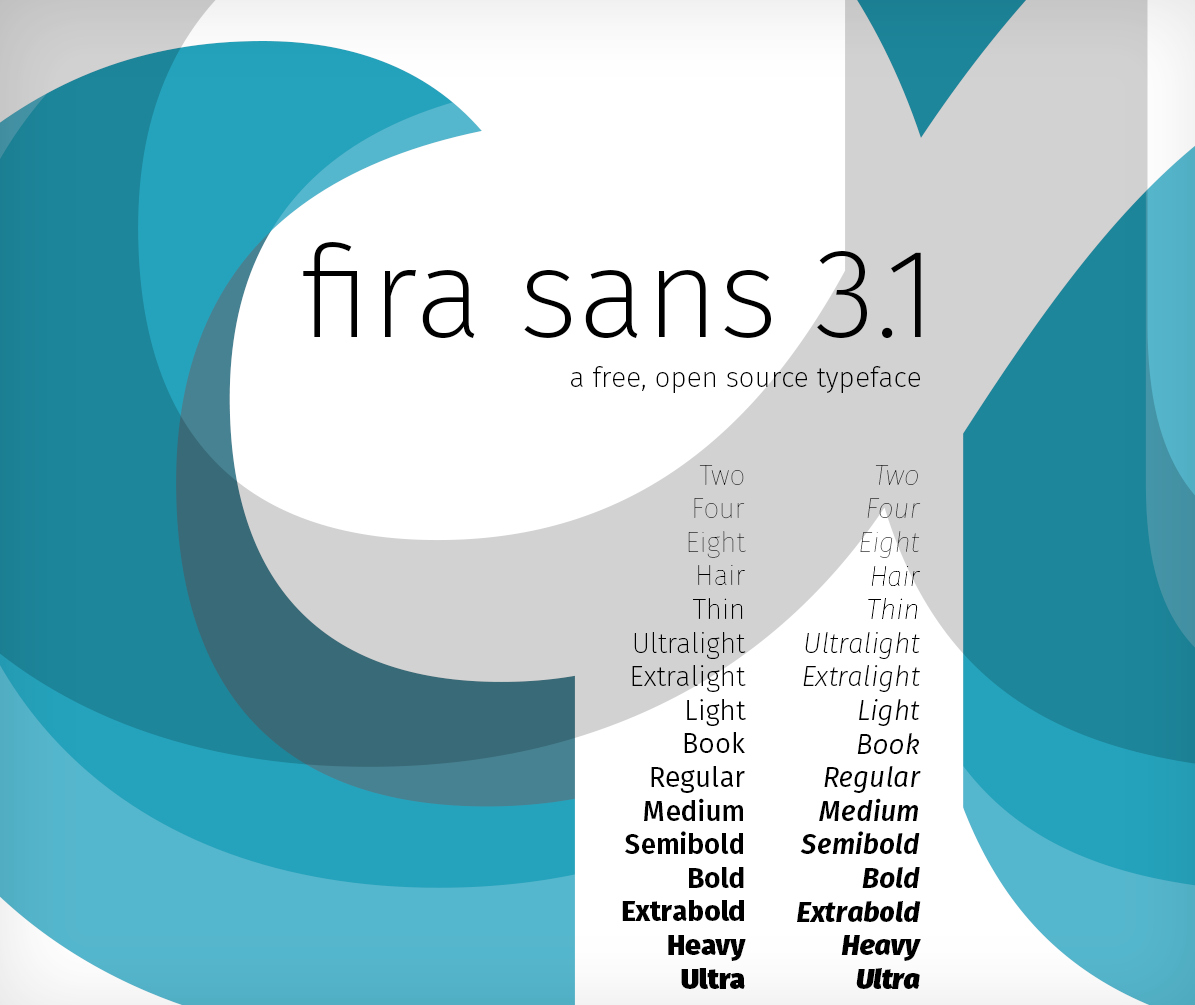
As designers in open source, we’re constantly looking for opportunities to bring the principles of universal access and redistribution to new areas. While the term “open source” may still be mainly associated with code, the value in free collaboration benefits every discipline – particularly design.
In that spirit, the Mozilla Foundation commissioned famed typographer Erik Spiekermann to create a completely free, open-source typeface in 2013. Thus was born Fira Sans, a gorgeous san-serif font that looks great on the web. So great, in fact, that we’ll be using it in Firefox’s in-content pages such as Preferences and the Add-ons Manager.
If you haven’t tried out Fira Sans, now’s a great time: version 3.1 introduces 16 different weights, a huge character map, and extensive language support. Also available is Fira Mono, a monospaced version of the original. Give it a spin on your next project!


I am a bit confused as to the download location of the Fira fonts (née Feura)…
In the beginning it was this repo (still linked to from buildingfirefoxos.com): https://github.com/mozilla-b2g/moztt . Then, it was this repo: https://github.com/mozilla/Fira .
Now you’re telling us to go here to dev.carrois.com… Which location is the most official one and which one will it be in the future?
You can get it from either, but I linked to http://dev.carrois.com's space it has the new version 3.1 with the additional weights, whereas that github repo only has version 1.1 for some reason. But thanks for noticing that – the github is the more “official” one and needs to be updated! I’ll try & find the owner and get 3.1 on there.
>the github is the more “official” one
Which of the 2?
Official for the typeface is https://github.com/mozilla/Fira, though admittedly it needs to be updated. The other, https://github.com/mozilla-b2g/moztt, is for the typeface specifically as it’s used in Firefox OS.
Thanks for the answer & sorry for the tone.
Btw, the Fira fonts are great, and easily among my favourite open-source fonts. I recently used them for a family card, too.
It might be an illusion, but the 3 looks taller than the 1.
Good eye! It’s not an illusion – the 3 and 1 have slightly different x-heights.
It looks like all curved bowls in fira sans characters (like the top of a 9) are slightly taller than flat arms (like the bottom of a 2). You can see this explicitly at the bottom of the fira sans letter b, which has both a curved bowl and a flat arm, both at different heights:
So, it looks like a stylistic decision. You’d have to ask Spiekermann to be sure, but I suspect this was done to create visual interest along the ascender height by creating two levels: a higher level that bowls reach, a lower level that caps reach, and some ascenders (like the b above) touching both via a diagonal terminal.
It’s common for round letterforms to go outside the normal bounds. If this isn’t done, they tend to seem smaller than they should when viewed in normal text.
How about using a typeface on this site at a size I don’t have to squint to read?!
Thanks for the feedback! You’re right, it’s probably too small. I’ll fix it!
Lovely! Didn’t know it existed. Will try to use it in the future
Indeed a great and impressively complete font 🙂
People, please, clean up these .DS_Store (and thumbs.db) files before releasing. The ZIP are full of messy and uneeded files.
But I see by your stylesheet you yourself use Google’s Droid Serif ?
You don’t use the fonts yourself then….
I use different typefaces in different places. Droid Serif is nice too – particularly for its readability on mobile devices.
Thanks from Hannover, Germany ! – I will try it.
Nice and clean. Will use it in my next project for review.
Truetype version avaiable ? OTF does not works on Windows.
Not on Windows 3.1, that’s for sure. Time to upgrade maybe?
Hi,
the download link is broken, only a 404 error page.
The download link works again. 😉
no, it doesn’t
Hey peci – Sorry this was down. I rehosted the files on this github repo: https://github.com/Boriss/firasans/archive/master.zip
Thanks for mentioning this! I rehosted them on a github repo: https://github.com/Boriss/firasans/archive/master.zip
Looks like the publisher made a minor update and removed the old version. This link should work:
http://dev.carrois.com/fira-3-1/#download
Thanks for mentioning this! I also added them to a github repo: https://github.com/Boriss/firasans/archive/master.zip
Hey,
Beautiful font you got there. Could you update the download links please? They seem to be down (again).
Thanks! 🙂
Thanks for mentioning this Amjad, and sorry about that! I rehosted them on a github repo: https://github.com/Boriss/firasans/archive/master.zip
Was curious about glyph coverage, turns out that there’s some information on the font designer’s website – no useful anchor, though, so must scroll down a bit from http://dev.carrois.com/fira-3-1/#pdf . Looks like most things outside Asian and Middle Eastern are covered (some partially).
Not surprising, given that, for example, Unihan has a ridiculously large number of glyphs 😀
Wow, after Open Sans and Raleway a really nice font. Awesome to see all the different font styles and weights.
I will definetly integrate it into our markdown writing service ( http://www.dbook.biz ). May use it as the default font 🙂