When I ask Firefox users why they love Firefox, the answer often isn’t because of Firefox. Rather, it’s a particular Firefox add-on that provides functionality that has become invaluable to users. From developer add-ons like Firebug to social add-ons like StumbleUpon, a single add-on can fundamentally change how users interact with the web.
The reason add-ons are so important is because they are a fundamental way that users take control of their online life. Firefox touts its customizability as one of its main selling points, but users’ ability to customize their browsing experience is dependent on the talent and creativity of the add-on developer community. I’ve written in the past about the importance of Firefox providing a user experience ideal for as many people as possible right out of the box, without add-ons installed. But each user is truly unique and uses the web in increasingly different ways. That’s why it’s so important that add-ons be trivial to find, install, and begin using.
The Current Add-ons Manager
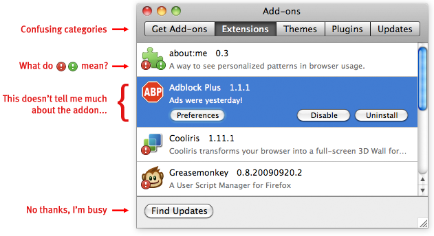
Add-ons are currently installed, maintained, and configured via the add-ons manager in Firefox. This window, found under the Tools menu, provides an inventory of installed add-ons and allows users to update, install, remove, enable, and disable them.
The add-ons manager has been largely unchanged since 2007, and it badly needs a redesign. One reason is that it has several usability problems that would provide significant benefit to users if fixed. For instance, the process of updating add-ons is currently characterized by interrupting important tasks such as startup. Locating a particular installed add-on currently involves navigating through categories such as extensions and plugins. Even experienced users I talked to find the distinction between these categories hazy. A redesign to address current issues should insure that installing and updating add-ons is trivial, notifications are non-disruptive, and the interface provides clear information about the state of a user’s add-ons.
However, a successful redesign of the add-ons manager must not only fix problems, but add functionality. This is because the scope and functionality of add-ons has increased dramatically and will continue to expand in future versions of Firefox. The current add-ons manager gives only the name of an add-on, an icon, a version number, and a one-sentence description. Users could benefit from more information, such as a description or a screenshot showing what UI the add-on will change. Added functionality is also needed because of new ways to modify Firefox, such as Jetpacks and Personas. These are similar to current add-ons in that users can choose items to download for added functionality, but they are installed, managed, and used differently. A redesigned add-ons manager must be able to incorporate emerging projects like these.
Redesign Priorities
From fixing current usability problems to adding needed functionality, there’s a lot that needs to be tackled in the add-ons manager redesign. To help focus the effort, the main areas to address can be described as five priorities:
1. Maintaining and Configuring
- Allowing users to quickly locate a particular add-on by name or by type
- Providing simple, usable controls for basic add-on operations
- Allowing new forms of add-ons, such as Jetpacks and Personas, to be maintained and configured easily alongside traditional add-ons
2. Updating
- Updating add-ons automatically by default. I’m increasingly convinced that most users, once they’ve decided an add-on is trusted, do not want to manually update it. They especially do not want to be reminded to update when they are starting the browser
- Allowing users the option to update add-ons manually, update only a particular add-on manually, and possibly to undo an update
3. Installing
- Streamlining the install process to as few steps as possible
- Providing the user with clear indications of what action is needed, especially when some add-ons require a restart and some do not
4. Discovering
- Providing a compelling first-run experience to new add-ons users, including clearly showing what functionality add-ons provide and what they will change
- Providing a usable, findable way on the add-ons manager to search all existing add-ons, only requiring a visit to AMO when greater community involvement or information is sought
5. Troubleshooting
- Providing ways to determine if a particular add-on may be causing performance problems, such as ranking by size, CPU, etc
- Giving clear communication and instructions if there is a security problem with an add-on
This is still very much a working list open to feedback and changes (especially via comments here or on the wiki). Basically, what I’d like to focus on is making add-on usage less disruptive and more accessible. Experienced and especially technical users tend to be very aware of add-ons and the functionality they provide. These users may see add-ons mentioned in the tech press, may talk to their friends about their favorite add-ons, and might even get involved in the add-on developer community. These are the users who say “I can’t imagine a world without add-on X.” But the benefit of add-ons is felt almost soley by this group. There are thousands of add-ons available that can improve the online experience of just about any user. Both users and developers deserve an add-ons manager that helps make customizing the browsing experience simple.


Recent Comments