For the next three posts, I’m going to be highlighting three areas of the Firefox user interface that could benefit from animation. Stephen Horlander and myself have been looking at Firefox with an eye towards where movement could make Firefox an easier, more appealing, and perhaps even faster experience with movement.
First, it should be asked why we would add animation Firefox. Animation in the browser is a tool, but not a goal unto itself. Wherever animation is used, it should be with a purpose (not “it looks cool”) and benefit to the user (not “makes user look cool.”)
Like many web technologies, animation is a useful but easily abused tool. The early web and the dawn of the .gif saw animation heinously overused with blinking, spinning, and scrolling animations added to sites because they looked cool.
As the web calmed down a bit and web and interactive design began to develop, designers and developers found that animation could be beneficial to users. For instance, it can make tasks seem more like real-world affordances, and thus easier to visually understand. It could give users feedback on how digital objects were being moved or manipulated. And yes, they could make interactive experiences more visually appealing.
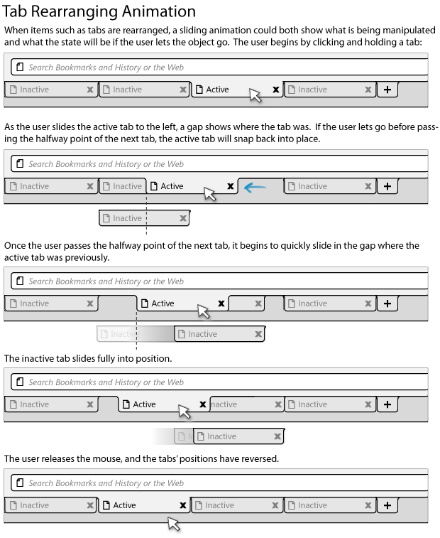
The first area we feel could benefit from animation is the movement of toolbar items within their rows on the Firefox chrome. This includes buttons like Home and Reload, the bookmark bar, and tabs. Currently, these items can all be shifted and reordered, but little visual feedback is given for these tasks. For tabs, only a thin strip shows where a dragged tab will be dropped.
By adding animation to the process of rearranging items, not only will Firefox feel more lightweight and adaptable, but it will be more visually clear what the user is manipulating and how the UI will be changed by letting go. For instance, animations of tabs being manipulated is essentially live preview of tab rearrangement: if a tab is slid to the right and an animation shows it doing so, releasing it only makes permanent what is being shown. This is similar to the tab animation motion currently in Safari and Chrome.
Because tab tearoff and tab rearrangement would utilize similar mouse movement, some thresholds should be added to prevent users from accidentally performing an unintended action. As Shorlander recommended, a “soft snap” could make tabs within a region of the tab bar slide, and falling outside that region causes them to tear off.
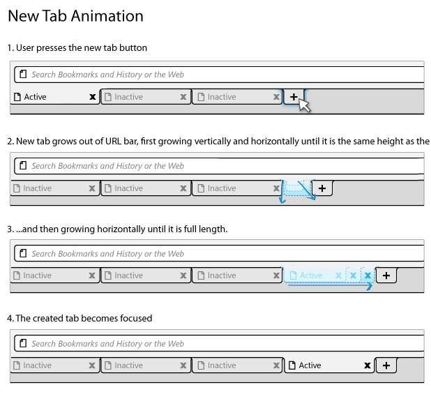
Slight animation could also give newly created tabs the feeling of organic growth into the browser.
(more details in the wiki)
The above sketches are based on work by Stephen Horlander.


This looks very promising!
Any bug numbers that we can trace for these developments?
Those would look nice, and be useful.
That would be cool! (Nothing wrong with that, right?)
The way Firefox moves tabs has been a huge beef. Epiphany on GNOME has done it this way for years. It works.
I would recommend making a new tab active immediately, even before the animation is finished. One of my biggest complaints with IE is how long it takes for a new tab to become active.
Mac OS X offers this animation in all the tools when rearranging buttons. The Camino browser already has this.
I really like how Safari handles tab tearing with the tab turning into a small thumbnail of the page you’re dragging, as it helps communicate exactly what state the tag drag is in.
Other than that, I think all of these would be great additions.
This is good and all but what about tackling the other 402 polish, uiwanted, useless-ui bugs first?
http://tinyurl.com/n8xy5e
Quite a few over 4 years old and the majority were created with the Firefox 3.0 release and later releases.
I’m sure joe the average user could care about the eye candy effect when he finally figures out he can drag tabs. There are issues out there that would actually keep people from using Firefox, this isn’t one of them.
sorry, I meant to say joe the average user could care less about the eye candy effect.
This is great as long as it doesn’t add any extra time at all into the processes. The button/tab-moving stuff can pretty easily be made instant, I’ve seen that happen elsewhere. I think the new tab animation will probably need to happen in under 100 or 50 ms for me to think that it’s fast enough. But then again, I rarely actually *click* on a new tab immediately, so who cares? As long as the tab is actually active immediately and I can type in the URL bar, that might be okay. But then again, because there’s still an animation going on, I might *think* I have to wait, and that’s probably just as bad.
-Max
re: “I meant to say joe the average user could care less about the eye candy effect.”
__________
I think he meant to say “could NOT care less.” But I also think he is wrong, and the popularity of extensions like these prove it:
SmoothWheel (soft-edge, adjustable speed scrolling)
https://addons.mozilla.org/en-US/firefox/addon/357
PageStyle2Tab (page background graphics on tabs)
https://addons.mozilla.org/en-US/firefox/addon/1523
Tab Mix Plus (progress bar on tabs, color text of unread tabs)
https://addons.mozilla.org/en-US/firefox/addon/1122
Tab Effect 2 (rotating page when switching tabs)
https://addons.mozilla.org/en-US/firefox/addon/9432
The benefit of these effects is to help the user maintain focus. Human beings are visually oriented and these visual cues give you better situational awareness–your attention is more “in sync” with the browsers activity. This kind of visual feedback also helps novice users learn the user interface faster because you have a clearer visual confirmation of what you just did (be it purposely or accidentally).
The resounding success of Windows and Mac OS is entirely due to the fact that they created animated graphic workspaces. When these products launched, only a handful of stubborn users rejected such “eye candy” for the standard text user interface. In reality, these visual enhancements make us more productive and better at multitasking. If you don’t like the product, you don’t have to use it–but don’t try to hold the rest of us back while pretending to represent the majority. While few people may have a need to drag tabs around, many of us are quite pleased that more attention is being devoted to the UI. Some of these graphically-oriented extensions are more popular than skins, for example–and infinitely more practical. So it is precisely the kind of things which are discussed in this blog post that people want. But they often don’t know they want it until they see it. And they often don’t see it until it ships with the browser. Now Firefox is the most powerful and flexible browser available, but it has always lagged behind the pack in terms of what we call “look and feel.” Kurt’s gripe about these bugs may be legitimate, but I think he is missing the point: no software is bug-free. If we stopped development work on the user interface until all of the bugs were fixed, we would still have a text-based operating system. There must be some kind of balance for progress to occur.