All posts in Customization

Firefox’s Redesigned Preferences Feel More like the Web

Another great Firefox improvement is releasing soon!

Firefox’s Preferences, until now, have required navigation through a cumbersome floating window where it’s nearly impossible to find what you’re looking for. This window is a classic example of a common software problem: settings are slowly added onto the interface as new functionality is introduced, and eventually it sags under the weight.

The mess that is current Firefox Preferences

The mess that is current Firefox Preferences

Until now, that is!

The Firefox UX team is excited to announce that brand new, beautiful Preferences are now the default in Firefox nightlies and will soon be in release Firefox. In this redesign, the interface is visually consistent, the information architecture is improved, and the whole thing is rendered in content space rather than as a separate window.

Firefox’s new in-content preferences

Why is it important that Preferences are in the content space rather than a separate window?

  1. Consistency across devices. By using the content space, we no longer have to rely on the ability of a device to draw separate windows and dialogs. This is particularly important on tablets and phones, where window management is more difficult. Now, users of mobile Firefox will see a familiar interface when move to desktop Firefox, and vice versa.
  2. Consistency across operating systems. Windows, OSX, and Linux all create windows and dialogs differently, which means the user’s experience with Preferences was different depending on the OS. Now, as we draw this interface within Firefox, we can make it look and feel identical across systems.
  3. Consistency with the web. Ultimately, the browser is a doorway to the rest of the web. For the browser to behave like a dialog-heavy desktop application rather than the web itself was jarringly anachronistic. Beneficially, rendering like a website also means users won’t need to find and manage a separate window in addition to their open tabs.
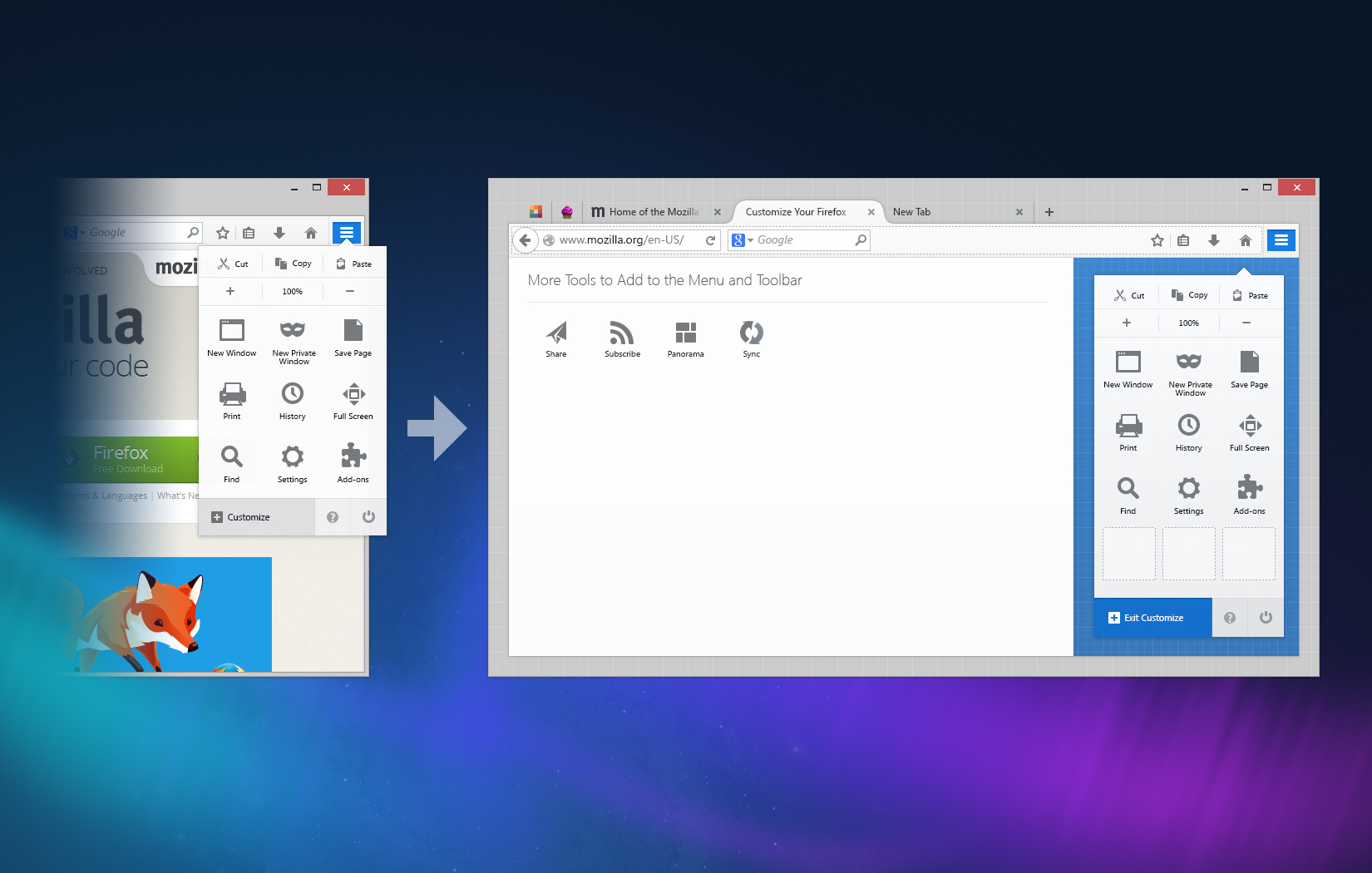
  4. Space to grow. Not being bounded by a small, floating window means we can create richer customization experiences. The Add-ons manager has already  moved to content space, and we’ve been able to explore richer use cases as a result. Similarly, expect to see innovative customization experiments as well as the usual Firefox settings.

And before you ask, yes, the next step is absolutely a search field in Preferences to summon the exact setting you’re looking for. This is needed particularly so users won’t have to “learn” our interface, but can instead focus on their task.

A special thank you goes to Senior Visual Designer Michael Maslaney, who’s been spearheading Project Chameleon, the style guide behind this redesign. Another thank you goes to MSU students Owen Carpenter, Joe Chan, Jon Rietveld, and Devan Sayles for creating the award-winning first version of Firefox’s in-content Preferences in May 2012.

Firefox and Flux: A New, Beautiful Browser is Coming

Tomorrow, on April 29, something amazing is coming to Firefox.

It’s not an interface adjustment or tweak.  It’s not a bug fix.  It’s a complete re-envisioning of Firefox’s user experience, and it’s been brewing for the past five years.

Firefox on Linux, OSX, and Windows

Firefox on Linux, OSX, and Windows

Good to Great

This new Firefox, Firefox 29, was borne out of a series of incredible, detail-obsessed designers and engineers understanding that taking products from good to great requires more than a series of incremental improvements.

Good can be achieved through incrementalism.  Great requires, at times, overhaul.

Firefox 29 contains extensive improvements that were planned back when Alex Faaborg, Madhava Enros, and myself were the only designers at Mozilla.  Back then, Firefox was beginning to buckle under the weight of its inconsistent code and interface.

Realizing the Need for Overhaul

It’s common enough for large codebases maintained across years to develop inconsistencies.  But, Firefox’s nature as an open-source community project contributed to idiosyncratic user experiences.   Menus and dialogs used different tenses and tones.  Add-ons behaved unpredictably.  Customization was handled differently throughout the browser.  Over the past few years, we’ve been working to improve many instances of inconsistent behavior, such as replacing modal dialogs for tab-modal ones, standardizing notifications, and using a uniform tone-of-voice.

Making improvements here and there is often what user experience designers at an organization are expected to do: fix what’s broken, slightly improve what isn’t, and generally don’t get in the way of engineering effort.  But, this method can only make an existing product slightly better, and the gaps it causes reveal themselves in time.

A sinking ship can’t be patched endlessly when it needs a new hull.  This is when user experience design is most effective: when it envisions the system as a whole.  When it steps away from the trees and sees the forest holistically.

Firefox needed a new hull, and the bulk of that hull is arriving on Tuesday.

Others have been blogging about Firefox 29’s beautiful redesign, so I’ll just mention the highlights.

Consistent Customization

Customizing Firefox is now entirely predictable and much more fun.  Rather than digging into Preferences windows and dialogs, you can make Firefox the way you like via dragging-and-dropping buttons wherever you want them.

A Customize panel – itself customizable – displays the tools you want available in a single click but don’t want cluttering your interface.

Firefox Customize Menu

Firefox Customize Menu

Simple and Streamlined

Gone are the bulky angles and edges of tabs and menus.  In Firefox 29, you’ll see streamlined, almost aerodynamic, curves giving emphasis to your current tab and subtly understating the rest.

Streamlined Tab Shape

Streamlined Tab Shape

Themes and Personalization

Making Firefox visually your own is not only easy, but gorgeous.  Lightweight themes look fantastic in 29 with a light interface overlay on whatever image inspires you while you browse.

Lightweight Theme Applied to Firefox

Lightweight Theme Applied to Firefox

Obsession with Details

It’d be hard to describe all the changes coming to Firefox in a single post, but I hope you’ll find that we left no stone unturned.  Firefox 29 is all about details: the glows, the colors, the animations all reflect our desire to make the entire experience seamless.  A special hat tip to our visual designer, Stephen Horlander, for his painstaking eye for detail.

It's All About the Details

It’s All About the Details

Tomorrow’s launch day will, perhaps, be our biggest yet.  It’s certainly an emotional day for myself and the others who have worked on this release for years.  I can’t wait.  I hope you love it.

Research Spinning Up on New Tab Page

Whenever you open a new tab in Firefox, your goal is to navigate somewhere.  To aid your navigation, on this new tab Firefox currently offers you… nothing.  Just a blank page.  100% white, and 100% not useful.

Firefox has been displaying this blank page when users open a new tab for as long as there’s been a new tab.  And, partially, it’s deliberate.  After all, a blank page is guaranteed not to distract you from your current task.  It’s just clean and white, like a canvas, offering no suggestions for the next move and no distractions from it.  Alex Faaborg explains very well in his recent blog post the concerns we have with distracting users and the ways that data overload on a new tab page can be harmful.

This isn’t the case when you open a new tab in other browsers.  Opera was the first to offer a “Speed Dial” with giant thumbnails linking users to their most frequented sites.  Safari’s giant wall-o-televisions offers much the same.  Chrome has played around with different designs, first trying a speed dial like Opera’s and later integrating other content, such as apps.  Internet Explorer, the most unusual of the designs, offers you some options: reopen closed tabs and sessions, start private browsing, or use an “Accelerator,” which usually means do “something with Bing.”

What happens when you open a new tab in different browsers

So, which approach is best for our users?  Would presenting large thumbnail targets to direct people to sites they frequently visit save them time?  Could we present information to make it easier for users to navigate to their next destination?  Can we do so without being distracting and leading users away from the task they had in mind?

We realized that we couldn’t answer these questions without finding out more about our users.  So, a few people at Mozilla are heading up studies to find out how people use tabs and how different designs of new tab page effect how they browse and user the web.

Here’s what’s going down:

1. Quantitative study through Test Pilot on what users do after opening a new tab

Intern Lilian Weng is currently working on a quantitative study within Test Pilot to capture data on what users do after they open a new tab.  This should answer questions surrounding user intention when opening a new tab, and possibly how long users take to perform actions after opening a new tab.

2. A/B test of a new tab page vs. blank new tab

Interns Diyang Tang and Lilian Weng are preparing to do an A/B test using Test Pilot to determine how user behavior differs when presented with a new tab page vs. none.  They are attempting to answer questions such as:

– Does a new tab page slow users down (e.g., by distracting them), or speed them up (e.g., help them find the target site faster)?
– Does a new tab page discourage breadth in visited sites?
– How do users navigate to a website after they open a new tab in each scenario? (location bar, search bar, top sites, bookmarks, history, etc.)
– Are there users who are more mouse-based and some who are more keyboard-based? How does a new tab page affect them?

3. Cafe testing for current Firefox

Diane Loviglio and myself are preparing more qualitative “cafe” tests to gain insight into how people use tabs currently.  We’d like to know why and when users open new tabs in a more contextual perspective than Test Pilot data provides.  Our goal is to find a wide enough range of users that the most common new tab behaviors can be grouped and discussed in a more tractable framework.

4. Testing multiple new tab page designs

Once the research from tests 1-3 is available, variations on new tab pages will be implemented and tried out with real users.  There are multiple testing methods that could be useful here, such as a multivariate testing or even journaling to gain insight into how new tab pages effect behavior of a user over time.

5. Creating a contextual speel dial implementation

Not quite a research project, but intern Abhinav Sharma is designing and implementing an experimental new tab page which uses contextual information about a user’s current browsing session to offer suggestions.  His page makes intelligent recommendations about where you’re likely to go next based on where you’ve been.  The project’s still in alpha, but you can see the code he’s done already for a basic speed dial implementation on his github.

You’ll notice that a lot of this work is being done by our awesome new Summer 2011 interns!  It’s only early June and they’re already rocking hard.

I’ll post what we learn from these studies as results come in.  I predict we’ll gain some insight into user behavior that will inform not only Firefox’s new tab design, but many other features besides!

Making Add-on Updating not Suck

Updating software sucks.  For most of your software, you’d probably prefer to never think about updating.  Ideally, your applications  would stay current and fast on their own without ever requiring your input.

That’s why one of the important changes in Firefox 4’s add-ons manager is keeping add-ons up-to-date automatically.  This happens in the background without you even noticing.

Automatically updating add-ons does exactly what users have been telling us they’d like for a long time.  However, some users will want to manually update their add-ons, as they did before Firefox 4.  Other users will want to automatically update some add-ons but not others.

Hard as it is to cater to many use cases, we felt it was important to allow users to manually update add-ons if they prefer.  Add-on updates are essentially new software, and users should always have the ability to opt out of them.

Below is the basic use case of managing add-on updates I’m proposing for Firefox 5 (which is only a few weeks after the release of Firefox 4 thanks to our new shorter release cycles).  The user begins with completely automatic updates on by default.  By switching to manual updates in the advanced menu, the user can go back to installing updates themselves.  Each add-on shows, in its detailed pane, whether it receives updates automatically or manually.

However, there’s another kind of usage that needs to be supported.  What if a user wants all but a few add-ons updated automatically?  Or, all but a few add-ons updated manually?  Allowing users to switch any particular add-on between manual and automatic updating allows users to make one-off exceptions.

If a user goes to the detailed pane of add-on, they can see how an add-on is currently updating and switch it to the other method.  To change <i>all</i> add-ons to the other method, the user needs to select that option in the advanced panel.  This way, we allow users to make both blanket rules and exceptions as they go.  Here’s a more complete diagram showing updating preferences, with one-off exceptions included: