
Tomorrow, on April 29, something amazing is coming to Firefox.
It’s not an interface adjustment or tweak. It’s not a bug fix. It’s a complete re-envisioning of Firefox’s user experience, and it’s been brewing for the past five years.
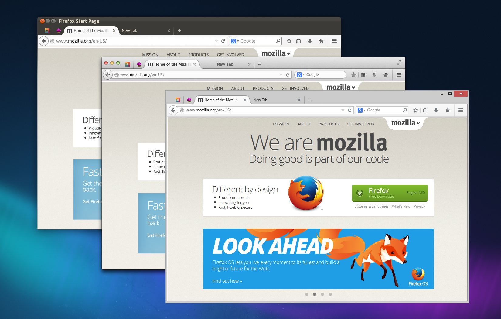
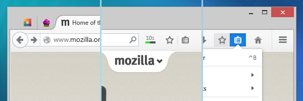
Firefox on Linux, OSX, and Windows
Good to Great
This new Firefox, Firefox 29, was borne out of a series of incredible, detail-obsessed designers and engineers understanding that taking products from good to great requires more than a series of incremental improvements.
Good can be achieved through incrementalism. Great requires, at times, overhaul.
Firefox 29 contains extensive improvements that were planned back when Alex Faaborg, Madhava Enros, and myself were the only designers at Mozilla. Back then, Firefox was beginning to buckle under the weight of its inconsistent code and interface.
Realizing the Need for Overhaul
It’s common enough for large codebases maintained across years to develop inconsistencies. But, Firefox’s nature as an open-source community project contributed to idiosyncratic user experiences. Menus and dialogs used different tenses and tones. Add-ons behaved unpredictably. Customization was handled differently throughout the browser. Over the past few years, we’ve been working to improve many instances of inconsistent behavior, such as replacing modal dialogs for tab-modal ones, standardizing notifications, and using a uniform tone-of-voice.
Making improvements here and there is often what user experience designers at an organization are expected to do: fix what’s broken, slightly improve what isn’t, and generally don’t get in the way of engineering effort. But, this method can only make an existing product slightly better, and the gaps it causes reveal themselves in time.
A sinking ship can’t be patched endlessly when it needs a new hull. This is when user experience design is most effective: when it envisions the system as a whole. When it steps away from the trees and sees the forest holistically.
Firefox needed a new hull, and the bulk of that hull is arriving on Tuesday.
Others have been blogging about Firefox 29’s beautiful redesign, so I’ll just mention the highlights.
Consistent Customization
Customizing Firefox is now entirely predictable and much more fun. Rather than digging into Preferences windows and dialogs, you can make Firefox the way you like via dragging-and-dropping buttons wherever you want them.
A Customize panel – itself customizable – displays the tools you want available in a single click but don’t want cluttering your interface.
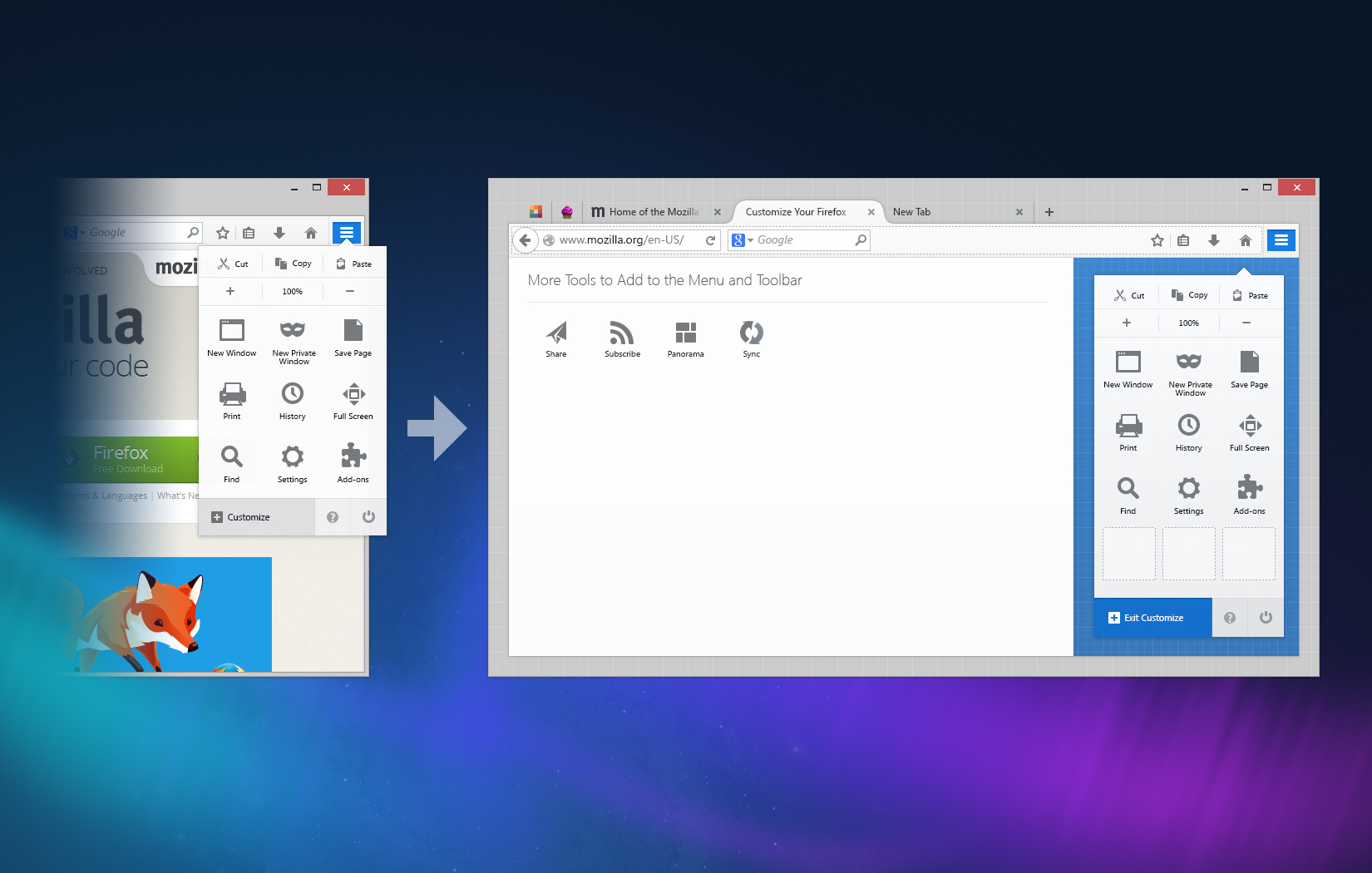
Firefox Customize Menu
Simple and Streamlined
Gone are the bulky angles and edges of tabs and menus. In Firefox 29, you’ll see streamlined, almost aerodynamic, curves giving emphasis to your current tab and subtly understating the rest.
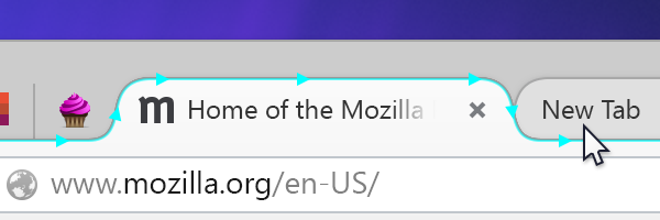
Streamlined Tab Shape
Themes and Personalization
Making Firefox visually your own is not only easy, but gorgeous. Lightweight themes look fantastic in 29 with a light interface overlay on whatever image inspires you while you browse.
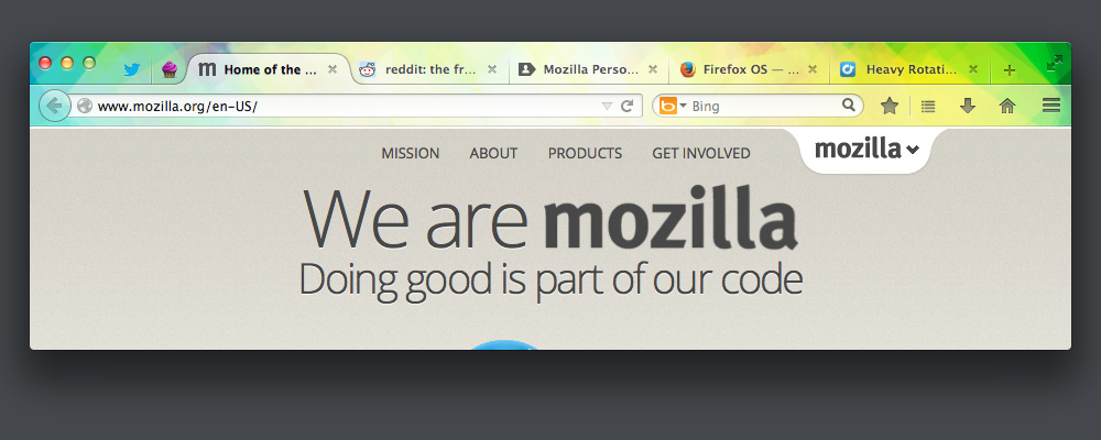
Lightweight Theme Applied to Firefox
Obsession with Details
It’d be hard to describe all the changes coming to Firefox in a single post, but I hope you’ll find that we left no stone unturned. Firefox 29 is all about details: the glows, the colors, the animations all reflect our desire to make the entire experience seamless. A special hat tip to our visual designer, Stephen Horlander, for his painstaking eye for detail.
It’s All About the Details
Tomorrow’s launch day will, perhaps, be our biggest yet. It’s certainly an emotional day for myself and the others who have worked on this release for years. I can’t wait. I hope you love it.
By completely ignoring your most passionate users and designing only for the lowest common denominator, Firefox is now completely worthless.
I’ve started advising my consulting clients to use Internet Explorer since its interface retains some usefulness.
That’s about 500 people who won’t be on Firefox.
Australis is terrible, and ruins Firefox.
It would help for complaints to be specific and actionable. Leaving the door open for improvement vs. being dramatic, unhelpful and demoralising.
Personally I’m glad FF is finally getting around to recovering screen space.
I’m happy for people to vent frustration if they like. Having to relearn UI always sucks, even if the change is an improvement. But, as you say, it’s far better to hear specific feedback and suggestions!
The change is not an improvement–indeed, the change pretty much cannot be an improvement. Once an interface reaches the point where I know how to access all the functions I want and can do so quickly and easily, there is literally no way to improve it–the interface has successfully stepped out of my way and let me get to work. I had, in fact, just gotten FF’s latest interface successfully customized to this point.
What you and people with your mindset want to do is make the interface keep stepping back into my way by moving everything around based on whatever your feelings on the matter happen to be at a given time. This has been a constant problem with Firefox over the years, though this update definitely takes the cake.
Sure, people will get used to it if they don’t switch. People can get used to anything. Personally, I am really tired of dealing with this, so I’m finally jumping ship. Bye.
Letting the UI “step out of your way” was actually one of our guiding principles! We hear from users and see in testing constantly that whenever a task is disrupted by the tool – in this case the browser – it’s a huge annoyance. Notifications, windows, dialogs – all irritating and all instances that take you from the task you want to compete and into the one the browser or website has in mind. That’s why we’re trying so hard to eliminate every dialog and notification that isn’t absolutely necessary (such as giving your webcam feed to a website).
I hope it’s not the case that there’s literally no way to improve it, though! We’d be out of of a job. 🙂
No, it wouldn’t. Complaints are being ignored, regardless of how specific and actionable they are. Even complaints that _come with patches to fix the problem_ are being ignored, and you can’t get much more actionable than that.
If you’re feeling demoralized, don’t blame it on the people pointing out the problems with Australis, blame it on the people causing the problems.
This.
I never asked to have the stuff I learned taken away. You would think they would have got the hint when so many people kept asking how to put the tabs back at the bottom. Oh and I like my menu bar, my firefox is small enough to have it and still leave a lot of real estate on the screen. Change for the sake of change isn’t good. IE attract new clients while losing your whole user base.
>> I’ve started advising my consulting clients to use Internet Explorer since its interface retains some usefulness.
… except for that little security issue that is driving most companies to tell their users to not use Explorer to surf the internet 🙂
Curmudgeons like this come out and complain every time there’s a change in the UI. Don’t listen to him. You all did a great job on this and should be proud!
If your advise is to run internet explorer that means there are 500 extremely clueless people.
You do know that ALL versions of IE have an extremely serious flaw that will not be fixed for at least 2 – 3 weeks? (unlike say opensoure software which patches flaws usually within 24 hrs – i.e Heartbleed)
http://abcnews.go.com/Technology/wireStory/microsoft-warns-internet-explorer-security-gap-23501356
So you would sacrifice their security over an interface disagreement. You are going to lose clients.
Happy to say Firefox’s security has never been better!
Frankly I am terrified by this. Most recent “improvements” to Firefox have been making it worse. The web is sucking more and more and Mozilla.org used to be a force for good but now I’m not so sure. I guess we’ll see what happens.
There’s no doubt the web’s in danger. I’d argue primarily due to surveillance, privacy erosion, proprietary standards, and corporate land-grabs. To those ends, it takes more than good user experience, but individuals and organizations committed to keeping the internet free. That’s a task we’re committed to. Not to go down grandiose-tunnel, but it’s perhaps the most important technical challenge facing this generation.
Looks Great. Thanks for the great work
Thanks, Shrey!
Stupid design!
I’ve been trying the new design since the Nightly Builds, I hoped it could be improved but not at all… So I still keep version 28…
It wastes a lot of space on the title bar and tabs bar, although they are combined, they still keep the same height!
It wastes much space of the address bar’s buttons, because there are no small icons any more!
And the add-on bar is disappeared, so I have to put the add-on icons on the address bar or title bar, WTF!
Hey Cocoa –
You can add a bar for add-ons by:
1. Click the Customize button
2. Click Customize
3. Click “Show/Hide Toolbars”
4. Drag whatever add-on buttons you want to the toolbar that appears
Yeah, that’s not what he meant. Or, at least, it’s not what *I* want.
Where is my status bar *at the bottom of the screen*? Why is it not possible to drag a toolbar over there. That’s just stupid and restrictive. And for no good reason.
We optimized for widgets at the top of the browser rather than anywhere in this release. But, if you want that status bar back, I’ve tested this add-on and it works! https://addons.mozilla.org/en-US/firefox/addon/status-4-evar/
Here’s another alternative that just does what it says on the tin (and no more):
The Addon Bar (restored)
You can then use Jennifer’s hint above to enable the Addon Bar in Customize mode, and move things from the navigation bar if you want. The Ctrl/Command+/ shortcut works, too, just like it used to.
I was also little upset by having to cram Ghostery/Disconnect and Cookie Whitelist into the navigation bar when I first started using Australis in Nightly, but this addon makes me happy again. (I groused a bit about the tab style at first, too, but now I prefer it.)
While extra toolbars are theoretically possible in Chrome, I think they’re officially discouraged, and I certainly haven’t seen any popular extensions that use them. So I think the redesign is still a win for Firefox, even if people are upset about the “orange button” being moved, because of the strength of Firefox’s addons, which in most cases will allow you to revert to the functionality you prefer.
Added to that, I think the new design is a wonderful improvement for less savvy users like my parents, and that is what they were going for.
Why is it still the case that on a higher DPI-setting in Windows 8, all the icons and tab outlines look blurry? (That happens whether “Disable display scaling on High DPI settings” is on or off)
love it, except for one crucial thing. on windows 8, having dark titlebars, means the text of non active tabs is black on black (=unreadable)
Hey Rene – have you tried the latest build? This was a bug that I believe we fixed – on dark themes the text *should* flip to white on Windows 8. If you’re seeing it on the latest, it’s definitely a bug we need to fix!
It’s not fixed yet. Can’t use Firefox now if I don’t change my W8 color scheme. 🙁 Very annoying! I think it’s Microsofts fault, but still.. Chrome does it right.
Still no fix? 🙁
Hey Karel. You’re right – it’s unfortunately a bug. It’s being tracked here – https://bugzilla.mozilla.org/show_bug.cgi?id=1007229 – and I’m advocating for it to get priority in our next sprint (starting next week).
Thanks jmorrow! 🙂
I’m having this problem too — where do I get the latest build?
more similar to chrome…sigh…
More space wasted on chrome. Bad.
Hey there. Indeed a great release. I enjoyed the new design already for a few weeks with Aurora.
Just one thing though that I still don’t get: Why can’t I close that last tab page??? On a Mac, pressing [CMD]+[W] closes it, so why can’t I do the same with my mouse?
Problem is, when I quit Firefox entirely, the content of this last tab is restored. But when I close the last tab using [CMD]+[W] and then quit entirely, on the next start a new tab page using my homepage is shown. This is perfect, now just add a close button on the last tab page too.
Thanks
Hey Marc – you can change this by going to about:config and changing “browser.tabs.closeWindowWithLastTab;false” to true.
I love the Godzilla trailer reference in the first two sentences 😛
Looking forward to it, really hope it isn’t as much of a memory hog as the current one is, it’s the only problem i have with firefox :/
Hey Ally! In addition to some of the user experience improvements above, this release has tons of memory and perf improvements. More info: http://www.mozilla.org/en-US/firefox/desktop/fast/
Overall I really like the Australis revamp. One thing I do find to be a curious oversight in the UI though is that the layout of the navigation buttons or location bar can’t be customized through the customize tool.
In reading about Australis prior to the release of FF 29, it sounded like making customization easier was one of the goals of the new interface. This regression of customization functionality seems to be a step backward in that regard.
What was the reasoning for this being a benefit to users?
Hey Matt –
You’re absolutely right that this is, as far as I know, the only UI we draw that isn’t customizable via the Customization Menu. We went back and forth on this a few times. Ultimately, the reason we left it “solid” is because of the amount of support requests we get from users who accidentally removed their URL bar and thus found Firefox absolutely useless. Essentially, the URL bar is the one part of the browser that makes it at all functional, and we thought the risk of users being without it outweighed the necessity of customizing every item. But, this wasn’t an easy decision to make, and maybe we were wrong! There’s several add-ons, like this one, that let you remove the URL bar as well.
I agree with Matt on this one. Overall the design is nice, but removing the ability to relocate the navigation buttons is a step backwards for sure.
You describe a scenario where people would accidentally disable the URL bar and have no web browser. That definitely made sense back when you could right-click and hide the bar, but now the only way to customize the browser is via the new customization interface (as far as I know…) So it stands to reason that if the user removed the URL bar, or any navigation button, it would HAVE to be in the customization panel, waiting at the bottom with the other unused controls. If they lost their buttons, they should know exactly where to go to get them back: Customize. They’d be right there, ready to drag right back where they came from. I’m almost positive that 99% of users are perfectly capable of reasoning out that the one and only single location for customization is the place you’d go to restore something that you removed while inside of that very same customization interface. And for the people who can’t reason that out, I hate to say it, but you can’t please everybody. And I think designing for the absolutely lowest tier of users may not be the best option in cases like this.
But if that’s too difficult for those 1%, and you’re truly worried about them, why not make it so that you can rearrange but not remove navigation buttons? The tiny refresh / stop button inside the URL bar just never made sense to me, and it kills me that I can’t put it back where it does make sense without using an add-on that has no guarantee of continuing to work across versions. 🙁
You can rearrange the nav & URL bar by adding items to the left of it in Customize mode. A bit hacky, but it works.
Maybe I misunderstood, but that doesn’t do anything for me. I stuck a sync button to the left of the URL bar but I still can’t move the back or refresh buttons.
I have really no clue why you put the back button on the left, the refresh button in the middle, and made them both unmovable. This seems extremely counter-intuitive and unproductive, and looks like change for change’s sake from my perspective.
I’m not sure how you can say that “Customizing Firefox is now entirely predictable and much more fun”, and that you left “no stone unturned”, when the user can’t customize and change the most basic aspects of the browser, things that we had no issues with changing for many years prior.
I do love it. Bravo.
Thanks for working so hard to make Firefox a good browser! I’m sorry that so many people feel the need to be unkind, and not recognize all of the hours of hard work that go into making a tool like Firefox.
-M
Thanks, Murphy! We don’t mind complaints – it shows users are passionate and care about the products they use. Also, it encourages us to research *hard* before we make change and to justify what we do.
I always have and will continue to use SeaMonkey. There was a time when I used Firefox and Seamonkey on the same machine, but that time has passed. Firefox has been heavier and slower than Seamonkey for ages now.
If you haven’t, I’d really encourage you to try a fresh version of Firefox and see if that’s the case. We’ve been hard at work on performance and memory management, and the difference should be pretty stark.
Stellar! Just upgraded, had not been keeping up on the pre-releases. The overall feel is awesome, spot on.
Thrilled you like it, Landtiser.
As long as it still supports userchrome.css then I’ll be happy, since you can make the UI look however you want with that (and I do).
What it looks like isn’t really that important to me. FF has to be much faster.
Speed’s still the most important browser differentiator. Give it a spin! http://www.mozilla.org/en-US/firefox/desktop/fast/
As long as the NoScript and AdBlock plugins still work, I welcome the changes (especially as regards a lower memory footprint). But the web is absolutely not usable without those two plugins running.
If either of those two don’t do what they do now, then the new Firefox is a complete non-starter, regardless of any UI or other changes.
You’re absolutely right. We made sure that our add-ons – particularly popular ones like NoScript, Firebug, AdBlock, and Ghostery – work well. In fact, making add-ons in Firefox more cohesive and consistent with the rest of the interface was a guiding principle that lead to the new customization system, where all tools display and act identically.
I upgraded to the new version this morning and, overall, I like the redesign so far – especially the new customizable menu. But wow, you really changed the tab appearance! The “subtle understatement” of the inactive tabs is not very subtle in my opinion. The borders between them (vertical lines) are so faint that it takes some careful looking to see that they’re even there.
So an inactive tab typically ends up having three visible parts: icon, title, and close button. The close button is almost centered between the end of the title and the next tab’s icon. When you combine this with the lack of any distinct borders, it seems to me that it becomes much harder to quickly visually acquire and understand inactive tabs – which is important when you have a lot of tabs open, or are switching between multiple tab groups, windows, etc. The same kind of problem exists between the titles and icons when there are enough tabs that the close buttons are not shown, although it seems less severe.
Anyway, did anyone study the cognitive burden implications of this change to inactive tab appearance? Especially when it comes to clicking on them with a mouse? My first impression, recognizing that I’m extremely used to the old square tabs with distinct borders, is that a lot of practical utility was sacrificed just for the sake of appearance. But I’m going to give it some time before using an add-on to get the old tabs back, which I tend to view as a last resort gonna-cause-problems-down-the-road kind of solution. And your blog post definitely inspired me to give it more of a chance. Thanks. 🙂
Hey Tom –
Thanks for the thoughtful feedback! The distances, colors, and hit-targets are parts we thought about and researched quite a bit. However, even with research, there’s many different conclusions one could reach (and I’m not claiming ours is perfect!).
We started de-emphasizing inactive tabs primarily due to feedback and user-testing that showed users sometimes had trouble distinguishing which of their tabs was active – particularly since the active tab may be scrolled out of view to the left or right. We played with variations on color and subtly, but found the most minimal solutions blended background tabs with the color of the window itself, such that there are two levels of visual hierarchy (active tab and window) rather than three (active tab and window and inactive tabs).
As for size of tab and close button, we also user tested a lot of variations. One thing you’ll notice is that the bottom “tails” of the tab extend into the next tabs to the left and right, such that if you mouse over the bottom left tail of one tab, you may be over an area that would be a part of another tab’s bottom right. This is interface cheating: both tabs are “bigger” when active by taking up more room to the left and right. The primary reason for this is optimizing for Fitts’s law – the amount of time it takes to hit a target is proportional to its actual or perceived size.
As for favicons before the title – it’s almost an industry standard at this point, but there’s some great studies that show how effective identifying a site by color and some branding is. I did a little research on that awhile ago, described here. But, it’s still a problem when multiple tabs are open from the same domain with the same favicon! It’s a challenge we’re thinking about quite actively (ideas welcome!).
While testing and research can help, ultimately they only lead the way. There’s no “best” solution, which is why we also listen to feedback and do longer-term user testing to see how users use Firefox over time.
shiny.
I’ve been running the beta for a while, and I think it’s absolutely gorgeous.
I’m sad to see that there’s always such a strong negative response to design changes. Most are quite ridiculous and not constructive. But, I’m sure you guys are used to that by now.
Cheers!
Thanks for the kind words, Evert! I think the negative comments just show how much people care about their browser. And we have that in common! I’d take a passionately angry user base over an apathetic one any day.
I like it, and immediately went looking in Customize > Additional Tools and Features for a Print Preview button to add, but didn’t find one. Is it somewhere else? Can you add it next time? No button, no keyboard shortcut, so I still show the original Menu bar to get to Print Preview. Thanks.
Hey Frank –
I don’t think we built a button specifically for Print Preview. Maybe we should! In the meantime, this add-on should add it to the Print button that’s in Additional Tools: https://addons.mozilla.org/en-US/firefox/addon/printprint-preview/
Frank might be a Mac user, because on Windows, the Nightly 31.0a1 (assuming this hasn’t changed in FF 29) behavior is to preview first when you click on “Print” in the new slab menu.
On OS X, the addon you mention restores Print Preview, but it’s a bit wonky. Print Preview hides all of the other UI elements, with no buttons to exit the preview or to actually print, so you’d have to know to press Ctrl/Command+W to get out of preview mode and back to the page you were looking at. This would really throw a less savvy user for a loop; they’d probably end up quitting the application trying to figure it out.
I’ll see if there’s already a bug report, or else file a new one. Just wanted to leave a note here for anyone else with this problem.
Hi! I love your professional replies to all the whining.
I really like the look and feel of the new Firefox. The only recent change I don’t understand is the change to the find bar that doesn’t remember text across tabs. I guess this is to fit with the model of tabs on top changing everything below. But i find it decidedly less useful. Often i open several tabs when hunting for a particular word and want to switch tab, hit f3, switch tabs, hit F3, etc. This no longer works and I don’t see how the new behaviour is an improvement. What is the reasoning behind this change?
Hey David –
We didn’t deliberately eliminate or reduce Switch to Tab. It should still work both in a window and across windows. I just tested it on release build and can’t reproduce the failure you describe. Are you not seeing “Switch to Tab” if the tab that matches your text is in another window? It may be a problem recognizing the text of the specific page you’re after. Can you reproduce the failure for different sites?
I think you misunderstood me. I meant that I have previously used find in page to search for a keyword or phrase in several tabs concurrently by pressing F3 or ctrl G to search again and ctrl tab to jump to the next tab, repeatedly to go through several tabs. Now the find bar no longer remembers a search from one tab to the next so it becomes very cumbersome to do this. Usually when firefox’s behaviour is changed I understand the reasoning behind the change, but not when it comes to this change.
There’s a good chance it wasn’t a deliberate change – that the behavior you speak of wasn’t an intentional feature, just a side-effect of how the find-in-page code worked. In which case, it’s the kind of thing that easily breaks when underlying code is changed.
Why doesn’t anyone understand my questions? Is it such an edge case really?
I’m pretty sure it wasn’t a deliberate change. In fact, I didn’t know it was even possible to search in page for multiple tabs at once. I’m going to ask around about this and see if another Mozillian knows what’s going on.
You’re right, I did misunderstand you! Try pressing Cmd-F instead of F. I suspect you’re using the stranger cousin of find-in-page. The one we support & document, Cmd-F, should be remembering your string. It’s working on my machine, anyway.
Understand that there’s Find (Ctrl + F) and Quick Find (just pressing “/” followed by some letters). I’m not even 100% certain whether Quick Find is enabled by default for new profiles, but its value is in doing quick, one-off searches without the search UI staying “pinned” to the bottom.
It doesn’t seem like the Quick Find search string is persisted between tabs. But the Ctrl + F find is, but only if you haven’t searched for anything else (or have an active search going) on that tab. It seems to work every time on “fresh” tabs. I was able to Ctrl + F search in one tab and then Ctrl + G or F3 for the same search term in a brand new tab, and that seemed to work every time.
I don’t think that FF 29 broke this or made it any worse than before. It’s just difficult behavior to program for.
It was a deliberate change with no consideration of how badly it would disrupt long-time workflows that depend on it. See my post below for specific bugs. Extremely frustrating that you’re not reverting to the working and more functional behavior.
If I would know that this interface gonna come I wouldn’t update. Looks nice but buttons are gone and I am not able to resize them nor label. Bookmark and History management was useful and handy , now it’s a mess. Australis looks nice interface but when it comes with limitations then Firefox will loose even more users. I am sure Firefox made a mistake and no one will be able to convince them like Microsoft’s Windows 8 mistake!
Hey Quazar. It’s true that buttons are not labeled in Firefox 29, but buttons shouldn’t be “gone.” If you’re looking for one you’re not seeing, try clicking the Customize button and then click on Customize. You may find what you’re looking for in our additional tools list.
Overall, awesome job with the new rev – and I was sorta surprised that almost all of the plug-ins worked at upgrade (Status4ever, a plug-in for returning the status bar to the bottom (where I like to put adblock, noscript, ghostery and DL stuffs) was the lone exception, but the beta on the dev section of that page sorted it).
So on the topic of constructive feedback, The upper block of three sections (tabs, URL bar and bookmarks bar) feels really thick from top to bottom. The text to grey space ratio seems out of balance a bit. The text takes up the middle 1/4th to 1/3rd of the tabs and bookmarks bar – so there’s lots of empty grey space above and below text (no icons by choice). Is there any way to reduce the vertical pixel footprint to shave off some of the empty grey area? (I had a similar complaint about the new Safari in IOS 7, so it’s not unique to y’all).
Thanks to you and the team for all the hard work – appreciate it. 🙂
Thanks for the great feedback, Moose! Glad to hear the add-ons work – we tested a ton & tried to make sure they wouldn’t break. Helps that we’re all big add-on users ourselves and have been dogfooding this thing awhile.
While customizing the greyspace isn’t supported in the UI, there’s a lot of great add-ons that do it. You might like this one I found yesterday that only shows the URL bar when you mouseover or focus it, giving you the entire row of UI back to content. https://addons.mozilla.org/en-US/firefox/addon/the-fox-only-better/?src=cb-dl-updated
That’s super useful (and completely solves the issue for me). Thanks! You’re a really awesome add-on scout ant! 😀
(and this highlights another reason I love Firefox – with add-ons, you really can build whatever browser you want).
I’ve been using the Firefox Nightly version for a while now – liked it immensely, and was wondering when the new interface would make its way to the main release!
Really like the new interface. After working in software dev and UI design, I realize that criticism on change is imminent, but necessary if software is to move forward.
Kudos, fellas!
Thanks for the kind words, Osama! Change is never fun for its own sake. It’s gotta be towards something worth the effort. I think Firefox 29 is worth it, but ultimately the users will decide!
Tabs on top are retarded, it only makes sense for it to be close with content they represent.
Tabs on top also increase the distance I need to move my mouse to switch tabs and I do it much more often than typing URL directly.
Well, it’s a longer-ago change, but one we made very deliberately. If you’re curious about the rationale, my once colleague Alex Faaborg made an excellent video explaining the rationale behind the change.
Video clearly states this is only about default and users still have a choice… not anymore!
Main reason for tabs on top from the video seems to be Firefox “apps”, because chrome got app store and now firefox has to.
Maybe someone is actually using it (you should know better), but not me. That would be reasonable in cases where browser is actually the OS, but last time I checked I’m not running Firefox OS, I’m sure it was xubuntu and it has all those native apps and that thing called task bar that let me switch between apps.
It took me month to get used to when you moved “open link in new tab” in context menu, I kept opening new windows without even looking at the menus.
It seems that Firefox just lives to make me relearn UI every few releases and completely change my habbits.
Should I expect you’ll remove a menu bar for good as well next time, so that I’d have to use another 3rd party addon to fix this crappy design decisions?
Do whatever you want to new users, let old users live with their habbits, at least ask me to try and give a way to undo – if something is clearly better, I’ll use it, honest.
Is it still possible to make Firefox look like it was before 4.0? That ability is pretty much the only thing that has kept me using it.
While we don’t recommend downgrading because older versions of Firefox have significant security risks, you can download an older version here: https://ftp.mozilla.org/pub/mozilla.org/firefox/releases/
I wasn’t asking about downgrading, I was asking about UI customization in FF29 — can I make it look old-school? Up to FF28 I’ve been able to configure everything so that it is reasonably close to the look prior to 4.0 — traditional menu bar and structure, status bar at the bottom, tabs and window decorations that match the OS style chosen, and so forth. Can I still do all this?
Not a perfect option, but I switched to Seamonkey a few months ago and have been happy with it.
The UI has barely changed in the past decade+.
I’m aware of seamonkey. I haven’t tried FF29 yet and am willing to give it an honest go before I jump ship. I admit, I’m pretty scared of this update, though, which is why I haven’t manually triggered it. The UI changes that have been happening over the past couple of years have been going in a direction that I’m incompatible with (I don’t use Chrome because I absolutely detest Chrome’s UI), and this looks like it’s a huge leap in that same direction, and it looks like it has less ability to make the kinds of customizations that are important to me than prior releases.
But, trying to keep an open mind. If I can make the UI be what I want and need it to be without having to install multiple add-ons or spend an hour fiddling with settings, I’m staying put.
You’d probably have to use a theme to do it. I don’t believe there’s any “revert to old UI” option in Firefox 29. https://addons.mozilla.org/en-US/firefox/complete-themes/?sort=rating
Ninja edit: Found one to restore classic theme! https://addons.mozilla.org/en-US/firefox/addon/classicthemerestorer/
Thanks for this! It looks promising.
I’ve tried the update, and I’m very pleased that my fears were unwarranted. I have to say, I dislike the deemphasis of tabs that don’t have the focus, and I dislike the fact that I have to use a plugin to get the status bar back, but those are little things, really.
Thanks!
Mozilla’s UI direction just seems to be, “Copy Chrome.” Don’t give me no line about changing the UI through themes, I would like to see Firefox to have it’s own identity by default.
Hey Anon. If you’d like to know more about the guiding principles we follow for making design decisions in Firefox, you might be interested in our Design Values (PDF).
Unusable shiny goggly-eyed garbage.
If you want specifics from a “whiner”: the inactive tabs are invisible, the whole window looks like it never has focus, and it wastes a ton of space.
This stupid disneyland look should have been a theme. (That no-one would install, incidentally.)
> We started de-emphasizing inactive tabs primarily due to feedback and user-testing that showed users sometimes had trouble distinguishing which of their tabs was active – particularly since the active tab may be scrolled out of view to the left or right
I’ll give you a hint: the webpage that you’re looking at, that’s the active tab. As for the tab scrolling out of view, does this new bubble gum look solve that? I’m betting not. So why bring that up.
This should have been a theme.
>As for the tab scrolling out of view, does this new bubble gum look solve that?
It doesn’t *solve* the problem, but it does make it more manageable by 1. making it more obvious that the active tab is scrolled off, by making the more-obvious active tab obviously not visible, and 2. letting quickly identify which of the scrolled-off tabs is active by making it more visibly apparent when the scroll is taken place. The active tab is much easier to identify when a blur of motion (scrolling tabs) is taking place.
I’ve been using this UI in the nightlies for quite some time and I think it’s a huge step in the right direction and kudos for being an open source project that actually is concerned about UX.
I would like that future versions of FF would refocus on emerging standards and browser technology.
I stopped being able to read my google play ebooks on FF, probably because chrome introduced some new bleeding edge API.
I can’t get into details, but I don’t want to rely solely on chrome to use their products *cough* *monopoly* 😛
Absolutely. Our recent work promoting and building out WebRTC is a good example of that. Are there specific emerging standards you think we should be investing in and supporting?
I’m loving the new Firefox at the moment and it is now my default browser instead of Chrome.
Thank you for helping the web development community with your awesome development tools.
Keep up the good work!!
Thanks for the feedback, Karam! Hope you continue to enjoy Firefox and let us know when you don’t. 🙂
It absolutely SUCKS Big Time, total EPIC FAIL!.
Goodbye Firefox after 10 years.
Hello Pale Moon.
Thanks for being a Firefox user for 10 years and today! Firefox forks are awesome, and I’d love to see more of ’em.
so neat, just loving it!! considering to switch back from chr… after years, thank you!
Thanks for the feedback, emzap! Really appreciate it.
thanks for the post. is there anything similar from the engineers working on FF 29 talking about the code/architecture changes?
Some devs have been blogging separately. This post from engineer Jared Wein may be helpful: The fresh and furiously fast Firefox
Notice the sad-face spike starting on 29th: https://input.mozilla.org/en-US/ (those are just the users pissed of enough to search for a website where to complain).
Should have considered backward compatibility (and opt-in). Tsk, tsk, Mozilla UX team.
Worry not, John, we were aware most of the input would be negative today. Thanks for commenting!
Dude. That’s intense.
I downloaded the new update today and played with it. I’m currently on PaleMoon because of some of the changes Mozilla has made that removed functionality or increased memory leaks for me. From using it, I fail to see any reason I wouldn’t choose Chrome over Firefox as the distinctions seem to be almost non-existent. Firefox is generally assumed to be slower(whether it’s true or not), Chrome has far better apps support, and the look is almost exactly that of Chrome. To make sure my own bias was not involved I actually grabbed some co-workers and asked what they thought and the literal first words out of one of their mouths was “Why did they make it look like Chrome”. Were Mozilla a competitor of Apple, I’m sure you’d quickly find yourself in court over trade dress. One would have though that the debacle of Windows 8 and the relative ease with which Apple has shown that you can create a common base and use that to tailor different experiences based upon the platform(believe me it pains me to support an Apple design choice), that for Mozilla to attempt to shoehorn mobile onto the desktop shows a complete lack of attention.
All that being said(because it’s far easier to complain than be constructive), there are some genuinely good ideas in the build. Making the active tab more apparent is something that once you see in action seems like it should have been obvious. The options that are left to customize seem dead simple and I really liked the highlighting to give people better direction when in customization mode. I didn’t get to see the actual speed improvements, because I run without add-ons enabled so it’s always run relatively fast for me, but it definitely feels a heck of a lot snappier. The intelligent navigation buttons are absolutely brilliant and for something so small it is very, very cool.
So overall, it could just be down to my disliking the look and some of the changes. I don’t like the menu being moved and unable to be customized, I don’t like the round tabs(that’s purely preference though). I do however really appreciate the time and effort you’ve put into the community and the obvious patience and care you’ve tried to take with the design choices you’ve made. I obviously don’t agree with all of them, but I don’t have to. You’ve made a great product and you’ve put some really nice new features in, you’ve also be extremely patient and understanding the with uproar that comes with any major change. Thanks for the work you do and thanks for taking the time to respond as you’ve done. I hope you never lose the obvious passion you have and look forward to more from you.
Hey Techno –
Thanks for the extremely thoughtful feedback. I get the criticism that Firefox 29 looks more like Chrome. The curvy tab shape is more similar to Chrome’s tab shape than Firefox 4’s. However, rather than “copying,” I think some of this comes from Chrome and Firefox (and other browsers) basically zero-ing in on a few relatively standard use cases, doing independent research, and reaching similar conclusions.
There’s a lot of reasons we made the tabs curvier. One is that the modern web is becoming more fluid and organic and less boxy and robotic, and it’s (arguably) a Good Thing. In the Days of Olde, there was HTML and that was it. It was box models and tables all the way down. As a result, the first website “designs” were essentially series of boxes. As CSS, Javascript, PhP, HTML5, etc popped up, web designers were freer to design what they wanted and not what they could just about manage to render. And, overwhelmingly, organic and fluid shapes are better perceived than their boxy cousins. While we did plenty of testing, a lot of this is truly subjective, so it’s completely legit to hate it and/or think we made the wrong call.
“the modern web is becoming more fluid and organic”
WTF does that have to do with good UI design? Good UI design is about consistency, discoverability, and accessiblity. FF29 fails on all three counts. Looking pretty is nice, but not at the expense of the core purpose of the tool.
The FF29 UI seems to be more about graphic design and less about usability. FF28 is much more efficient in its use of screen real estate.
Absolutely, good UI design has to be consistent, discoverable, and accessible – but more things as well. Creating a good user experience also means making products that delight, inform, and inspire. We all want the tools and products to use to be functional and useful – but we also want them to be beautiful. Apple didn’t become a success simply from out-performing Windows, but also because they built tools people wanted at an aesthetic level.
That said, Firefox 29 puts consistency in particular at its core. Treating all UI elements the same rather than different was a huge win for making a cohesive interface. And we have more consistency wins coming down the pipe, such as gathering all of the Preferences and management interfaces into one easily accessible page.
Overall, I love the redesign! Detail that bothers me: the glow awkwardly ending on the left vertical side of the address bar when it hits the back button. I would like to see the address bar unified with the search bar as well in the same way it is with Chrome and Mobile Safari.
The single only one last feature I’m staying with this crap browser is the Tree Style Tabs addon which cannot physically be replicated on Chrome.
I spent hours to revert to a productive state with FF29 and failed miserably. I’ll be staying at version 28 until I can no longer develop on it and move on to chrome which is virtually the same by now.
If you like Tree Style Tabs, I bet you’ll love the features my team’s working on now for tab and session navigation in sidebars – visually and hierarchically. No modern browser is providing really useful ways to navigate the chaos of tabs and sessions. There’s many wins to be had here.
Headline in The Register “New Firefox version delivers Chrome-clone UI redesign…”
If I wanted a Chrome clone than I would choose Chrome – I don’t – I think its as bad as Explorer in usefulness and access to bookmarks etc etc etc. The both stink.
Why is Firefox wanting to copy Chrome? because it has become so popular in such a short period of time and Firefox wants to jump on the bandwagon because it is losing ground. Any why has Chrome become so popular? … because Google have thrown millions of $$ at advertising it and getting people to download it. NOT because it is a better browser.
If Mozilla / Firefox marketing department did their job and showed people what they are missing out on by not using Firefox then no one would have to bow to Chrome. So get creative you guys and get out there!!
PS: I’m available
Well, we don’t have as much money as Google, but we have done some creative stuff to get the word out. Honestly, word-of-mouth is still the most common reason users give for discovering and using Firefox.
I don’t care for the new interface at all. Why the fuck do you have to keep messing with something that is central to the experience and which people have already made their peace with? All it does is disrupt the experience.
Now it looks like a phone browser. What is the benefit of that?
We hope to make experiences better than something people make peace with, but that they’ll actively enjoy using. To this end, we can always improve. It’s true that changing UI is always disruptive, which is why we only do it deliberately and carefully, validating with research along the way.
The new design is awful, takes up too much space, and is a real downgrade for Firefox.
Guess what? People use FF because it is *not* like Chrome or IE.
Please sack all of the bored graphics designers and UI engineers and fix the bits under the hood rather than the nothing-needed-changing-UI.
People were annoyed when MS Office got ribbons. The thing is – their computers didn’t automatically update one morning, they had a choice to upgrade or not.
I am annoyed because I booted up this morning expecting to do some work and instead I spent all morning having to sort out the mess that my browser turned intro.
I use Firefox because I believe it is the best tool for my web development. It has all the plugin tools that I need to get my work done.
Without asking me, without warning me, you just pushed a major UI overhaul onto my machine. I am very happy that you push security updates to my machine. I believe that this is the best way to do things. All of us are more secure if all of us are up to date. But that isn’t what happened. You have exploited a feature that was developed to keep everyone safe. You have used it to push your lowest-common-denominator UI onto my php-building, regex-tastic, .htaccess-mastering, build-the-web, elite-machine. In doing so you screwed up my morning.
I do not want you to ever, ever push major UI changes out, like they are security patches. Ever.
Another thing. If I wanted to use Chrome, I’d be using it. You are going to hear that alot. It’s true.
And finally, please write out
“UI CHANGES ARE NOT SECURITY PATCHES”
100 times.
And don’t do it again.
I understand where you’re coming from, though I suspect silent updates will become increasingly common. Change is frustrating, yes, but having to manually install at every update is more frustrating still. Firefox ships a new version every three months. I couldn’t imagine manually installing the darn thing that often. When I joined Mozilla, it was as you said: people would be asked to go download a new Firefox every time there was an improvement. The time between the releases of Firefox 3 and 4, because of this, was 2 years! Two years we could’ve been improving the web all along the way, but we had to wait to tell everyone to go download. Ack!
I’m glad we’re moving away from that model, and very happy that Firefox (and Chrome) deploy this way. The web itself is well used silent updates: websites usually “deploy” to everyone at once, after all. Facebook’s UI changes can be frustrating, but I prefer relearning them to downloading a new version of Facebook every few months.
Sorry but whatever the underlying technical impovements in FF29, enforced UI changes to a much loved friend are never welcome.
A flexible cutomisable UI that has been tailored by it’s user to their choices and experince has exactly the same attachment as comfortable clothes, the seat position in your car the ordering of bookshelves, tins in cupboards etc.
Removing levels of customisation on the placement and appearance of UI elements when Mozilla markets itself on customisation is just crass marketing.
My immediate gripe is the Tab Bar not being postioned directly over the the Tabs, seperating two logically grouped elements with a third which is higher in the heirarchy of use is just dumb.
The CTR plug in proves that the UI is not vital to Firefox rendering web pages which is all it is meant to do.
If you want to avoid a new Coke Classic Coke moment I strongly suggest that you include something like CTR in ver29.1 to at least allow the placement of toolbars buttons and icons, with the option to replicate that across my suite of devices or lock a device to a chosen pattern.
You’re right! Change from what we’re accustomed to is always frustrating and involves relearning – even if it’s an improvement.
You may disagree, but I think Firefox 29 is actually more customizable than previous versions. The ability to drag and drop any tool or UI element brings customizing to an easier and more usable level. Some of this was possible before, but only in bulky Customize modal dialogs and add-ons. Just easily repositioning the browser – even as you browse – is a new use case that we’ve been loving ever since dogfooding Firefox 29.
Not entirely sure what you’re referring to here – the tabs on top of the URL bar? That’s a change we made quite awhile ago. Also a controversial one.
You’re referring to Classic Theme Restorer? https://addons.mozilla.org/en-US/firefox/addon/classicthemerestorer/?src=search It’s an add-on we will continue to happily host and support.
¡Great design!. I love it.
But, I hope you can put the tabs in the title bar. Maybe it’s just because I’m using Ubuntu Gnome 14.04
Bookmarks you can, Tabs you can’t without an add-on right now. That’s a good idea, though, and I suspect users who use less tabs might really like that. Maybe we could add a tab bar to the Additional Tools list with the option of hiding the default tabstrip. Could be interesting!
Ok some points accepted; but customisation tends to be a one off deal.
I know you guys will have done a lot of work to get 29 outa the door, But when all is said and done. rounded corners, nice typography , beautiful shading is just cosmetic. None of these things make an application any more fit for purpose or easier to use no matter what your psychologists and focus groups say. Once a user becomes habituated to an app we are selecting options by moving to a point in screen space not to the pretty blue button.
I can’t drag and drop any UI element e.g. the reload button in the address bar.
I suppose my main point was that I could customise FF out of the box without needing an add-in.
BTW Congratulations on handling us they way you have, go and have a Beer you’ll have earned it today/
You’re right that our work is not done here! We’ve got a lot of other improvements and features coming that I suspect our community will love. In fact, one of the benefits the drag-and-drop UI gives us is the ability to try out more cool experiments and functionality that go far beyond “surface deep.” Imaging opening the Customize menu and seeing a new feature under Additional Tools. You don’t have to use it, it’s not even visible in the UI, but you can take it for a spin and see if you like it. And we learn what works well “in the wild” as a result.
And thank you for the beer! I had a Westvleteren 12 on Monday. Made the whole week more awesome.
My first impressions: seems very nice. Simple, intuitive and nothing has changed that ruins my workflow 🙂
I was expecting the All Downloads to be tab based now, is that coming (alternatively Show All Downloads could take you straight to your file manager instead – a pseudo file manager in the browser always struck me as an unnecessary intermediate layer anyway).
You’re absolutely right, and we’re working on moving downloads (and other dialogs) to a tab right now!
this is exactly what i do not want in a browser. my tabs are for browsing, and download dialogues, for me, belong in a separate window, or as it is in FF28, the notification arrow/dropdown…. out of my main browsing view, off to the side.
i’m giving up, and moving on to safari after FF28 stops working with my most important add-ons… safari doesn’t have all the flexibility i like in pre-australis FF, nor the add-ons, but it’s better than what you’re turning my once favourite browser into; a shambling trainwreck with a terribly configured UI.
change is not always good.
Firefox updates should have an option (say, in “Options”) that, when checked, informs the Firefox update process to “NOT CHANGE THE UI.” Security, performance, and everything else under the hood can and should change for the sake of improvement — but don’t go and automatically change a highly customized UI because you think you know better than I do what I want, because you don’t. After I’ve customized Firefox over the years to look exactly the way I want it, and then to suddenly have a foreign looking browser on my desktop is unacceptable. Yes, there are add-ons to get it back to almost the way it was, but it’s maddeningly frustrating and requires time and research and playing with options all over again. If this continues, then one of these times, I’m just going to give up on Firefox and use a browser with a more stable UI, even if Firefox is better in other ways. I hate to reward all the hard work that goes into “improving” Firefox by giving up on it, so I hope some serious thought and effort will go into respecting users customizations during the update process rather than dumping on your users and expecting them to eat it or clean it up each time.
Big UI changes are definitely frustrating. That’s why we do them very rarely and only with confidence back by data and testing. Arguably, this is the first major UI change since 2011. But scarcity of changes doesn’t make it less annoying for users, and we absolutely understand how unsettling it can be to have your “home base” messed around with. I’m not asking you to love it, but I hope you’ll play around with it and see if it can’t be a new home base for you. If it can’t, hey, try another browser. Unlike in, say, 2003, there’s actual consumer choice in the browser market, and that’s a good thing.
The changes are great. People complaining here are just whining because they’ll have to swtich one or two things. Stop being grandpas.
It looks a lot nicer, a big improvement. I wish you’d add some nicer effects when dragging tabs about, IE, Safari and Chrome have some smooth animations I really miss.
I’m interested in why you didn’t go for a combined search and URL field – I am so used to this now that going back to Firefox is confusing (and yes I know there are add-ons that can replicate this, but typing “define:word” and it still reads it has a protocol rather than a Google lookup!).
Overall a good step forwards though.
If I’d wanted Chrome, I’d be running Chrome.
I have rolled back to FF24 and locked the version.
I can only hope someone produces a fork without this hideous new UI you tried to force on us.
Another commenter recommended the fork http://www.palemoon.org. I haven’t used it, but maybe it’ll meet your brief.
Chromefox really sucks. Mozilla will be outa business in about a year if they don’t withdraw this piece of crap! I tried chrome and it sucks too,so why rip off their browser!
Whatta buncha jerks mozilla chromefox!
I don’t get why people keep saying that the new UI takes up too much space. I think we’ve gained back a great deal of screen space and I like the new interface I think it looks great, though I have been using it for a while on the nightly channel. One thing I would like to see is for Firefox to find some way to combine the tab bar and the title bar into one bar the way chrome does, thus freeing up even more screen space. On gnome3 there’s a pretty much useless title bar above the tab bar though maybe that’s gnome’s doing? Thank you for all the hard work and dedication Firefox devs.
Hi Jenn,
I just wanted to say that despite all the negative comments and view of Australis, I LOVE the new look of Firefox, especially on Linux! It’s a lot sharper and less cluttered. On Windows 8 it looks really clean as well. Just wanted to give you a thumbs up and for Mozilla. I think people forget how hard Mozilla is working to provide us with a better Internet. Thanks for the many years of Firefox and the years to come.
Regards,
Jim
Is there a way to leave the old UI in the code and have a switch between the old and new UI? I hate it when people change too much at once. The old version was working fine. You get used to a workflow. I’ll have to find a way to reinstall the older one. 🙁
Hey Greg – This add-on should do it: https://addons.mozilla.org/en-US/firefox/addon/classicthemerestorer/
Thanks, that’s nice to be able to control where things are. I like the tabs at the bottom below the favorite book marks. Why do people like to change things so much? If it works, don’t fix it. 🙂 I rather have them work on cleaning up the code to make it more efficient, bugs etc.
Your endless positivity is as mindnumbingly crass as your new UI, and confirms the large number of comments I have read all over about FF devs just not listening.
Talking about add ins to change the UI back is just an admission of your mistake. After all, if it was so great, why the hell would anyone want to change it?
Quite frankly it sucks. Get over it. Admit you made a mistake. That’s what intelligent people do.
My version was also dog slow. Jerky, unresponsive and a complete mess.
What was it you said about knowing there would be an increase in criticism or some such? And you think that is a good thing? If I had the same attitude with ignoring my customers wishes I’d be out of business in no time. Even M$ realise they got it wrong with W8…….
I also don’t want a Chrome look alike. A comment above was quite right. Chrome has a large user base not because it is good, but because it has been foisted on users by a mega rich corporation in search of better profits. They’ve been sold a dream. The same is not going to happen to FF.
Short term fix tonight was sudo apt-get remove firefox, download ESR (ridiculous rapid release nonsense anyway) untar, make a shortcut and carry on working. I haven’t got the time or the patience to go dicking about with new toys and stupid ideas.
Tomorrow I’ll install something else, migrate out my data, and wave you good bye, along with my entire company, and every other user I have encouraged to use it, and anyone else I can find who does.
That’s quite a lot of installs…..
Some nice suggestions on alternatives above – thanks people.
I’m a long time FF user (pre v1 if I recall), but you have finally driven me away (and plenty of others from the looks of things)
Nice work.
But I bet you’ll find something positive in all this, won’t you ? Because that’s how you’re programmed and you can’t think differently. Just another battery in the Matrix.
Yours in complete disillusionment.
Love this!
cute graphic, but your snark is indicative of how you’re taking none of us longtime users seriously… something tells me i’ve been using firefox as a browser far longer than you’ve been employed at mozilla.
CTR, while a valiant effort, isn’t a true solution, especially at the rapid rate mozilla rolls out new versions… i can see it breaking a couple of cycles down the line. i truly feel for Aris (CTR) right now, he has his work truly cut out for him. instead of demeaning users with snarky graphics, how about doing something constructive, like hiring him? he’ll eventually get burnt out with the demands of your rapid release cycle and quit, like tons of past developers have, leaving us users in the lurch.
in the meantime, i’m sticking with FF28/24ESR.
thanks for nothing.
That is very unprofessional, but thanks for showing how much devs give a crap about current users. Its like when established games try to clone WoW or CoD because they are making more money. In the long run no one is happy, current users leave and new users won’t come over for a crappy version of what they are use to.
what happened to your quickly photoshopped retort? did you decide it was too unprofessional? this is exactly why us users can’t take firefox developers seriously anymore… you treat us all like we don’t know what’s good for us, so you force unwanted changes on people, then mock them.
John Crisp, exacty, bull’s eye, bang on! You expressed it much better than I could.
Australis=ribbon=w8=waste of precious time for users and clueless arrogance for devs.
Went to ESR, will look at palemoon.
OH GAG ME!
When did the Chrome guy get hired? This blows horse nuts! Need to hire yo ua few people from AOL also.
I miss possibility to open bookmarks sidebar with one click every time, not to gooing first to bookmarks than show bookmark sidebar…previous version could do that wit one click every time…now bookmark icon oppens every time bookmark section and not sidebar…
Please do not push this abomination on users. You started behaving like some other well known arrogant companies. It is utterly ugly, and slow, too. How can one revert to previous version?
Thank you!
Marcus
If you apply this theme, you can get the previous interface while still gaining the security & performance improvements in Firefox 29: https://addons.mozilla.org/en-US/firefox/addon/classicthemerestorer/
Based on my experience so far, these criticisms are very strange. I think this release is simply great. After upgrading, every extension and plug-in worked, toolbar and extension customizations carried over, and I had everything customized to my liking with the new customization scheme in minutes. Beautiful, modern, smooth, and very usable interface. A big thanks for all your hard work.
Thanks very much, JBrenner. Glad you like it!
Some people are here to get things done, not worry about shaded drag’n’drop icons. Who cares? Stop breaking the tool (it is a tool, get it? not a short-shelf-life eye-candy fashion accessory ) I chose and used to support. How can I recommend it now? I simply can’t.
Am I going to explain to my mum how the new FF works? No way. So goodbye FF 29.
I am sure you guys have the best intentions and work hard, but you have lost the plot unfortunately.
Sadly.
Making the whole addresbar uncostumizable was a serious step back for me (enough to consider using chrome from now on).
Luckily there is an add-on “Classic theme restorer” which fixes most of the problems FF29 has.
Here’s some specific, actionable feedback: when I updated (to see the hullabaloo — I work at Microsoft, so I feel the pain of UI changes 🙂 ), the dialog that pops up says:
“Restart to Update”.
The problem is, I can’t tell if it means that it will restart Firefox (which is OK), or restart Windows (which isn’t, I’m editing some documents).
It turns out that it means, “Restart Firefox”
Good point, and great feedback! Ultimately, it’d be great if you didn’t even have to restart anything. We got there with add-ons (eventually)!
I think I am going to stop complaining about Australis now, as the devs believe they have data on their side, not really understanding much about data analysis, how early adopters/power users drive the adoption of new technologies, or the fact that even if only 10% of your users make use of one feature, it’s not the same 10% for each discrete feature.
The devs are righteous in their incorrect beliefs and shoddy data analysis (and understanding of what they should be analyzing), and are now so committed that they can’t change their mind.
I’m advising any clients I have to stick with IE as it changes much more slowly, and the interface is good enough.
Already upgraded back to FF 28 and disabled updates.
Will sit and wait to FF with old interface, or a fork, wich comes first.
Thanks for the trouble you give me, forcing me to unistal this unwated crap (FF29)
I will never go to Chrome Spyware or Microcrap Exploiter.
for now i will wait.
I have a bug that is driving me crazy. The speller reverts to the first language in the list, French. I have to change it each time I start Firefox (right click for menu). I’m on Xubuntu. I couldn’t find anything about it on the web. Any ideas how to keep it on English?
Thanks.
2011 FF had 31% market share. 2014 18% market share. What makes you think the UX is going in the right direction? Will this turn around the FF user hemorrhaging? What did all your UX research and studies say about why uses are fleeing Firefox? Aerodynamic tabs? Tabs on top?
If you’ve been following Mozilla’s history, it’s gone from a community development to a dictatorship and an echo chamber. Every release shows how disconnected FF has become from long-time users and is another nail in the coffin of what used to be the favorite browser. Chrome came in and people switched because it was fast and efficient. Absolutely nothing to do with the UI.
I do love the irony of Mozilla continue to say FF 29 is the most customizable interface in FF history. Then why can’t I move my tabs to the bottom? Oh there’s a addon? Wonderful, so I have to use a third party plugin so restore behavior and I can get rid of aerodynamic tabs? What shall I ever do without aerodynamic tabs?! By the way, forget ever asking Mozilla for help when you have a third party plugin installed. First response from Mozilla support is: It must be the fault of a plugin/addon, create a new profile.
UX/UI is simply a solution looking for a problem. By the way Office 97 is calling and they want their flat buttons back. At least Office 97 let you move around toolbars.
I actually feel sorry for you. You see, I have yet to meet someone that likes the changes to Firefox now that 29 is out, and I’m guessing that you as an individual had at most minimal input, so you are probably not really to blame for this.
I work in a company of about 300 people who mostly use Firefox – well, at least until today. The people that have been telling the rest of us to use Chrome are enjoying it. We used to say, “Yeah, it’s faster, but the Chrome interface sucks”. Now we can’t really argue with them.
I am actually curious to see if Mozilla will actually listen to the users or just continue on down their current path.
Bottom line. If an “improvement” increases the difficulty in using any software, it’s not an improvement. Firefox users were also not given any warning (those with a life anyway) and no way to revert back to 28. It’s easy to dismiss complaints as coming from curmudgeons, but that attitude reflects a profound ignorance and naivety.
I know software developers often mean well, but many fail to consider the ramifications of their brilliant ideas. I’ve used Firefox for many years, but this improvement will drive me toward other browsers.
The fact that the developer cannot understand why people are upset is the most unsettling aspect.
You can revert! of course you can, just uninstall completely firefox. Then form mozilla FTP download a version 28 firefox , run the setup and in less than 2 minutes you are set back to the old good working version . I just did that . Just ensure you disable automatick updates in options, and disable backgwound update downlad and you are done =)
Will the reload button become movable again?
If you’re afraid that users could loose it, I’d suggest to make it non removable from the location bar. That way users could move it anywhere but not outside the location bar where it could get lost.
May 4 2014. I did a new install by ubuntu mini.iso 14.04 for server with LAMP, xubuntu.desktop. No addons. (Desktop includes Firefox.)
Bug:
Since first use the urlbar is blacked out (black on black after typing the first few letters of the url, but some parts of the address are grey on grey.) So I have to cursor back over the url to see if I typed it right. Tried safemode, no change. Tried changing theme.
If I type very fast without pause the url bar does not blackout until a moment after I finish typing.
Usability:
Normally I am a firefox fan, but I always change the tabs to at bottom. And I always install status 4 evar to put the status line back at the bottom. Now that is broken. I liked the old tabs. This new layout looks incomplete. And that big round back button wastes vertical space.
Updates:
Too many. They mess all my carefully chosen options. Optimising for keyhole size screens messes with big screen use.
Just came across this website and thought that I would offer my feed. In contrast to other users, I have to admit that I quite like the new Firefox look. The curvy look of the tabs looks nice than the box look. I also think that getting rid of the orange button is good because it makes the interface look less intrusive.
I do however have some criticisms some recent and others of a long term nature.
1. There are too many updates! As a network administrator it causes me a lot of problems when the end user is running as a standard user, when we are trying to keep a consistent look on all computers and to ensure that the addons that we have installed work with the new version of firefox. Less updates please, or separate minor and major updates so that minor updates only include security updates and bug fixes and major updates actually change the engine, ui and so on.
2. Recent criticisms of the latest update are two fold. I like to have the home icon on the left hand side of the address bar. With this new version of Firefox, I can no longer have the home button on the left hand side of the address bar as its now sited in between the address bar and the back button. This is annoying as I use the back button quite a lot and I am always clicking the home button instead of the back button because of where the back button used to be. The second flaw that I have encountered is that previously I was able to select which closed tab I want to open, but in this version it took me several days before I realised that the closed tabs are now shown in the history – but of course its not something that one would notice easily.
3. My biggest complaint with Firefox is the slow startup speed of Firefox especially on Netbooks. I realise that Chrome is basically Internet Explorer with a different UI and that Internet Explorer is basically preloaded within Windows, but even other Non Microsoft programs don’t take anywhere near the length of time that Firefox takes to start on less powerful computers like Netbook. This is something that really needs to be addressed. I am hoping that when I deploy the latest Firefox update for my clients that this version will dramatically improve the startup time on especially the netbooks which I find take forever to load Firefox.
4. My other huge issue with Firefox and something that hundreds of people have complained about is the lack of central administration of Firefox for both the program and the Firefox Profile. This is very frustrating when working in a domain or any work environment when you have to use 3rd party tools to do basic things like change the proxy settings or update Firefox. this ties in with point one – where you never know when the UI will change with an update – which is an issue in a work environment where consistency across all computers is quite important.
5. Bring back the yellow star colour for the favourites because it was very visual and easy to click on. Now you have to look slightly harder for the star favourite in order to quickly favourite something. I don’t see this as an improvement when its now harder to see for a quick click.
I will say that I like the new back button which hides the forward button where there is no page to go forward to. Very good idea. I kind of like the idea of including the refresh and stop icon in the actual address bar as its not often that these icons are used and it makes sense to put it in the address bar for real estate reasons.
One feature request. I have discovered that you can set flash player to never activate, ask to activate or always activate. I was testing this out as I want to keep flash player disabled until I actually need it as I am finding that too many websites seem to lag and flash player seems to be the cause. I like the feature of asking to activate flash player, but I would prefer the ask to activate work in the sense that when I click on a flash player movie, it asks me if I want to activate flash player for that website, instead of having a damn annoying popup on every website I visit asking me if I want to continue blocking or to allow especially seeing as I clear history when Firefox closes down.
Thank you
Robert
I forgot to mention in my post above that I would like the ability to prevent plugins like .net, Microsoft Office and Java Virtual Machine from automatically installing themselves into the plugins section. I cannot even remove the plugins, I can only disable them. Is there some way to address this issue as I have at least five plugins disabled because I don’t want them installed, have never and never will use them in Firefox, but I am unable to prevent them being automatically installed and I cannot uninstall them from Firefox. Thank you Robert
Apart from the “can do no wrong” and “it’s not us that are wrong, it’s you that’s stupid” attitude that I’ve observed from most Mozilla high-ups, you seem to have a flair for annoying loyal users. (remember when you decided to reassign Ctrl+E and then changed your mind without restoring it back, because “it’s only Windows, they’ll have to learn the Linux way”?) Maybe that’s why Google Chrome keeps gobbling up your market share.
In any case, since you wanted specifics, here’s a few, about what’s wrong with Australis and not just that:
1. What’s wrong with windows? Windows have a well-defined border, title, control buttons and ‘box’. Why is it that you keep trying to hide the title bar and turn the Firefox window into some obscure ‘blob’ on the screen, without well-defined handles and title? We *still* use other programmes, you know? That use normal ‘windows’? One word for you: CONSISTENCY.
2. What was wrong with the add-on bar? Any serious user has a bunch of add-ons that either display information or have an icon that *needs* to be *somewhere*. Do you expect everyone to fill up the space that’s meant for the address and search bars, with add-on buttons and text boxes?
3. What was wrong with allowing users to choose *where* and *if* they wanted things? Like, say, the ability to have the ‘refresh’ button *before* the address bar? Or even in a different ‘bar’? Assuming, of course, that you would allow any other ‘bar’ to exist, unlike the untimely demise of the add-on bar, and not force users to cram everything next to a tiny address bar, for lack of space.
4. If you want ideas, try looking at the following add-ons:
— Download Status Bar
— Compact Menu 2
— Status-4-Evar
— TabGroups Menu
5. Recovering screen space does *not* mean forcing users to abandon their usage patterns, nor dropping their favourite add-ons, in favour of “rounded tabs”. For your information, the old ‘square’ tabs were much more space-efficient and trim. While the new ’rounded’ tabs might look good for your new-age look, they are in fact *wasting* precious pixels. I’d much rather have one more tab visible, than “nice, rounded” tabs.
6. Let users change what they want, *without* reverting to add-ons (that might or might not exist)! I realise you want everyone to follow *one* UI, but that’s not realistic. Different users have different needs and different habits. Make the best browser you can and allow the end user to decide how they want things shown!
7. Last but not least: stop changing things for no reason! Stop changing the UI every year, when there’s no need to. As far as I’m concerned, the UI of Firefox 3 was just fine, as a baseline. Streamline it if you want, make its design more modern, but why you had to change *everything*, is truly beyond me. Now we have to add yet another add-on, just to keep things simple. And for the record, I still want my tabs *below* my address bar. Why force *your* way on to me?
thank you…
funny thing about you mentioning FF3… i met a person works in deveopment for aple today. guess what browser he uses?
firefox 3.
are you paying attention, jmorrow?
While you’re making changes to an interface that worked fine for me, you ignore absolutely deal-breaking change you made in the past that badly broke my (and others’) workflow. ESPECIALLY:
913536 – Opening findbar only assumes previous value the first time
https://bugzilla.mozilla.org/show_bug.cgi?id=913536
920031 – Find text is not remembered between tabs (e.g. when Find Again)
https://bugzilla.mozilla.org/show_bug.cgi?id=920031
These feel like arbitrary changes from an arrogant organization. Not good.
I think firefox looks awful !, aerodynamic? is not intended to fly , just to render webpages!, I dont like it at all and aftery tring a bunch of plug ins to restore the old functions it used to have , lost hours just configuring to make lokks and works a little like it was before, but as I was not satisfied with all that and was a bunch of time wasted just to make it look a little better or normal, just uninstalled and got from the FTP of mmozilla a old version of firefox 28 and installed again…. I think I just wont update anymore and will stick to version 28 forever or until version 29 gets fixed, in my personal computer at home I can use version 29 because is just for playing and browse internet, but in my work I just cannot work -I do tech stuff and need firefox the way it was. For playing is Ok for working is useless. Thanks!
I remember the good old days when I used addons to add functionality now I use them to restore functionality taken by closed minded devs. Also I fail to see the advantage of curved tabs it certainly isn’t aerodynamics .
Sorry but the quote below is inane designer garbage nothing in this statement is remotely close to a reason to use curved tabs
“Gone are the bulky angles and edges of tabs and menus. In Firefox 29, you’ll see streamlined, almost aerodynamic, curves giving emphasis to your current tab and subtly understating the rest.”
Change for change sake isn’t advancement.
i myself guffawed at the “aerodynamic” tabs thing… this isn’t a car, it’s a browser.
mozilla has been in the business of forcing unwanted change on users past few years. i’ve seen at least 6 of my favourite extensions break, never to return… relegated to the add-on graveyard by the whims of out of touch UX designers.
ENOUGH, MOZILLA. LISTEN TO YOUR USERS, NOT YOUR BORED DEVELOPERS. how’s about fixing those memory leaks instead of polishing a turd?
“It’s not an interface adjustment or tweak. It’s not a bug fix. It’s a complete re-envisioning of Firefox’s user experience, and it’s been brewing for the past five years.”
It took you five years to clone Google Chrome’s interface and you call this a “vision”?
What if I happen to favour the less visionary but exceedingly familiar and usable UI?
Are you Microsoft to feel, you have to foster a phone-UI on our desktops? – Sorry, clearly you are not Microsoft; if you were, you would listen to your customers and ease the “Modern-UI-pain”.